All Aboard The Discovery Express – Book Review
Written by Emily Hawkins and Tom Adams Illustrated by Tom Clohoshy-Cole
Published by Wide Eyed Editions ISBN: 978-1-84780-989-6
Reviewed by Karl Andy Foster
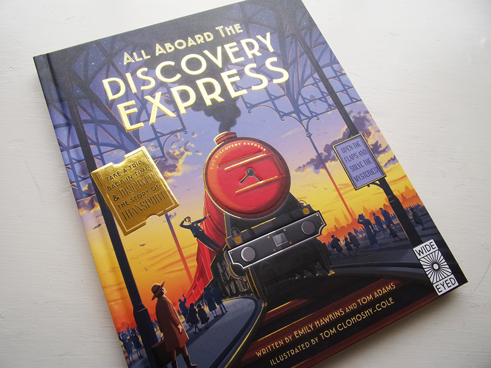
The cover of this hardback book features embossed areas and a complex and colourful wraparound illustration. The bold title is accompanied by a golden ticket and a sign that instructs you to “open the flaps inside and solve the mysteries.”
The story begins in Paris in 1937, and we are going back in time on an instructive and entertaining journey showing the history of travel on a global stage. The first spread also explains how to use this book. You are notified that Professor Pendleton is missing and it is your job to find him, so keep a tight hold of your train ticket because you will need it!
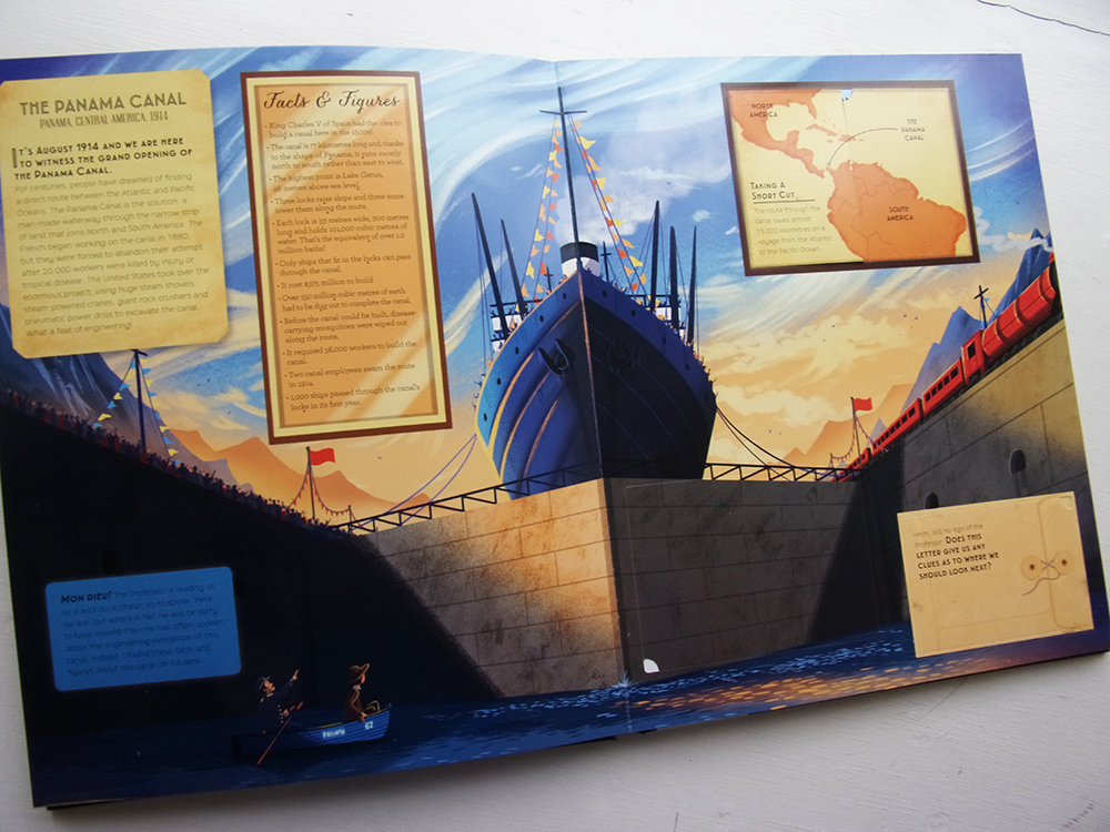
The numerous flaps on each spread contain fascinating facts, stories and technical information. The facts don’t shy away from the grim realities and costs of ‘progress’, and this is particularly striking in the Panama Canal entry. It also does it’s best to promote the role of women in the world of transport, which is commendable.
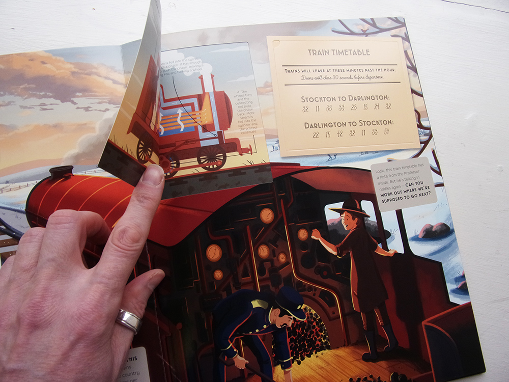
Aimed at children aged 6 to 10 years, this book will grab you with its interactive elements of inventive clues with puzzles to solve and a plethora interesting facts. Panels under the flaps show you the principles of how things work – I thought these were really well done – from how the gears on a bike work and the principles of a steam engine, to how a submarine moves up and down and the evolution of jet propulsion. There is a file shaped flap on each spread that contains a clue to the train’s next destination! You have to read the riddle and solve this puzzle before you can move forwards.
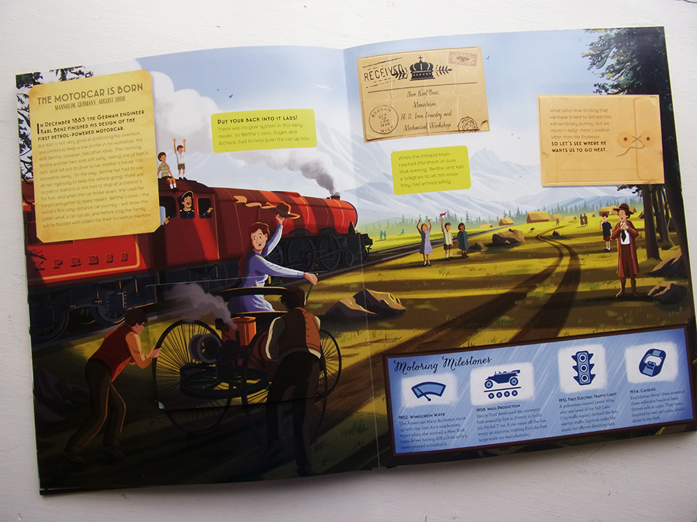
The illustrations by Tom Clohoshy-Cole range from The Panama Canal to St. Petersburg and from Versailles to the Mississippi Delta. They work best when they show vistas at sunrise or sunset. Clohoshy-Cole shows sensitivity for machines and landscapes. The human characters suit the style of the publication, but they’re not the stars of the story and could have been more expressive.
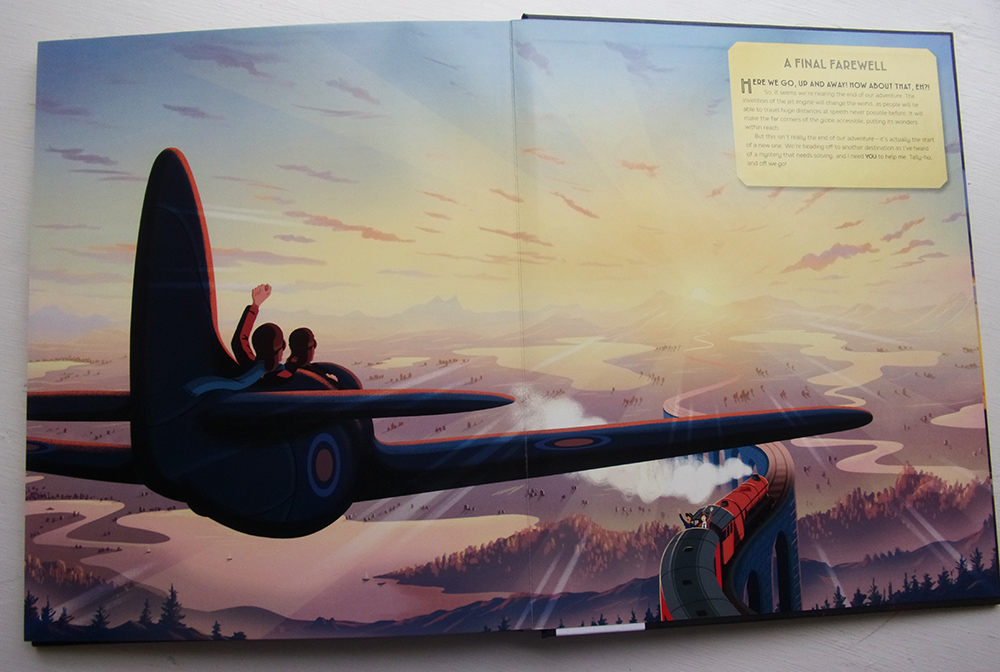
I do think that too many typefaces have been used as this interrupts the information hierarchy on some pages. Otherwise the design of the book compliments the content and promotes the excitement of finding out new things. This concept is something that could be used for future Wide Eyed Editions publications, and I suspect that from the legend on the final page that this will be the case.
Back to News Page
