- Why did you create this work?
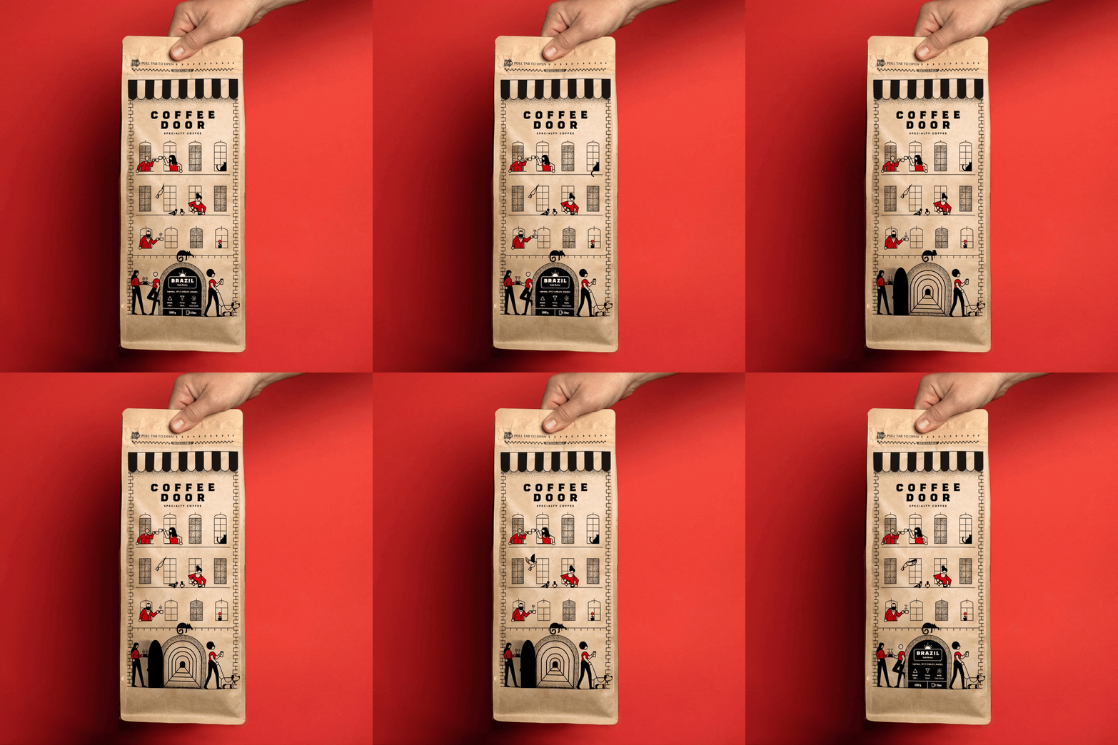
To create a unique and standout design, I drew inspiration from the door that is the brand's core. I opted for a minimalistic approach, using only two colors and simple illustrations to highlight the building design on the packaging. Each package features people enjoying coffee at their windows. When placed together on a shelf, the packages resemble a charming neighborhood. - How were your illustrations used?
Coffee Door uses them in its packaging designs and printed brand elements. - What materials and techniques did you use?
As a result of my geometric style, I created them in Adobe Illustrator. - Was this project commissioned?
Commissioned - Commissioner Name
Aykut Arikan - Commissioner Company
Coffee Door - Personal Website or Portfolio Link
kursatunsal.com - Instagram
@kursatunsal - Biography
Kürsat Ünsal is a graphic artist and illustrator based in Turkey. His style is characterized by simple colors, geometric shapes, and careful observation, creating stunning visuals that help brands stand out. He has worked with clients such as Apple, BMW, and EPAM, among others. - Where are you currently based?
Turkey
Read Interview


