WIA2020 Curated Highlights: Monochrome
We’ve rounded up some of our favourite WIA2020 shortlisted entries that use a very limited colour palette – many in pure black and white, some with flashes of colour. Limited colour choices sound restrictive, but can often offer up a whole range of new creative possibilities. Monochrome can also help to evoke particular emotions, the look and feel of black and white photographs, or to give a period feel to illustration work that full colour may not do as effectively.
The World Illustration Awards 2020 Shortlist features 200 hundred projects by New Talent and Professional illustrators from all over the world organised within 10 industry relevant categories.
If you would like to learn more about a project, click on the title or image to see the full submission.
Lou Green : Toshi’s
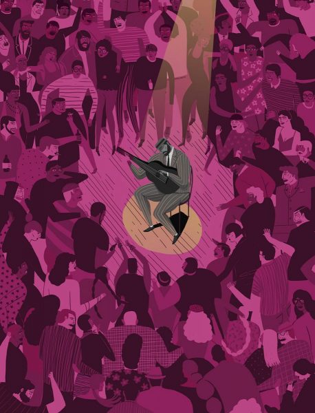
This personal piece by Lou Green is inspired by a gig he attended at a dive bar. The purple captures the vibe, and the musician is highlighted by the spotlight shining through. The piece uses the limited palette to evoke the spirit and atmosphere of the show. The piece was made digitally as a personal piece for the artist’s portfolio.
Lou lives in rural Chapel Hill, North Carolina on a farm. His portfolio focuses on narratives and snippets of life through crowds and clusters of information. He makes work for editorial and publishing and has worked with some of the biggest names in the US.
Personal Website:
http://www.lougreenart.com
Peter Strain : The Lighthouse
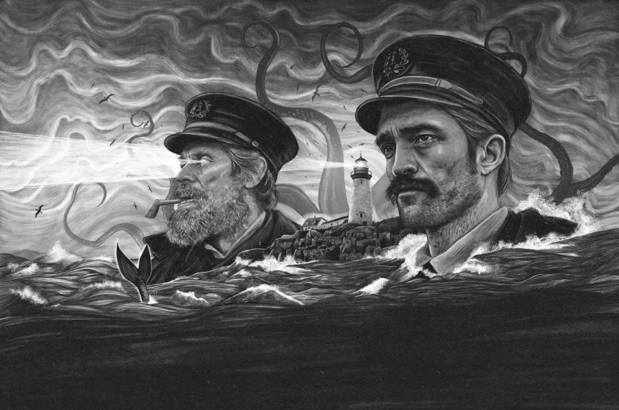
Peter was commissioned by Empire U.K to create a double page opener for their feature on Robert Eggers newest film ‘The Lighthouse’ Using a combination of pencil, ink and digital, this piece uses monochrome to great effect, echoing the late 19th century aesthetic of the film, which was shot in black and white. Peter lives and works in Belfast, Northern Ireland. His work is inspired by film and music as well as social, political and cultural issues.
Social Media:
@peter_strain
@peterstrain
Personal Website:
https://www.peterstrain.co.uk
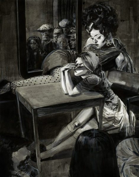
Xintong Yang : Rich People are Weird
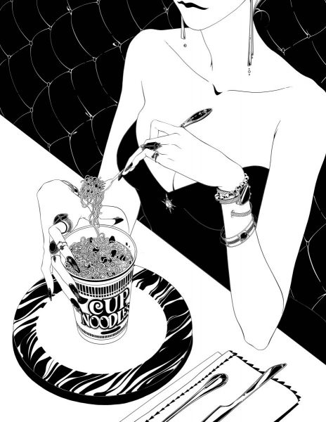
Xintong Yang’s digital illustration is a project piece, based on an article named Why Rich People are So Weird, that was published on The Online website about the behaviours of the rich which are hard for others to understand. The use of black and white highlights the curious details in the piece and has a feel of the Art Deco period. Xintong (Dawn) Yang is an illustrator studying at the Minneapolis College of Art and Design in Minneapolis, Minnesota, and is due to graduate in 2020.
Social Media:
@dawn_xt_yang
Personal Website:
https://www.dawnyangart.com/
Anna Sokolova : Netflix Originals Delft Blue
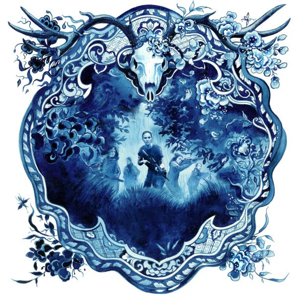
Anna’s epic series of 25 square images for a large-scale mural were commissioned by Netflix for its headquarters in Amsterdam. The works are painted in a traditional 17th century Dutch ‘Delft Blue’ style, while retaining the character and iconic imagery of the Netflix Original films. The pieces were made using fine lines and washers of watercolour, tempera and mixed media on cotton paper. The particular challenge of this project was the creation of an impressive and dramatic artwork using only one colour.
Anna Sokolova is an award-winning illustrator and artist based in Berlin, Germany. Anna works with mixed media, merging the traditional and innovative approaches.
Social Media:
instagram.com/plushbrush
Personal Website:
http://www.annasokolova.eu
Hanyu Mu : Pressure
Hanyu Mu’s portfolio piece explores the social pressures on women. This started as a challenge to use ink creatively, and uses layers of ink washes and white pencil to achieve it’s monochromatic depth.
Hanyu Mu is originally from China, and is now based in Atlanta, Georgia, USA, studying MFA Illustration at Savannah College of Art and Design.
Social Media:
mega_mooon
David Despau : Albert Camus
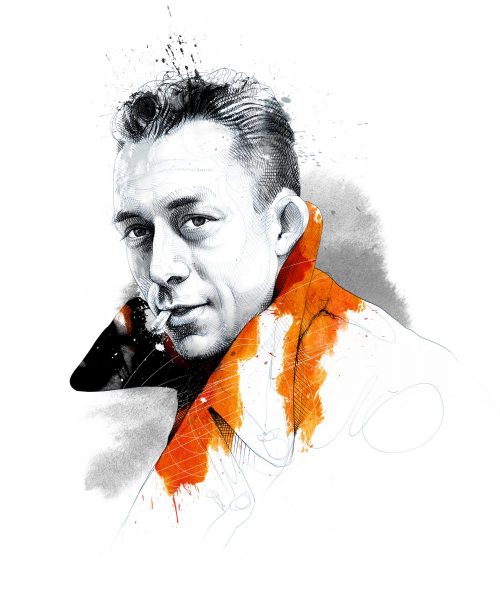
This cover illustration was commissioned by French magazine L’Express for a special issue about the famous writer, philosopher and journalist Albert Camus. The portrait is based on a photograph of Camus using black and white, with a splash of vibrant orange to add vibrancy and interest. The work is made using pen on paper, with texture and colour added digitally in Photoshop. David is a freelance illustrator based in Spain. He is represented by Colagene.
Agent Website:
https://www.colagene.com
TAO&TAO : Floating Life
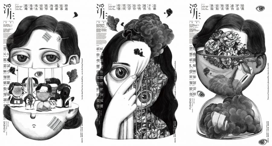
This work is based on a Chinese phrase ‘floating life’ – meaning that life is empty and unreal. These surreal pieces use black and white lines and shapes to emphasise this feeling and to create a visual language to describe the idea of a floating life. The pieces are made digitally and were created as a portfolio piece.
Tao&Tao, formerly known as Youxi Tao, is a student of Lu Xun Academy of Fine Arts, China-UK Digital Media (Digital Media) Art School, studying MA Illustration.
Social Media:
https://www.zcool.com.cn/work/ZMzUwOTc4NDg=.html
Ruth Waters : Lost Dog
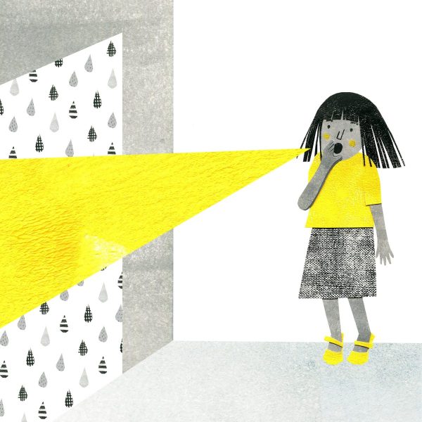
Before embarking on this wordless picture book, Ruth’s work had always been used a wide range of colours, so this project became a challenge to use just two colours to tell the story. The artist chose yellow as a bold colour to highlight the important elements of the story. The work is made using collage of painted paper. Each element is made separately and scanned, resulting in a digital collage.
Ruth Waters creates children’s illustrations using collage. Made by hand, she paints, cuts and layers paper to make unique, colourful and fun pictures. Ruth lives near Brighton, UK, having recently returned from Australia. She is represented by Bright Agency.
Social Media:
ruthwatersillustrations
ruthpwaters
Personal Website:
www.ruth-waters.com/
Yu Tang Chen : The White Wolf’s Moon
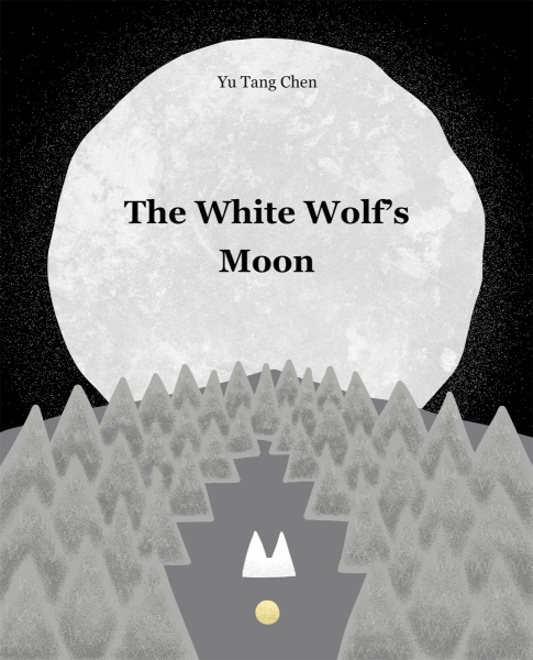
Yu Tang Chen’s project is a picture book. It uses black and white, with tiny amounts of a pale gold colour to great effect to show the moon, and wolves’ eyes in the dark.
Yu Tang Chen is an illustrator and graphic designer from Taiwan.
Social Media:
victang821
Emily Kearney : Saint Mick
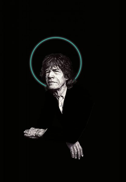
Emily Kearney’s work is a portfolio piece intended eventually for the editorial market. It uses graphite and pencil with digital elements to depict Mick Jagger, with a halo picked out in green adding interest and very simply communicating the message of ‘Saint Mick’.
Emily is a new talent illustrator, based in Atlanta, Georgia in the USA.
If you enjoyed this curated list, why not have explore the full WIA2020 shortlist, for more inspiration!
Back to News Page
About THE
AWARDS
The World Illustration Awards is a global celebration of illustration.
The Association of Illustrators has run a juried illustration competition since 1976. The latest incarnation, the World Illustration Awards in partnership with the Directory of Illustration, has been going strong and growing since 2015.
WIA focuses on supporting and celebrating creativity internationally, by connecting illustrators with their peers and the global illustration industry.
The Awards are split into two groups: New Talent and Professional. All work, commissioned or self-initiated, is accepted across the ten categories as long as it has been created within the past year before the Call for Entries closes.
If you have any questions get in touch with the awards team
[email protected]
PRESENTED BY
The Association of Illustrators
The Association of Illustrators is the professional body for illustration in the UK. Established in 1973, the AOI champions illustrators and the illustration industry with education, promotion and campaigning to achieve a thriving industry for us all. Memberships are available for illustrators, agents and colleges with discounts available for students and represented artists.
Directory of Illustration
Workbook’s Directory of Illustration, the world’s leading illustration resource, is distributed free of charge to thousands of art commissioners who regularly hire freelance artists and animators. Advertising agencies, corporations and publishing companies depend on the searchable directoryofillustration.com website and annual printed Directory to find top talent for their campaigns and projects. In print, online and on social, we help artists successfully grow and sustain their professional careers.