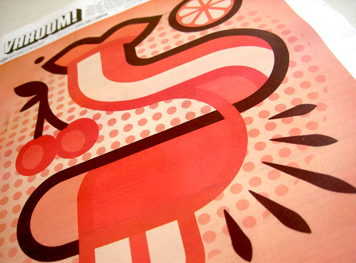
The Varoom Report: Taste V19
Taste
THE ILLUSTRATION REPORT Autumn 2012
ISSUE 19
Varoom 19 stretches the idea of Taste as visual sensation like a ball of strudel dough. The menu includes New Wave Food Mags, Literary and Aesthetic Taste, John Pasche’s Lips for The Rolling Stones, and the question that erupts, like raw chilli on the tongue – who are the new tastemakers for Commissioners? And how do illustrators respond. In his feature ‘Art Directing Taste’, Michael Salu, Artistic Director of Granta is brutally honest – illustration, “might need to do more than vocationalise aesthetics and cultivate a broader palate of profundity for its own survival. Editor, John O’Reilly’s introduction to this issue follows:
1.0 Taste’s Border Control
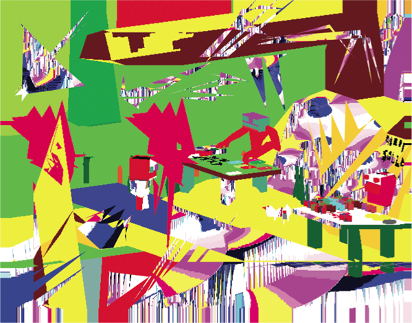
Cartoonist Ben Jennings’ olympics cartoon is a choreography of Taste. There’s the Cyclops-like, union Jack-clad mascots Wenlock and Mandeville, marksmen perched on London rooftops with telescopic rifles – what else could these singular eyes be for? The five olympics rings become crosshairs.
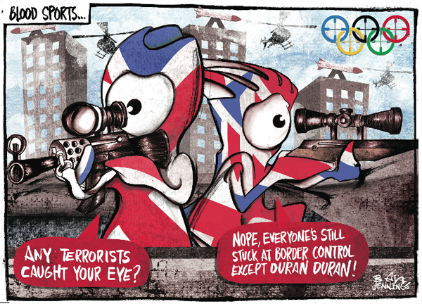
Ben Jennings – Blood Sports for The Guardian, 2012
1.1 A Very British Apocalypse
It’s a dense narrative composition of colour and shape: the white-out-of-ruby-red speech bubbles, the patriotic clothes, the muted skyscrapers, rockets and choppers in the background, to the final observation that raises a quiet eyebrow to a very British kind of apocalypse: “everyone is stuck at Border Control except Duran Duran.”
1.2 Taste as Cultural Capital
Taste is something that has traditionally been about a kind of Border Control, between highbrow and lowbrow, between the educated and the vulgar, between those with economic and social power who assert their ideas of Taste (in the words of Friend Sociologist Pierre Bourdieu) as a form of ‘Cultural Capital’.
1.3 Taste Flatters
The just released Phaidon Archive of Graphic Design, featuring 500 examples “Compiled and researched by experts”, asserts its Taste not in the no doubt tasteful selection of work but in the design and packaging which enables it to sell for £140. It’s a kind of ‘Cultural Capital’ in a box, a set of visual codes designed to flatter the taste of its design and ad agency audience. Taste is something visual, sensual, physical. The visual creates Taste.
2.0 The Taste of Music
This issue of Varoom highlights Taste in illustration as something visual and visceral. The idea that that the visual sets out the parameters of how we experience, sense, and taste things. Taste as something defined through colour and line, like the sensation created by John Pasche’s “Tongue” in his image for The Rolling Stones Sticky Fingers album.
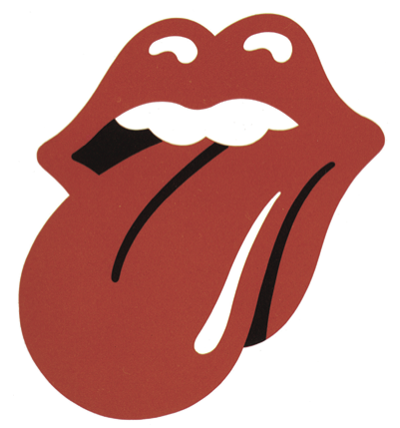
John Pasche’s Rolling Stones Logo
2.1 Questionable Taste
Martin Colyer explains in his feature Licking The Logo that the original Warhol image of a man’s crotch was problematic for a couple of reasons. Yet Pasche’s mouth and tongue, designed to be a simple letterhead and logo, became the visual entrypoint for experiencing a band and its music that sold itself on what music critic Simon Reynolds called a kind of ‘uncouth’ and ‘raw sexuality.’ And as Colyer points out, “arguably, the lips appearing as you turned the album over was a juxtaposition in more questionable taste than the underwear…”
2.2 Abstract & Sensual
All illustration practice is a negotiation of Taste, between the abstract expectations of the client delivered in the brief and the concrete, sensual visualization of it by an illustrator. The modern form of this idea of Taste as a blend (another taste metaphor) between an idea and its physical expression is rooted in the Aesthetic philosophy of 18th century German philosopher Immanuel Kant, a key figure for Romanticism.
2.3 Be Cool
In his landmark work The Critique of Judgment, Kant argued that judgements of Taste are subjective, personal, based on feeling and pleasure, and also universal – we believe our judgements should be recognised by everyone else. What’s more our judgment should be ‘disinterested’. ‘Be cool’ implies Kant, our sense of what is Beautiful shouldn’t be based on whether an image for example is of my boyfriend/ girlfriend, child, favourite pet… Kant’s ideas on Aesthetics were used by Art critics such as Clement Greenberg to champion modernist, Abstract Fine Art – but it doesn’t have to. ‘Beauty’ for Kant involves creating a new order, a new way in which we can taste the world.
M/M (Paris), Balenciaga Spring-Summer 2002 invitation. After campaign photography by Inez van Lamsweerde & Vinoodh Matadin
3.0 Conversations
M/M Paris take existing forms of Taste and reshape them, whether it’s the idea of Taste contained in briefing from a fashion client for example, or the idea of Taste expressed in the expensive photography that is shot for the campaigns they are working on. Then they draw over it, adding another dimension of Taste that is not just an expression of their own taste but an exploration of the idea of Taste, of how we ‘taste’ things visually. The drawing, inking, and resampling of the images, their image-making feels like the pen is a ‘probe’ or ‘sensor’, testing out the space of an existing image, trying to learn its visual form, trying to communicate with it. M/M Paris talk about this work as a ‘conversation’ with an existing image. But perhaps these are conversations in different languages – between an official language and a vernacular, idiosyncratic, language.
3.1 Taste Cultures
The work of M/M Paris sits between a rigid, hierarchical, official French state culture and the popular, vernacular culture they are interested in, in particular the more fluid English Pop culture. Two different Taste cultures. It is not difficult to see how French sociologist Pierre Bourdieu would arrive at his idea that Taste is based on social class in a country with deeply hierarchical structures around Taste. But their work also signals a different moment in visual culture, a moment when Illustrative practice itself seems set to become a default mode for visual culture.
3.2 The Fluid Image
The treatment of photography by M/M Paris underlines the shift in power in visual culture from recording to editing, from reporting to narrating, from frozen and the static to the plastic and the mobile image. Photographer Henri Cartier-Bresson wrote in his 1952 book, The Decisive Moment that, “to me, photography is the simultaneous recognition, in a fraction of a second, of the significance of an event as well as of a precise organization of forms which give that event its proper expression.” Beyond the question of form, this was the age of daily newspapers and magazines, where the relative scarcity of photography, and the distribution of images, was a decisive factor in itself in determining what counted as a decisive moment.
3.3 Sampling, Tasting ‘reality’
In the age of still cameras (excluding the mind-bogglingly fast scientific cameras) shooting 14 frames per second, the idea of a decisive moment moves away from the shoot to the edit. It’s the aftermath of the ‘moment’, the edit that matters. Technological innovation means photography is much closer to the idea of a continuous data feed, a sampling of ‘reality’. It’s no accident that an Artist/Illustrator John Stezaker (see Varoom 15) won the prestigious Deutsche Borse Photography Prize.
David O’Reilly, RGB Xyz, 2008
4.0 New Storytelling, New Audience reception
Cultural taste is always connected to physical taste. When we taste things, we sample, we dip our toes in the water. And when the physical or technological world changes so does our Taste. In Lo-Res Fast Minds, Bryony Quinn examines illustrators and animators, such as David O’Reilly, Quayola, Grant Orchard and Kolchoz, with a crunchy aesthetic, who create with old software or exploit ‘glitches’ as a kind of new visual shorthand. What’s more this basic aesthetic fosters a new kind of storytelling which Quinn argues, is one where “the image-maker can use to successfully bounce between ideas and mini-narratives much quicker, communicating much faster and in a manner we’ve become accustomed to in our digital lives.”
David O’Reilly, The External World (detail), 2011
4.1 Exceedingly Bad Taste
The External World by David O’Reilly harks back to the classic cartoons of childhood, of Warner Brothers, where visual forms exceed received social norms, rules and conventions. The deadpan descriptor on Vimeo simply says, “A boy learns to play the piano.” The film is built from a series of mini-narratives which push the boundaries of the cartoon grotesque: a blind old ‘rabbit’ in an ‘Acme’ retirement home, slips on a banana skin and splats flat on the floor inky black blood spilling out; a patient with a ‘spiky’ depression cloud hovering over ‘him’ listens to the soothing tones of a doctor but gets the prescription – ‘go fuck yourself’; one bird sings to another expressed in visual notes and the other turns round and ‘poos’ on the other bird; the episode of mock TV programme “Father and Son” where a game of Frisbee results in a decapitation which is telegraphed for it’s shock-humour. O’Reilly uses grotesque Taste to visualize personal relationships as a kind of wound – the horror of human desperation. If the Chapman Brothers deconstructed Looney Tunes, it might look something like this.
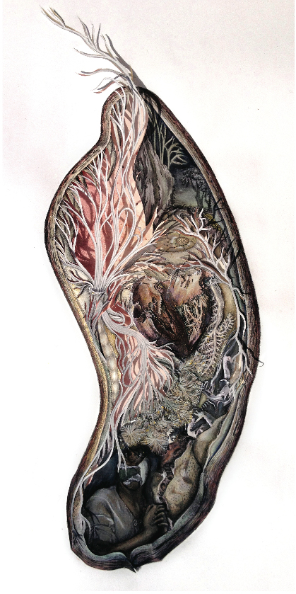
Kanitta Meechubot, illustration included on cover Granta 120 the Medicine issue, 2012
5.1 The horror
Horror is one of the themes explored by Michael Salu, Artistic Director of Granta magazine in recent issues of the magazine, where he published the entire graduate show work of Thai artist Kanitta Meechubot, from Central St. Martin’s in 2011. The Horror issue features the delicate gothic imagery of A Garden of Illuminating Existence, a meditation on her grandmother’s fight with cancer. Meechubot’s work features on the cover of the new Medicine issue, where a wound is projected into the photograph of a body, inside the ‘wound’ sits Meechubot’s illustrations.
5.2 The Palate of Illustration
The question Salu raises at the end of his reflections around Art Direction is at least as challenging as any of the work he discusses. In an age where all sorts of visual artists and musicians work across the range of our creative industries, Salu asks, “I often wonder what the term ‘Illustration’ now means. Maybe Illustration is ripe for re-contextualisation? or maybe as a medium it might need to do more than vocationalise aesthetics and cultivate a broader palate of profundity for its own survival.”
6.0 Changing Tastemakers
We’re in an age where the tastemakers are changing, from the trade and creative magazines to bloggers and design companies such as It’s Nice That and The Church of London who through websites and magazines have gathered hard-earned Cultural Capital, gathering fans for their cultural products and clients for their commercial, but they are heralding a major shift in taste. Increasingly commissioners of illustration are bypassing the old channels, and using sites like these as research for hiring illustrators. If the idea of Taste feels au courant as the French tastefully say (we’ll come to the new wave of Food magazines) it’s because benchmarks of Taste are shifting. Tasting is some- thing we do, daily, hourly, on blogs, sharing and sending images, rather than something we seek, something which supports our sense of self. What’s ‘trending’ is a blur, just enjoy the ride.
Michel Tolmer, illustration for article on Bertrand Gautherot, The Fool #1, 2012
6.1 From Look To Taste
The last decade has seen an eruption of books, magazines and imagery around food. But the photographic image showing how food should look, is shifting to illustration which shows how food might taste, even exploring the idea of Taste itself – such as The Food as Art History from The Gourmand magazine we feature in our New Wave Food Mags article. Designer Jamie Brown uses real food to illustrate food illustrating great art movements.
1.2 Art as Illustration
Nicholas Blincoe writes of Brown’s visual essay, “Bauhaus reveals itself in strongly German elements – pumpernickel, sausage and mustard – arranged in stark geometric designs, while Arts and Crafts is represented through floral designs carved from vegetables in a palate restricted by both colour and flavour.” Art as illustration. We are having to rearrange our ideas of what Taste is and what illustration is and does. In a world where ideas of Taste, and the guardians of Taste are changing fast, Illustrators have the opportunity to be the Tastemakers. They just need a generous palate.
To purchase Varoom 19 go here
Back to News Page