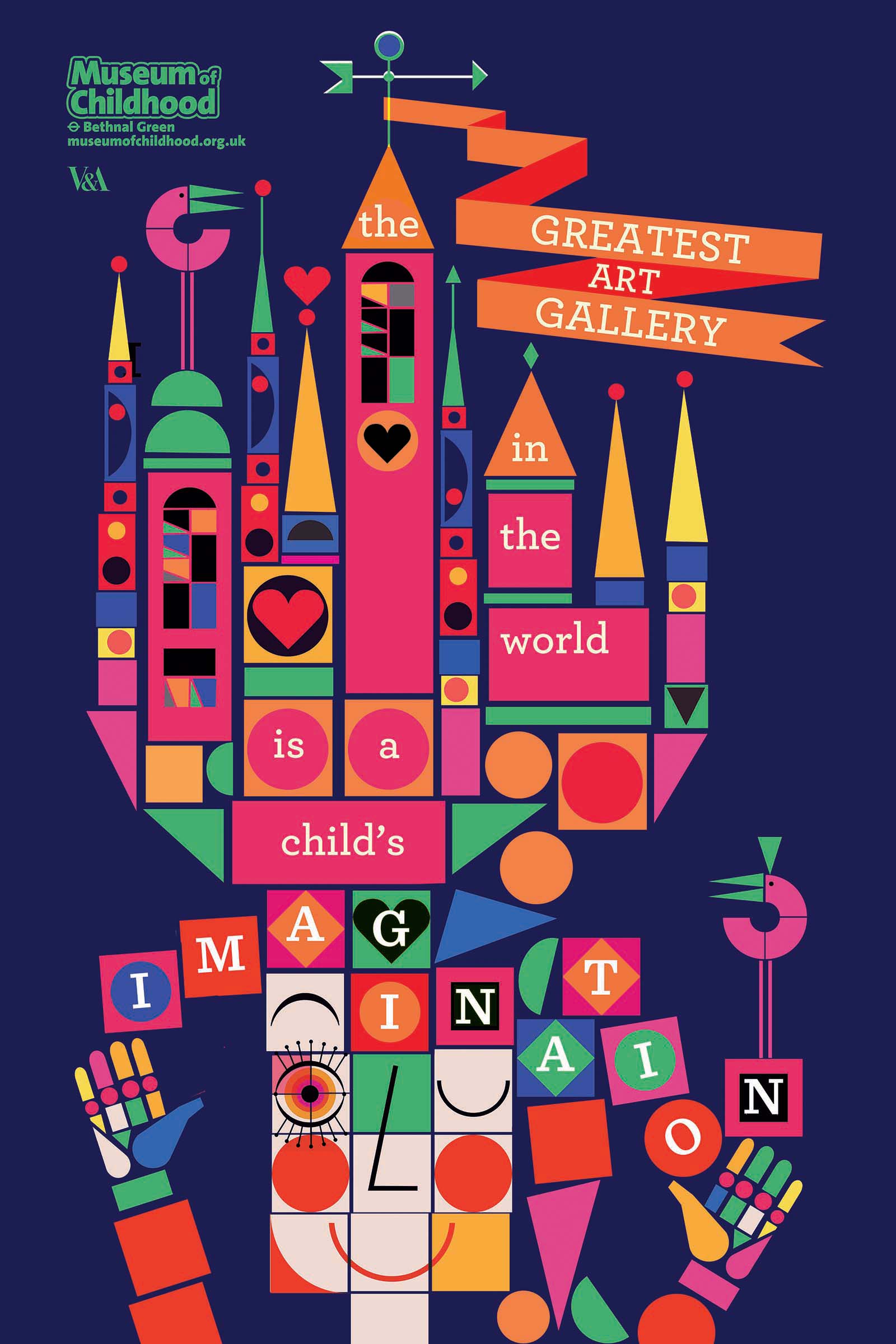
MUSEUM OF CHILDHOOD CAMPAIGN
ADVERTISING CATEGORY WINNER
PROFESSIONAL
Lesley is a self-taught illustrator who studied English Literature at degree level. Her illustration is graphic, colourful and engaging featuring narratives, characters and mythological creatures. Her work has been shown at film festivals worldwide and clients have included The BBC, Channel 4, OKIDO magazine, V&A, Wrap magazine and many more.
Lesley is based in Glasgow and you can see more of her work at lesleybarnes.co.uk
Commissioned by AMV BBDO, the poster artwork was used to advertise the V&A Museum of Childhood across London. The posters were part of a wider campaign, and illustrators were asked to reflect the creative vitality of childhood.
The judges loved Lesley’s fun, intriguing and playful posters as they are a strong example of illustration collaborating successfully with design and art direction, which is key to successful advertising. The imagery communicates much more than just a message, it evokes an emotional reaction about the experience of going to the museum.
The following is an excerpt from an interview with Lesley featured in the awards issue of Varoom magazine.
BRIEF: Interpret the statement “the greatest art gallery in the world is a child's imagination” in a “positive” and joyful way. The posters had to be playful, friendly and evocative of childhood without being obviously childish.
MATERIALS: I started with cut-out paper shapes and then worked up the finished poster digitally.
RESEARCH: I looked back at what I used to used to create ‘art’ with as a kid. I remember loving those sticky, gummy shapes which I used extensively in my pre-school collage career. I also have vivid memories of a duffle bag full of wooden blocks. Both of these recollections inspired and informed how I approached my final design.
PROCESS: I played with paper shapes to get the composition of the ‘building blocks’ in the poster right. I think this was actually quite an important process to go through as it was basically me just playing about, until something felt ‘right’. It was this element of ‘play’ that I was trying to capture in the final illustration. I then worked up the poster on my computer (it felt easier to do this digitally as the dimensions were so big!)
RESISTANCES: One of the main difficulties for me was making sure that the type and the statement all worked as one with the illustration and design. It was actually quite hard to balance the two, but I think now the illustration and words are both elevated and create something more than just the sum of their parts.
INSIGHT: When I was making the poster, I wanted to appeal to adults as well as children, so I tried to find a way of creating a sense of nostalgia without alienating the young. Building blocks seemed perfect as they are something that everyone can relate to. One of the insights this gave me was that something simple like a ‘building block’ can be the most creative thing, more so than any fancy toy or ipad, and there is something wonderful about that.
DISTRATIONS: Numerous. The brief gave me the excuse to basically revert back to childhood.
NUMBERS: 3 orange circles, 1 cut finger.
AFTERWORDS: it makes me smile.


