Scientific & Medical Illustration
Our partners at the Directory of Illustration have a keen industry insight into scientific illustration through their Medical Illustration and Animation program.
Their media manager, Marika Carradine, offers a view from the USA on a range of illustrations themed around Science and Technology from across the categories.
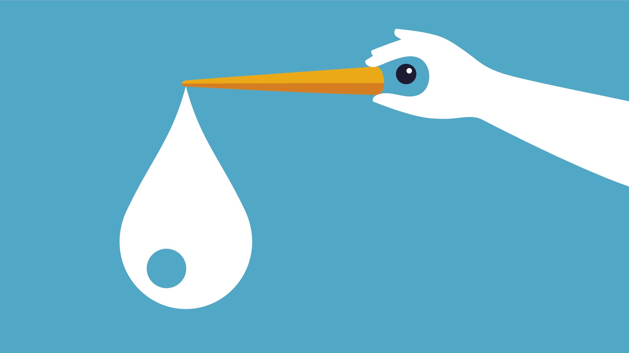
Noma Bar: Tinder drove me to freeze my eggs
This series of illustrations is remarkable for its immense complexity in meaning hidden within its extreme simplicity of shape and line. It requires the viewer to look closely and carefully to decipher the multitude of ways the illustrator depicts egg-freezing in the utmost minimalist manner. These images are unapologetically two-dimensional, and through the exceptional use of shape and negative space in the horizontal plane, they contain a richly layered vertical sphere of conceptual genius. The clean and precise shapes are a great nod towards the precision of science and medical technology, while the baby blue color choice along with the conceptual graphics of a stork and a snowflake, invite a parental softness for a sensitive subject.

Nate Kitch: Putting Parkinson’s in the Picture
With something as difficult to express in words as the hidden realities of living with Parkinson’s, Nate’s work gracefully brings to light the complexities and the broad spectrum of symptoms of an individual’s experience in such an impactful way. Nate says it best: “With art, it’s all there spelled out for you. It hits you with more immediacy.” The overlapping of imagery and the true collage effect that Nate employs in this series is such a powerful way to visually demonstrate the day to day differences in experiences for individuals living with Parkinson’s as well as for those of their spouses. He quite literally is taking the complex pieces of living with Parkinson’s and not only putting them in ‘the picture,’ but creating a beautiful series that encompasses the painful, darker moments as well as the brighter moments of Parkinson’s.
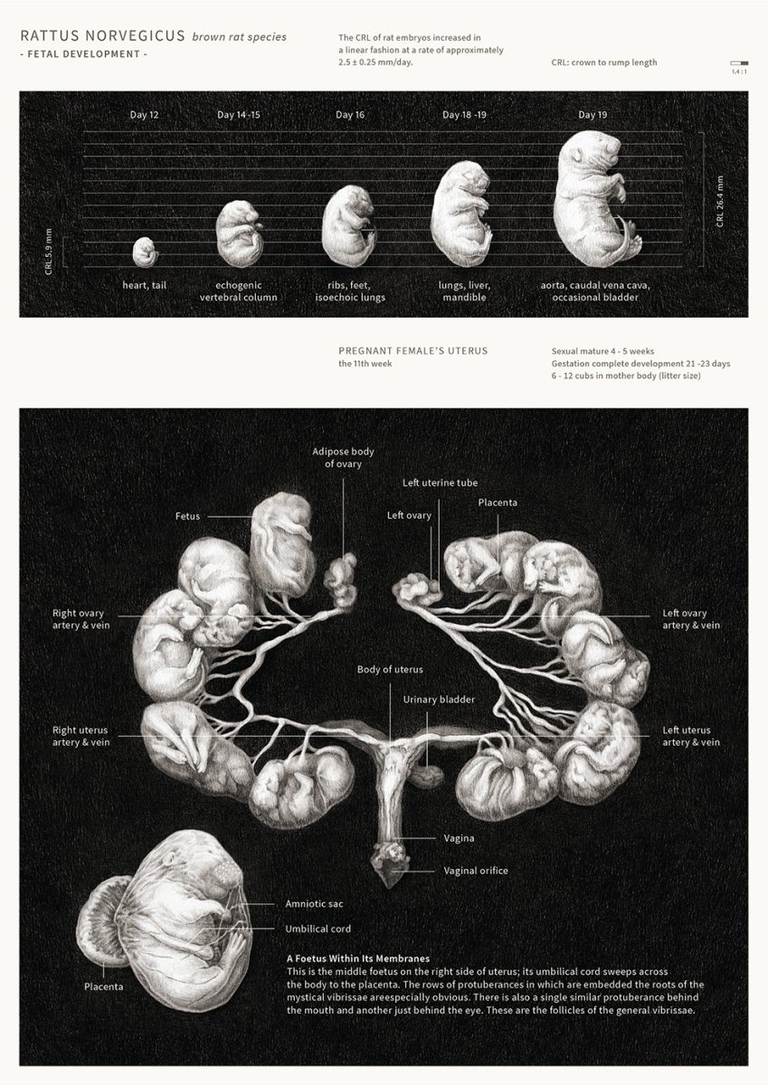
Pigeon & Snake: Rat Fetal Development
Rarely is the saying “an image is worth a thousand words” more true than when it comes to scientific and medical illustration. This scientific infographic educates, explains and informs the viewer of the fetal development of the brown rat species in a single image that is both visually impressive and absolutely fascinating. It would take pages of words to describe and explain what the viewer can see in just a few blinks of the eye. The decision to use a dark background is an excellent choice for pronouncing the illustrations and adding depth. The illustrations are expertly drawn, making the fetal development very clear while also adding a bit of romanticism in the way that fine art naturally does. The marriage of art and science is highly functional but it also visually inspires an endless wonder and awe for the natural world.
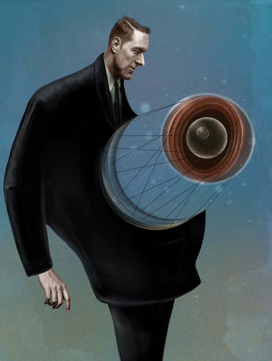
Charlie Padgett: Cell Passages
In Charlie’s signature vintage style and stunning use of layered texture, he creates such aesthetically pleasing works that feel nostalgic in their portrayal of novel discoveries in science and the human body. The rich textures and layers create an air of mystery, reminding us how mysterious the natural world still us but also what a long history science has and how far we have come in what we know. The complexity of the fat cell at the molecular level is artistically simplified and the lines connecting it are such a clever way of conveying time, cellular passages and cellular communication. Charlie’s work is a shining example of the power of artistic interpretation in distilling scientific information in a single image.
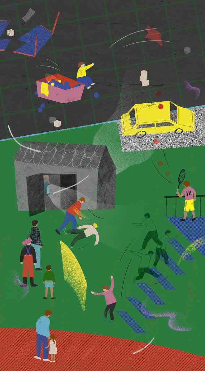
Nico Liu: ADHD
These illustrations so kindly portray the experiences of ADHD. The use of scattered images helps to communicate how scattered one’s attention can feel with ADHD, while the choice of subjects and the style of the imagery is a reminder that it’s okay and it’s manageable. Nico’s almost bird-eye view vantage choice and the decision to make the characters small, helps the viewer to see the issue from afar, aiding in the artist’s goal to help the viewer see the unnecessary daily trifles and to better realize the bigger picture in managing their ADHD. The colors, shapes and 2D elements create a bit of whimsy and fun, making the topic approachable and enlightening for understanding ADHD visually and intuitively.
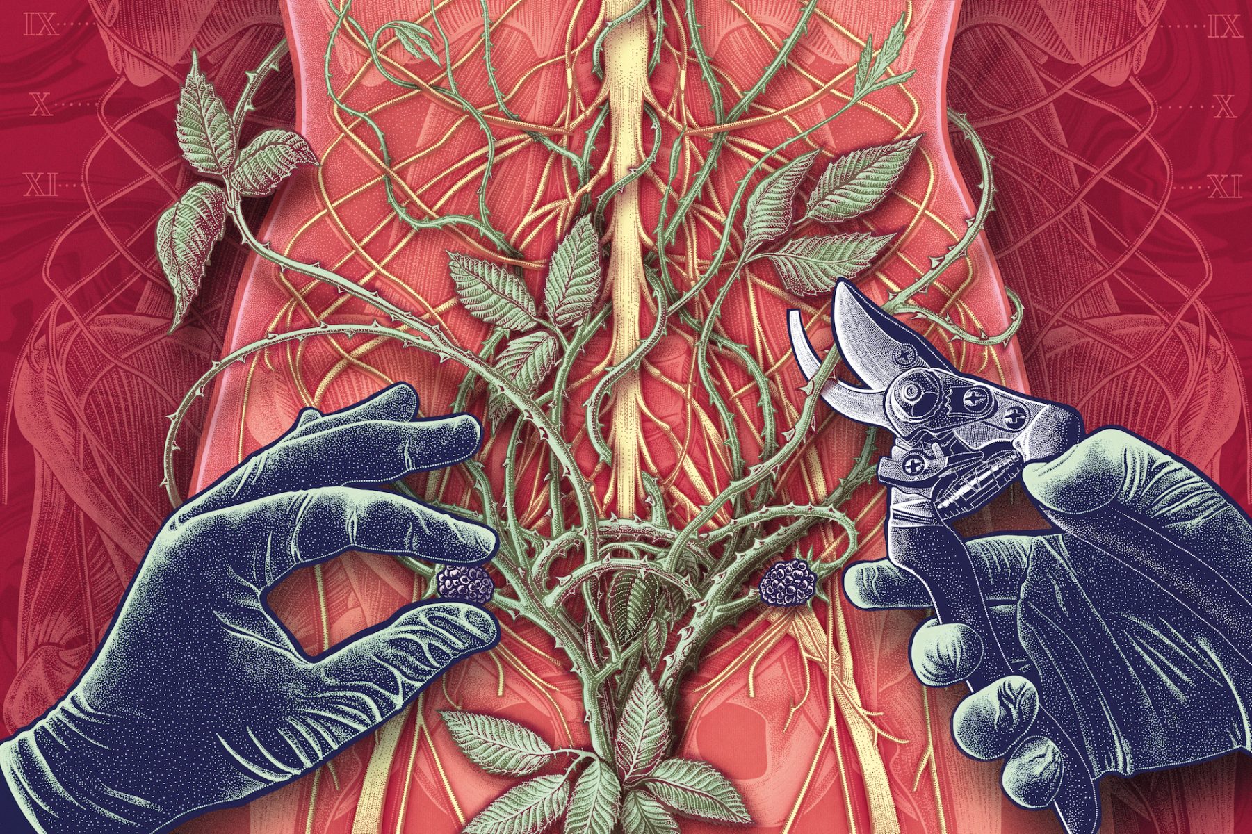
Jennifer N. R. Smith | WonderTheory: Endometriosis
There are few things more powerful than metaphor when it comes to conveying feelings, emotions and experiences. The carefully chosen visual metaphor in this image instantly induces a physical reaction within the viewer. We can all vividly imagine the painful sensation of hypothetically having thorny brambles tangled within our insides. The use of brambles, vines and blackberries is also a poetic representation of the body’s connection with nature. Not only is the imagery beautifully executed with exquisite line-work and collaged layers, but the traditional styling and vintage textures remind the viewer of the subject’s important historical context.
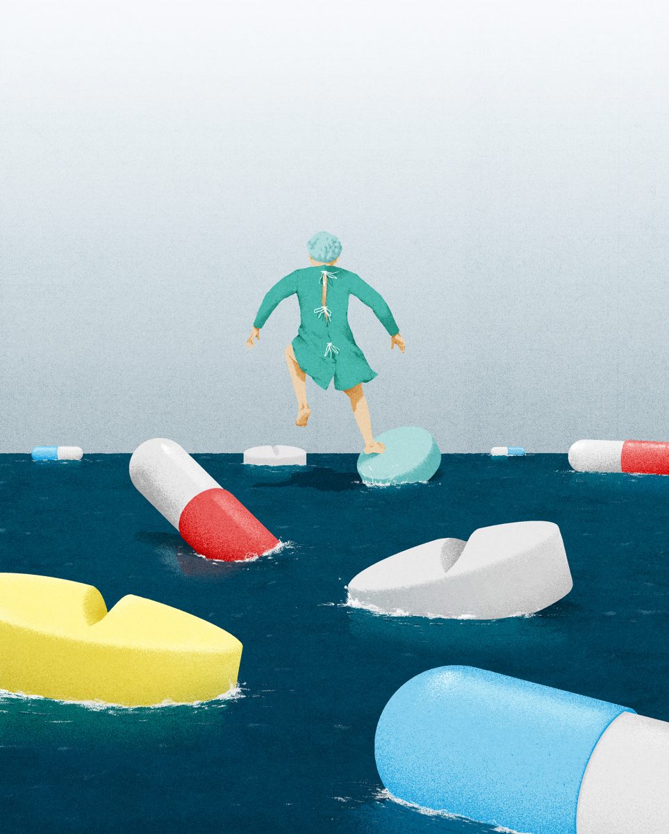
Hendrik Dahl: Advances and challenges in healthcare and medicine
This conceptual illustration immediately communicates to the viewer the immense challenge of proper medical treatments with the dicy balancing act of increasing pharmaceutical usage while avoiding the all too common risk of overmedication. The choice of water in this piece makes it poignant how treacherous this balancing act is and makes the instability of navigating this topic viscerally understandable to the viewer. It also adds an element of time and a sense of urgency for addressing this issue. Hendrik’s clever perspective choice and placement of the subject from the rear effectively places the viewer in the ‘shoes’ of the patient, so that the viewer can easily feel like we’re right there with the leaping patient – an expertly crafted and powerfully effective composition.
