Image & Text
Typography and illustration meet…
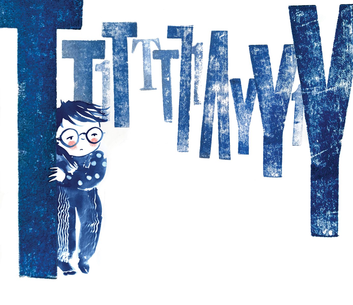
Kate Rolfe: Navigating Dyslexia
Kate Rolfe’s illustration for a children’s picture book uses painted letterpress forms as part of the imagery to communicate what it is like to experience dyslexia. The book is intended to help children struggling with dyslexia, and increase the understanding of others.
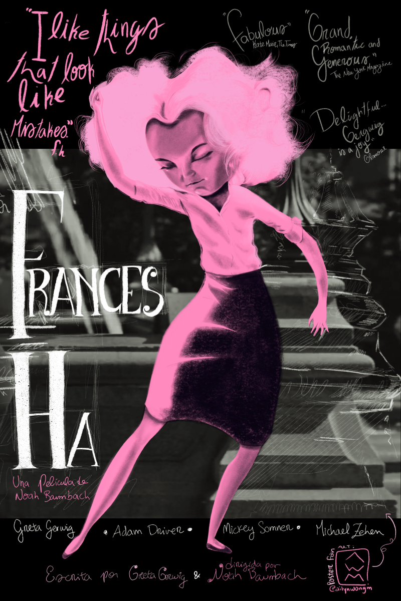
Ailyn Wong M: Movie Posters
This poster design showcases the artist’s signature style which incorporates cinematic imagery, exaggerated characters, and hand-drawn calligraphy, all intertwined to create a visually exciting piece of illustration.
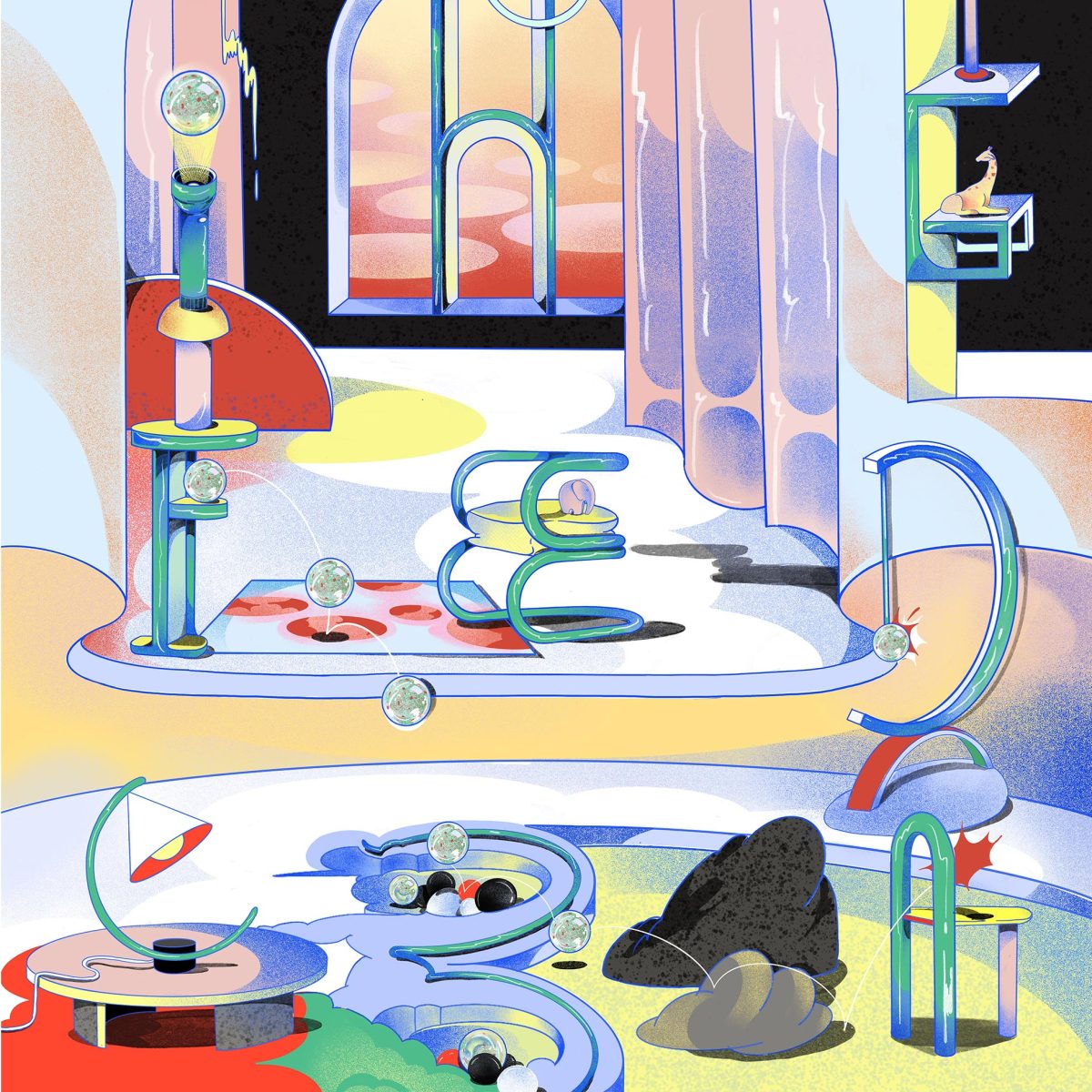
beyapanicha: Alphabet Furniture Room
This work was created as part of the 36 Days of Type project on Instagram, creating an A-Z alphabet based on furniture design. This illustration was created using Procreate on iPad Pro.
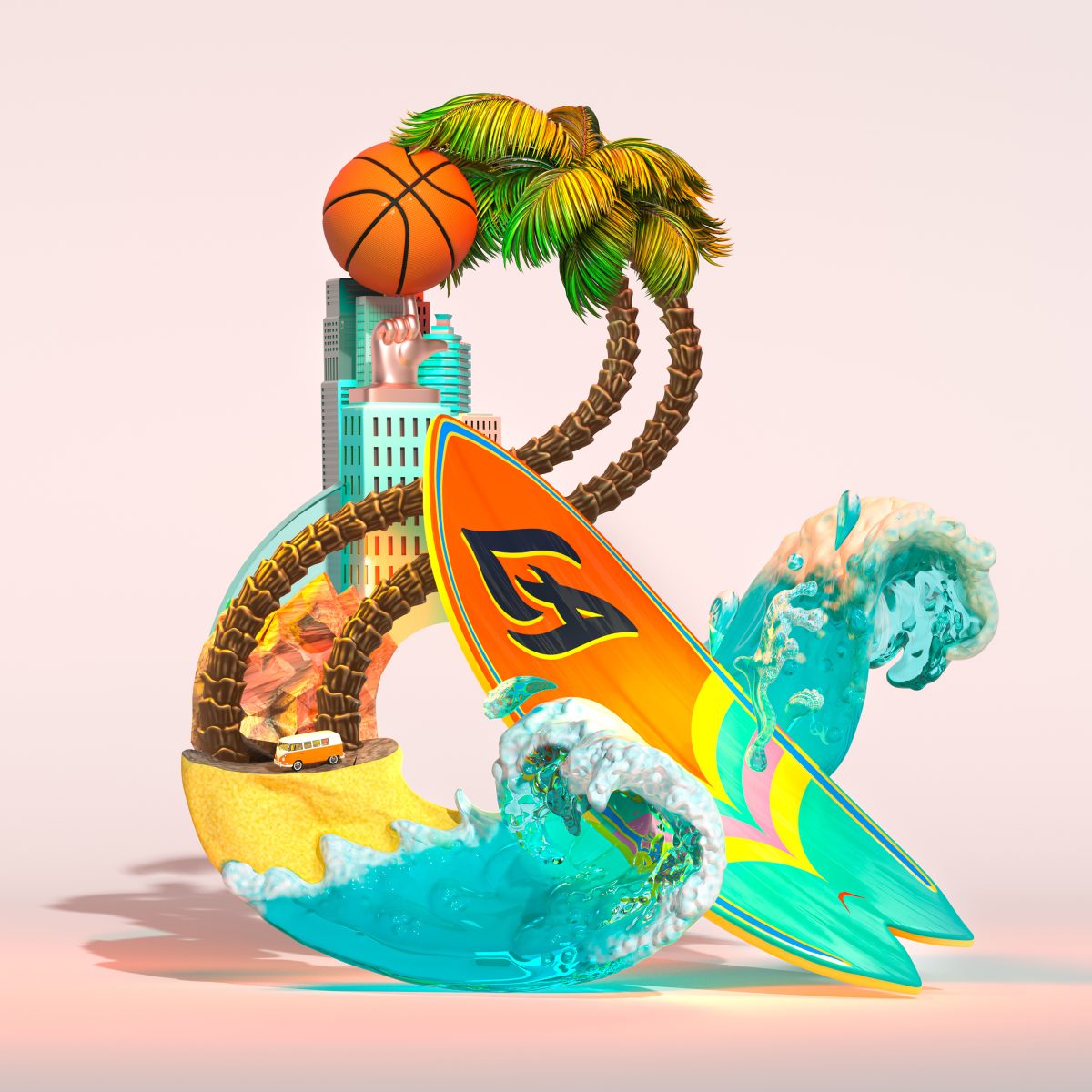
Lisa Sheehan: Saatchi & Saatchi OneAmpersand
This series of 3D conceptual illustrations focuses on the ampersand symbol as the main image. This work was commissioned by advertising agency Saatchi & Saatchi, capturing the range of work that they create, including that for their main client Toyota, parent company Publicis, and the locations of the company’s global offices. The illustrations were designed to be used on presentations and internal communications.
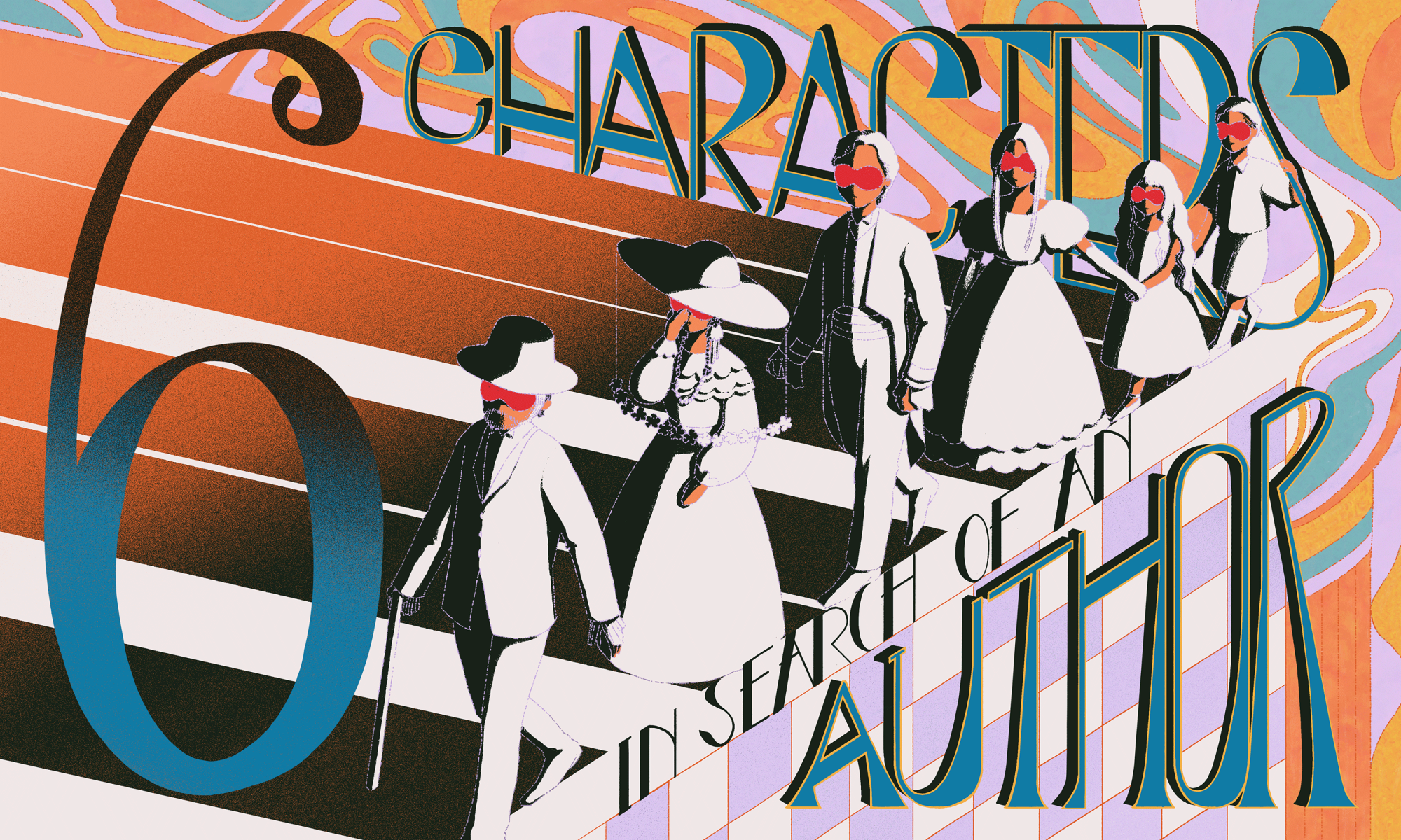
Yuqing Liu: Six Characters In Search Of An Author
This project is a series of digital illustrations inspired by a play ‘Six Characters in Search of an Author’. The cover uses a vintage style of typography, combining crosshatched texture and blocks of colour, in contrast to realistic draughtsmanship.
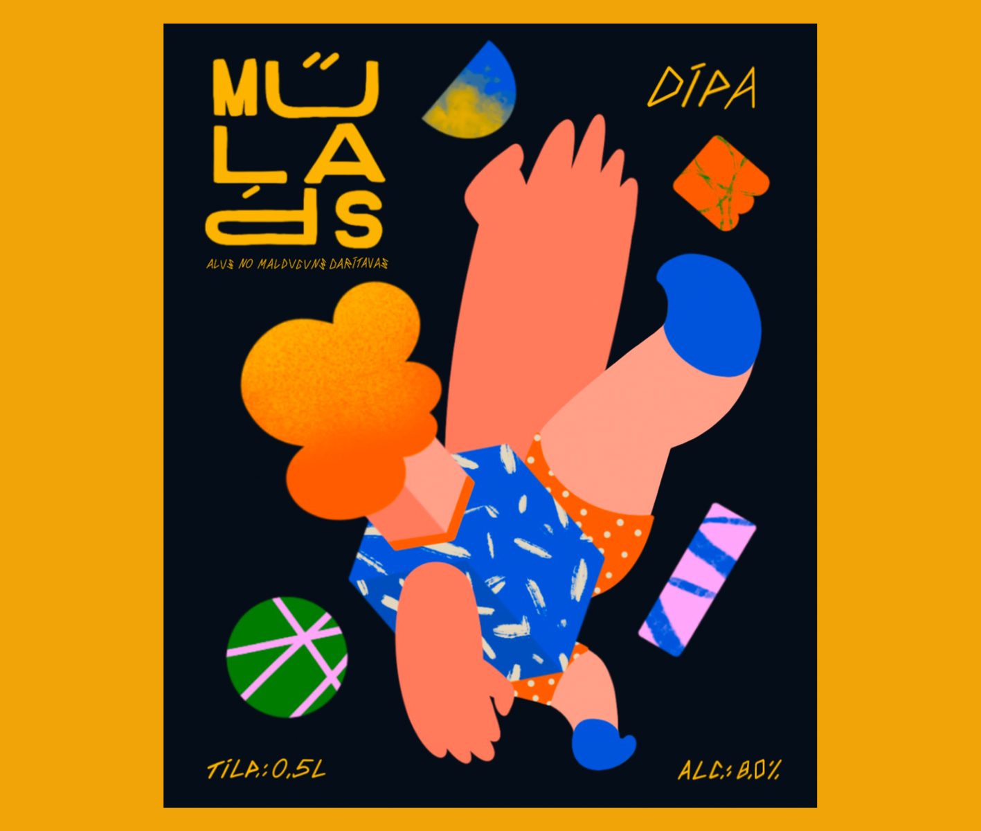
Ričards Znutiņš-Znutāns: Malduguns beer brewery
This beer label design for the Malduguns brand features the Latvian word for ‘clumsy’. The letter ‘P’ in the word ‘Mūļāps’ is placed upside down, alongside a falling character, reflecting the sense of an awkward clumsiness. This has been included in the ‘wordmark’ used throughout the packaging and promotional material.
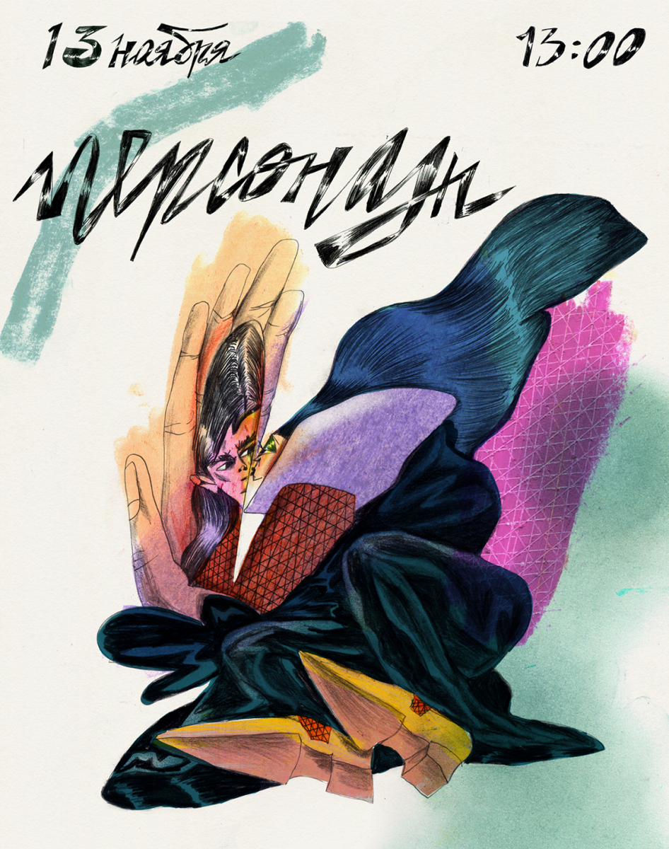
Lena Chetverik: Playful Poster Series
These posters show the themes of various lectures, using mixed media. The hand-lettering is an integral part of the images, using experimental, expressive forms to create eye-catching work.
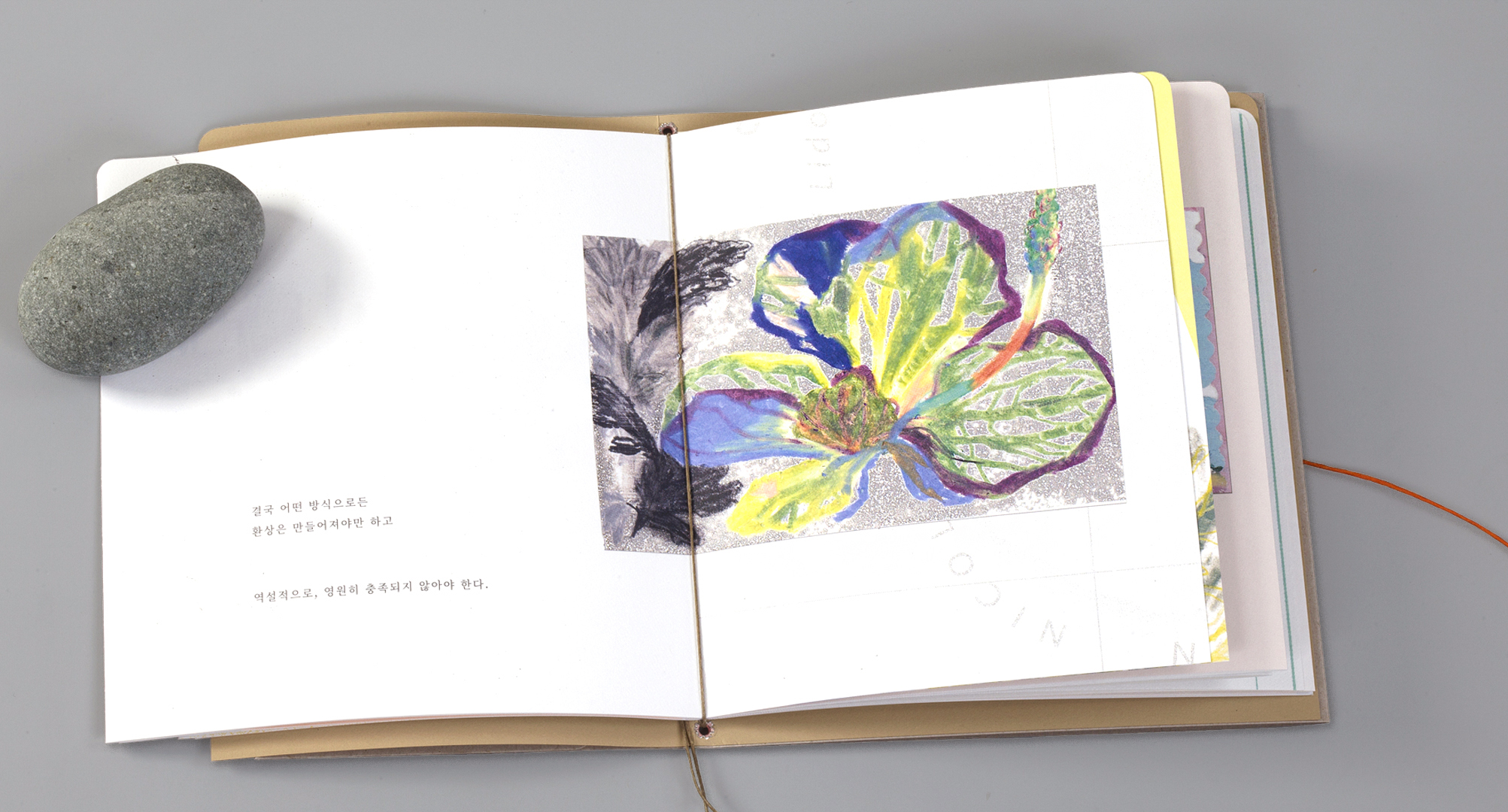
ggemgemi: Bon Voyage
ggemgemi’s book uses ephemera collected on their travels. The printed text, and hand drawn text are as integral to the story of the book as the images.
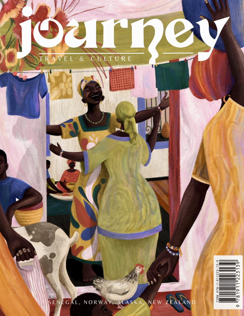
Abby Mundell: Teraanga – the word that defines Senegal
This magazine cover with hand-rendered type was a self-initiated project inspired by a BBC travel article. The piece is itself inspired by a word: ‘Teraanga’, meaning generosity, hospitality and warmth, which embodies the national character of Sengal.
