Brands & Campaigns
Projects from across the WIA2022 shortlist which use illustration for commissioned (and prospective) product design, branding, and advertising campaigns, often across multiple digital and printed platforms.
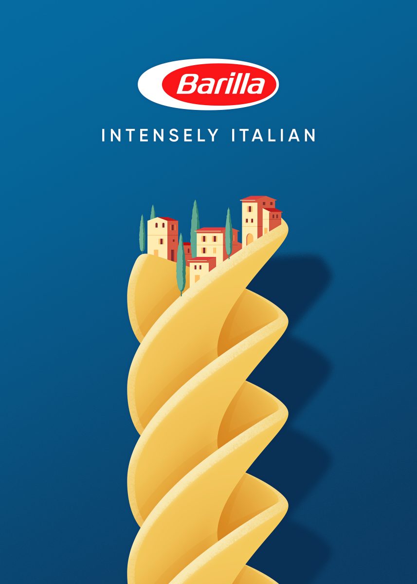
Joey Guidone: Intensely Italian Campaign
Jerry Guidone’s campaign for Italian brand Barilla features a range of conceptual illustrations that highlight the different pasta shapes in the product range, and a sense of the Italian ‘dolce vita’. The imagery is instantly recognisable, and is designed to be used in print magazines for advertising to the UK market.

Loe Lee : Coca-Cola + Coffee 2021 Campaign
This suite of illustrations was commissioned by Havas Group for a campaign of animated adverts for Coca-Cola’s Coke + Coffee campaign. The animations have a dreamy quality with a warm colour palette that give the rejuvenating feel.
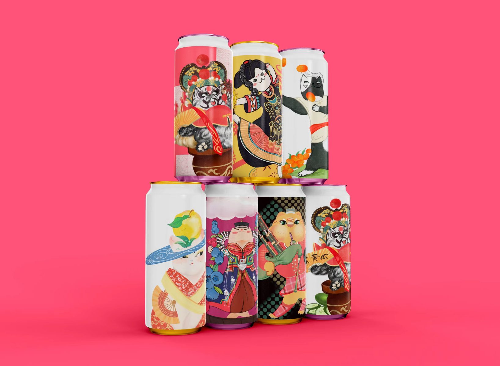
Panzhe: WANWEI Craft Beer Label Design
Panzhe’s set of craft beer labels feature a series of fun, anthropomorphised cat characters. These whimsical illustrations, alongside a carefully chosen, high contrast colour palette, give these beer labels a personality that will stand out on the shelf.
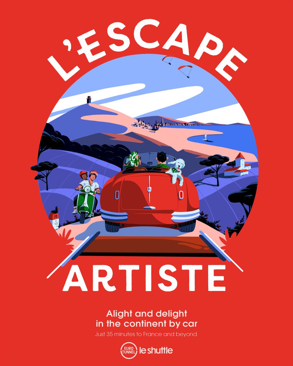
Paul Sirand: L’escape Artiste – Eurotunnel
This series of illustrations by Paul Sirand were commissioned by Eurotunnel for a campaign across posters, social media and press. Reflecting the colours of the UK and French flags [white, red, blue], the colour palette creates a coherence, making them immediately recognisable. The consistent composition featuring a circle within a square allows the various destinations reachable by the Eurotunnel to become the central focus of each image.
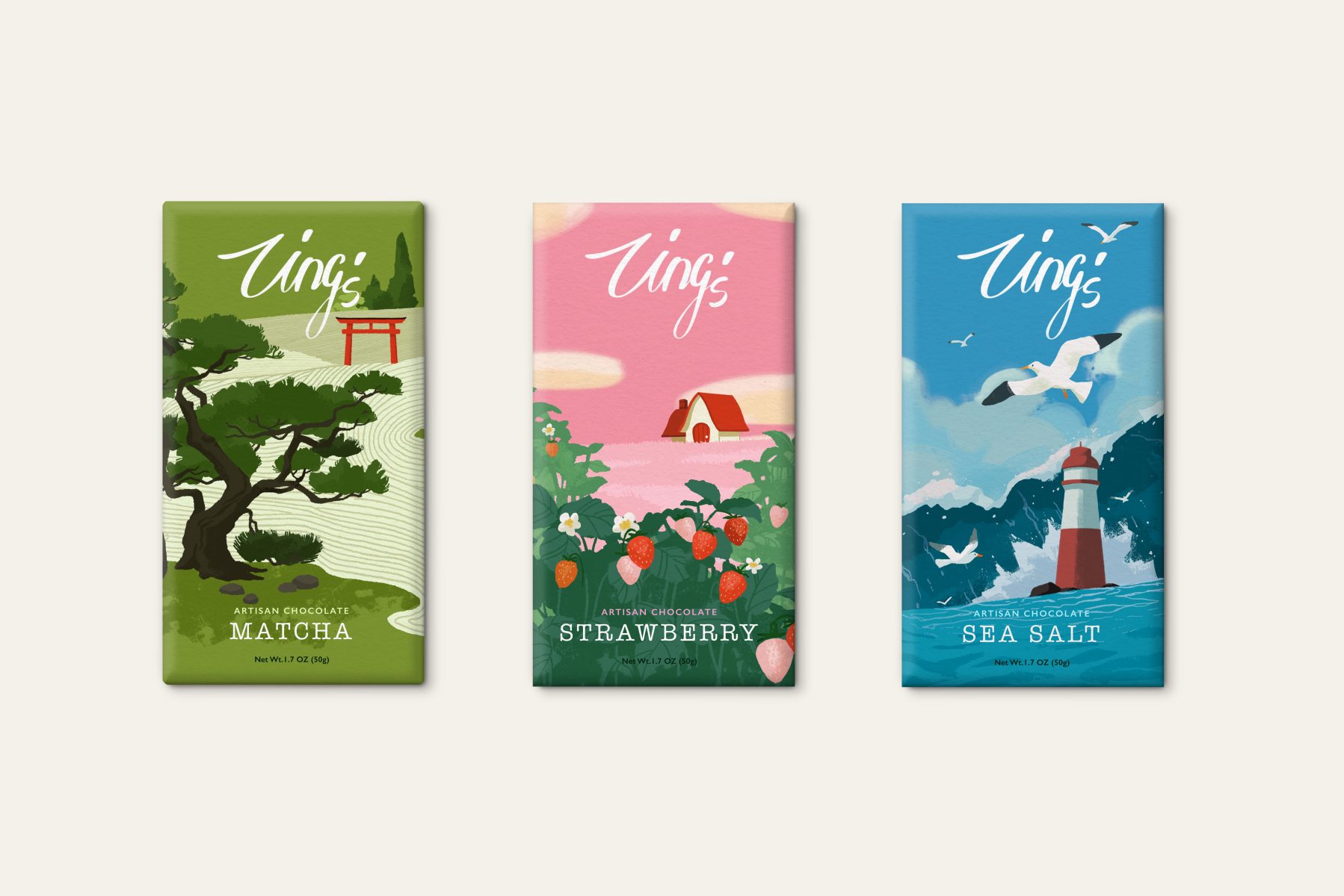
Zhiying Chen: Chocolate Package Design
This prospective project features illustrations for three different flavours of chocolate bar. The images have a consistent look, with pops of red, and each flavour represented by a depiction of a natural landscape.
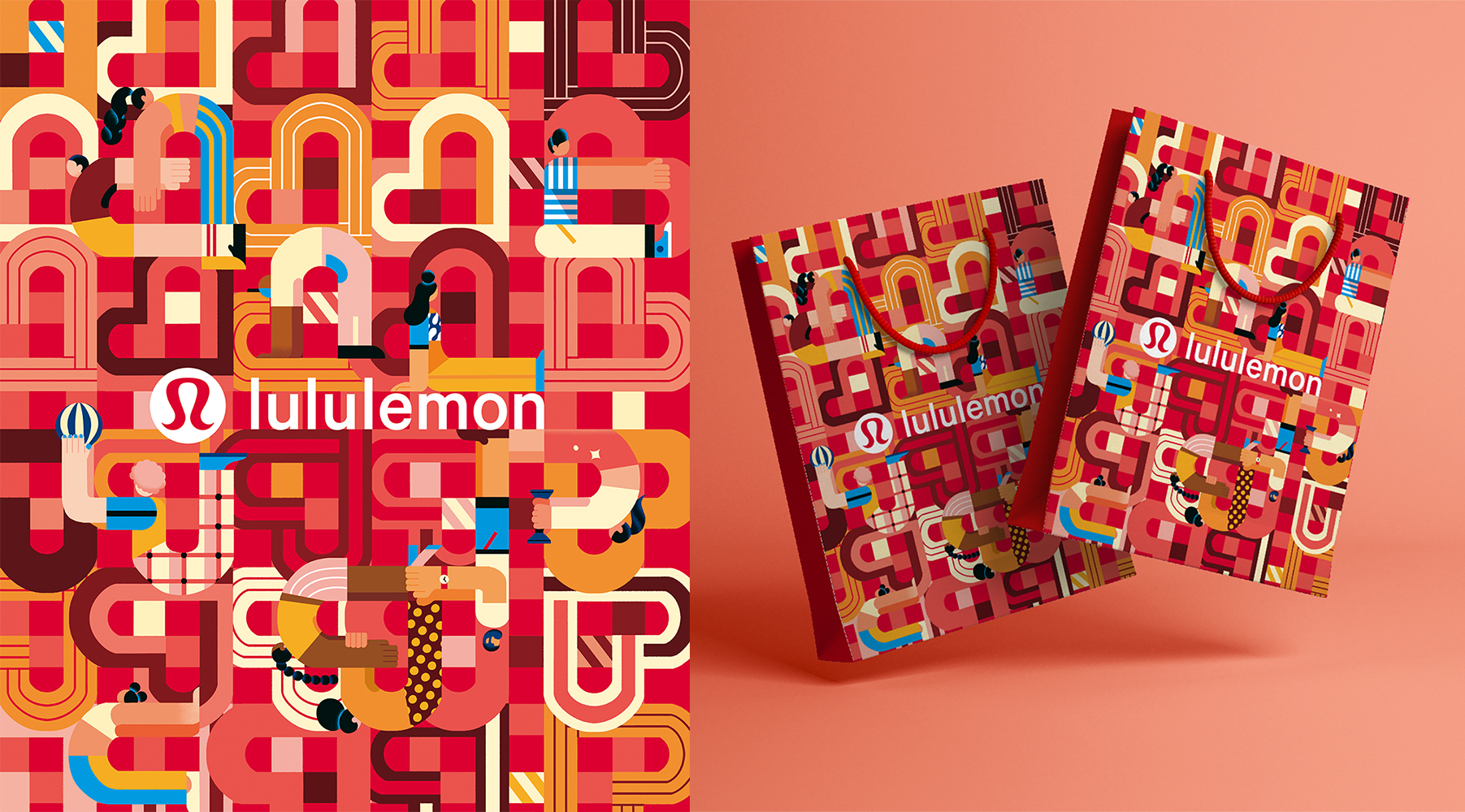
Yulong Lli: Lululemon 2022 Chinese New Year Edition
Yulong was commissioned by Lululemon to create branding for store decoration and shopping bags to celebrate Chinese New Year. The woven design alludes to a Knot symbol, a traditional Chinese way of sending a love message.
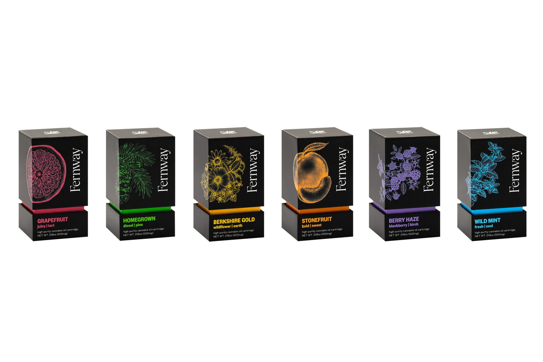
Lizzie Harper: Fernway Packaging Pen and Ink Illustrations for Range of Botanically Flavoured Products
Lizzie Harper was commissioned by Fernway to create a series of illustrations for their products. The illustrations were drawn using pen and ink before being digitised and recoloured to allow the illustration to stand out against the black background. Placement of the imagery on the corner of the boxes adds to the eye-catching design, giving it a unique feel.
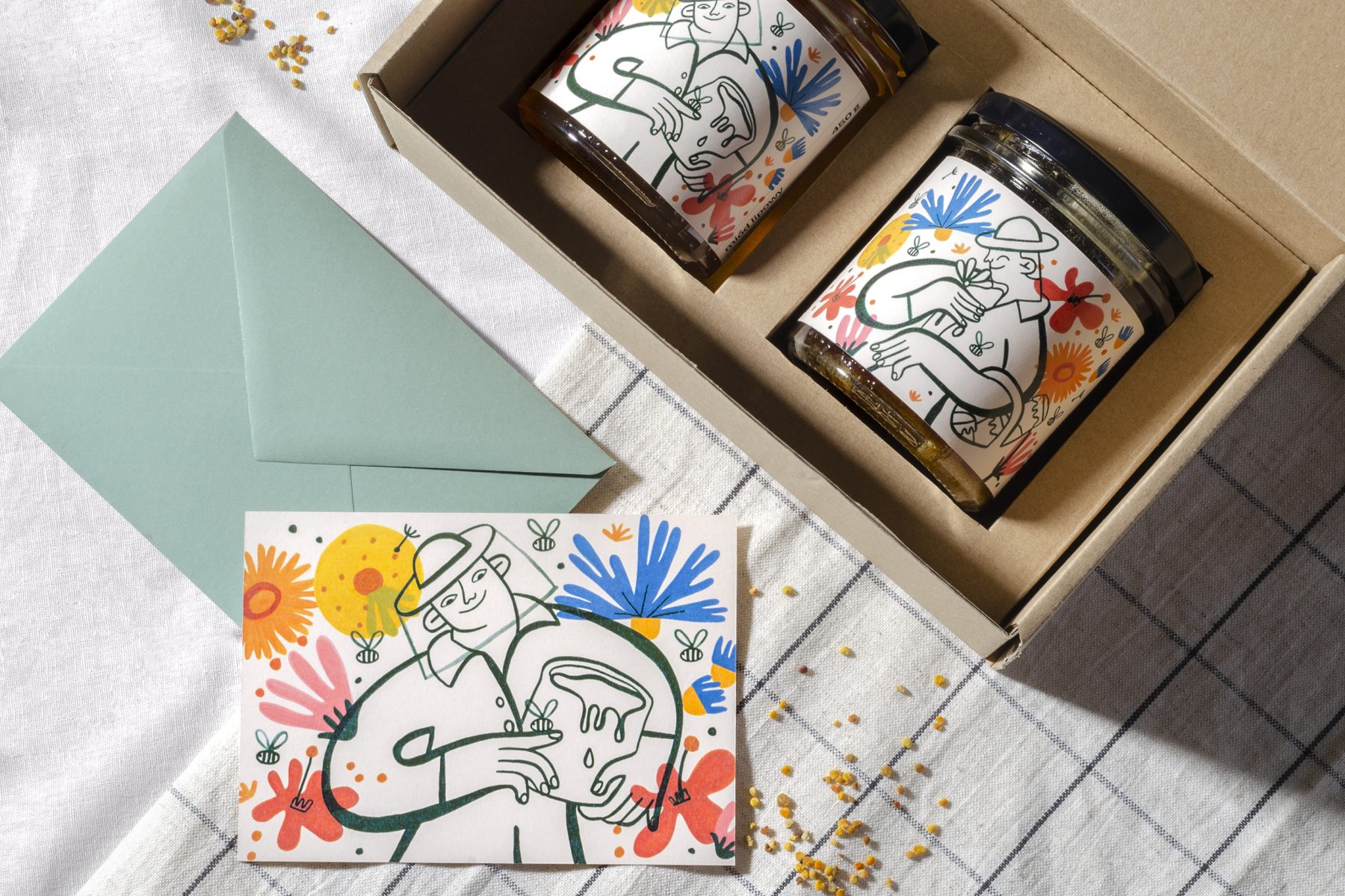
Aleksandra Badura: “Mr. Masuria” Natural Honey Packaging with Illustrations of Brand Hero
Alexandra’s design for Polish honey brand Pan Mazur highlights the honeys’ natural qualities. The line-drawn central character is surrounded by colourful, whimsical illustrations of the flora that gives the honey its flavour. The illustrations are designed to be used across the brand, as labels, postcards, and an animated GIF.
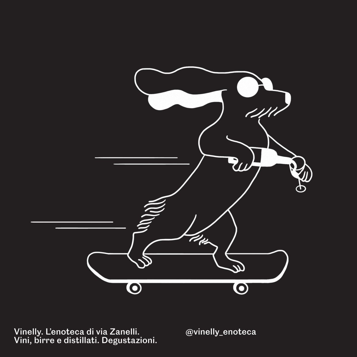
Maria La Duca: Paul Vinelly is the coolest buddy for Vinelly branding
Maria was commissioned to create a new brand for Vinelly, a pop wine shop. The illustrations had to have a contemporary feel to appeal to a younger consumer. She came up with a character, Paul Vinelly, a sociable, fun, charismatic cartoon dog who could become the mascot for the brand.
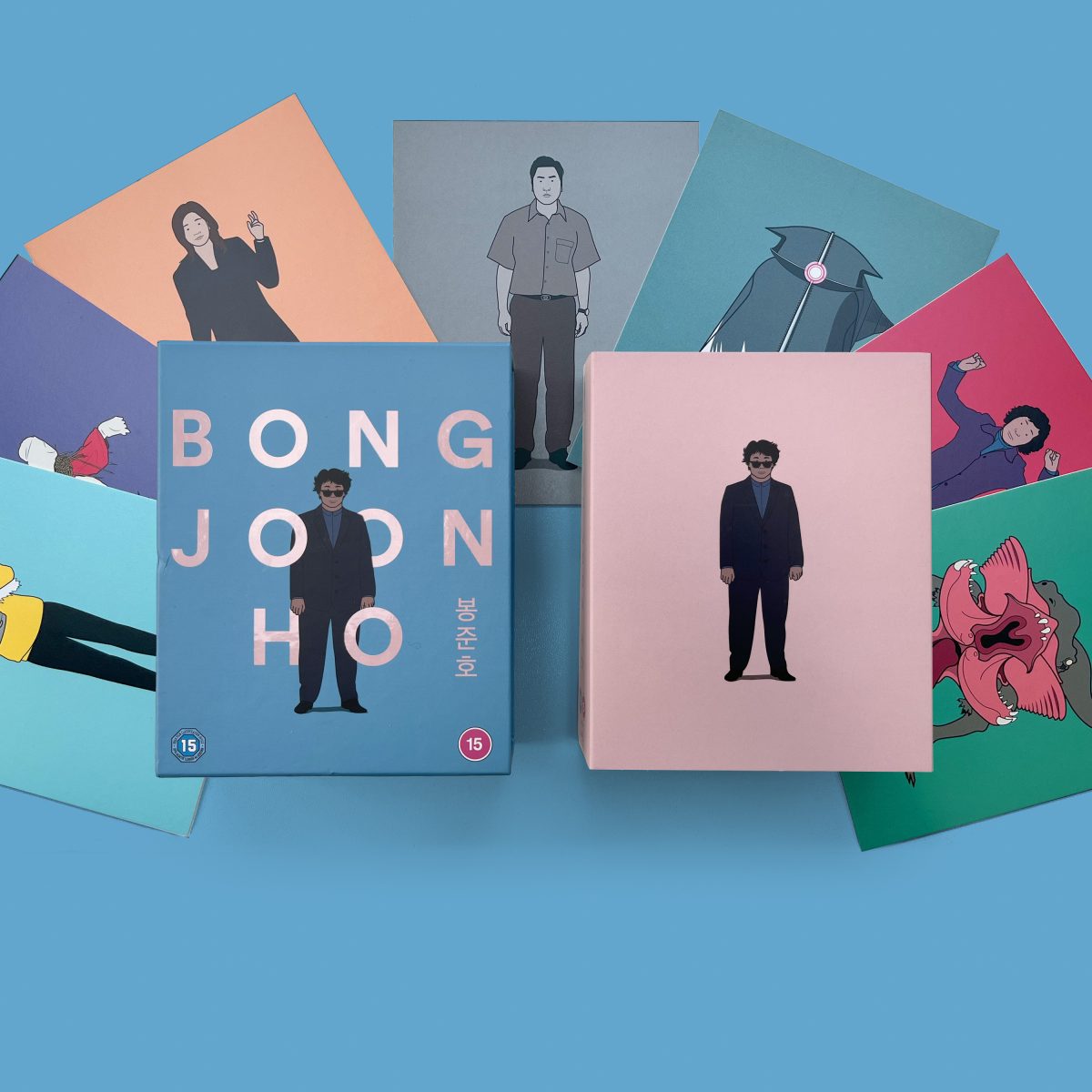
Andrew Bannister: The Bong Joon Ho Collection
Andrew was commissioned by Curzon to create artwork for a Blu-ray box set which would house a collection of 7 films by the South Korean director Bong Joon Ho. The characters and symbols are rendered in line with flat colour, creating an overarching aesthetic across the range.
