Dynamic storytelling and 'fact-checked' dreams
Exploring the use of motion illustration in the online editorial sphere, Derek Brazell talks to art directors and illustrators, discussing why motion is used, what commissioners are looking for, what brings illustrators to motion work and how they manage these types of commissions.
Stars twinkle across a night sky, flames leap off burning money, mature yoga practitioners let off a parp, atmospheric lights glow on and off forever. Just as with static illustration, animations created for editorial publications and platforms cover a vast range of subjects attracting the reader?s eye ? and with motion that eye may be even more engaged, entertained or informed.
There are endless ways to create a visual narrative, and while these are inventively captured in still illustration, the addition of moving elements can extend a narrative creating a desire to know where that visual moment is going. A vignette with a beginning, middle and end, even if the main elements of the image do not change substantially, engages our desire for a story that is only sated if we keep looking to see where that story is going.
Much artwork requires an element of technical skill, and motion work can become more technically challenging the more sophisticated the visual is. Currently an increasing number of illustrators are exploring the potential of motion in their work and those who may have just started out, alongside those who have been animating for some time, are producing gripping motion images which more than fulfil the requirements of online editorial platforms nowadays.

Why motion?
What are the benefits of animation for editorial clients? Clearly any image that moves is going to catch the eye of online readers, but animations can serve different purposes for different topics.
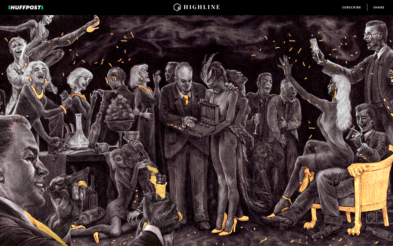
Usually the decision to commission a motion piece is determined by a combination of factors ranging from subject matter and type of audience to budget and team expertise. ?As key/title art, moving images are very successful at capturing attention in a busy digital landscape,? says freelance art director, Una Jani?ijevi?, ?Within a long-form storytelling setting (such as Huff Post?s Highline) moving images tend to reward the reader, and often function to highlight key concepts or reveal additional layers of information.?
Una?s use of images by Rebecca Yanovskaya moving in planes rather than being ?animated? demonstrates this very effectively for a story on white collar crime, with the images leading through sections of the article.

For Lesley Palmer, Art Director at The Ethel ? a platform created to give older women an empowering, expressive voice ? movement brings more emotion and relatability to the characters being illustrated. ?With a flat illustration you can convey one facial expression, but with motion you can tell a broader story. For me, slight motion can be as effective as notable motion, but it?s always more successful when it has a purpose.?
In the case of a practical ?how-to? story the use can be utilitarian; ?Think about how successful YouTube tutorials have become for the amateur, novice and sometimes professional individual searching to fix something themselves,? says Dian Holton, Senior Deputy Art Director at AARP Media, who oversees creative forTheGirlfriend.com, Sistersletter.com and The?Ethel, ?An animated step-by-step can show someone how to perform a

