The Guardian G2 AD Sarah Habershon
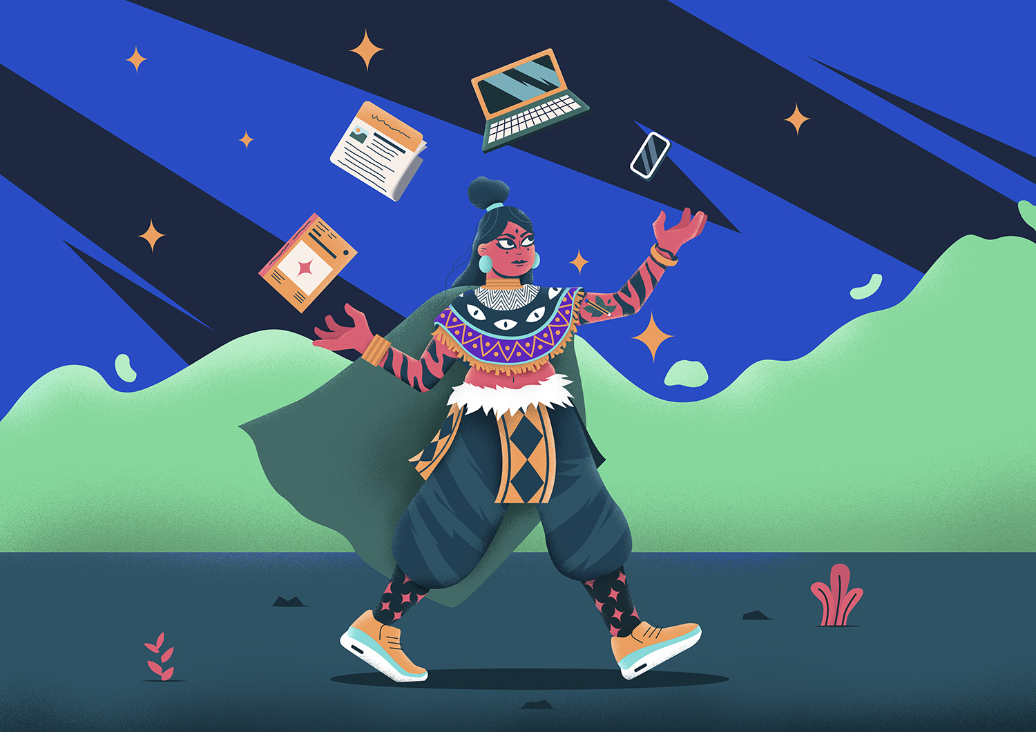
The Hopeful Side of the Story
Alix-Rose Cowie talks to one of the UK’s pre-eminent editorial commissioners, Sarah Habershon of The Guardian.
War, corruption and a global pandemic: news headlines can feel overwhelmingly negative, fraught with devastation and desperation. Up against some of these grim outlooks is G2, the 12-page, pull-out section in the centre of The Guardian newspaper that focuses on more uplifting features.
Sarah Habershon is the art director of G2, responsible for commissioning editorial illustration. “Our brief at the moment is to be the joyful part of the paper with features that entertain, encourage optimism, or provide helpful lifestyle information,” she says.
A successful illustration provokes an immediate reaction
Sarah
Talking to the Editor
Usually the first thing people see before delving into a story, editorial illustration — coupled with the headline — sets the tone for the piece that follows. Sarah works closely with the editor to establish what’s appropriate. “For the more serious features we have a thorough discussion about the approach to take for the tone of the illustration,” she says. A question she often has to ask is if it’s possible to find a hopeful element in a traumatic story. “When we run a piece about a serious issue I try to use illustration to highlight the positive, hopeful side of the story while respecting the seriousness of it,” she says, “the light in the darkness.”
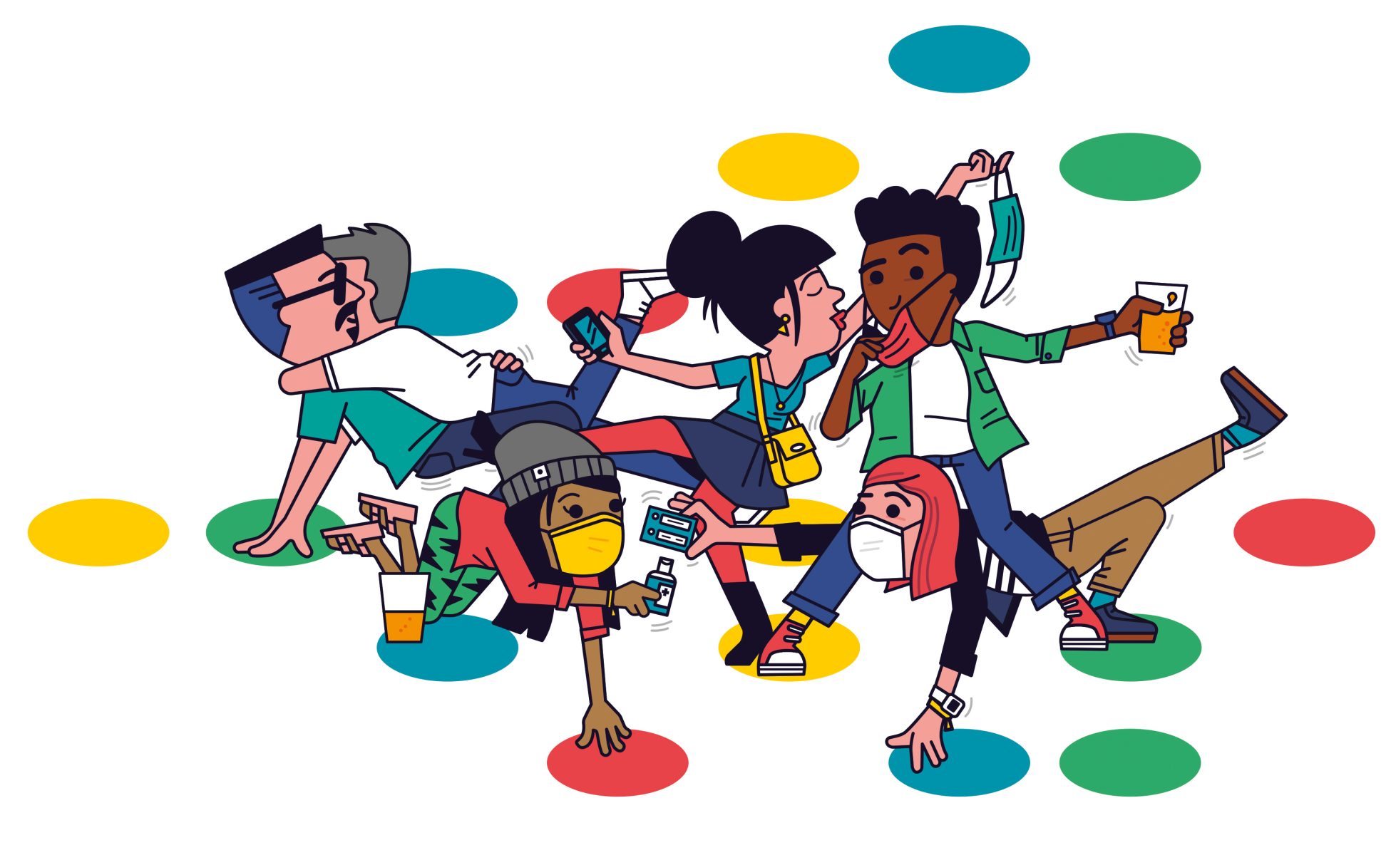
A sense of humour
In The Guardian’s case, illustration often lends a welcome sense of humour. “It’s a way of inviting the reader into the page,” Sarah explains. In keeping with the editorial identity and different subject matter of each segment, the type of illustration used can indicate which section of the newspaper the story appears in but there’s a playfulness in the illustrations that’s common throughout.
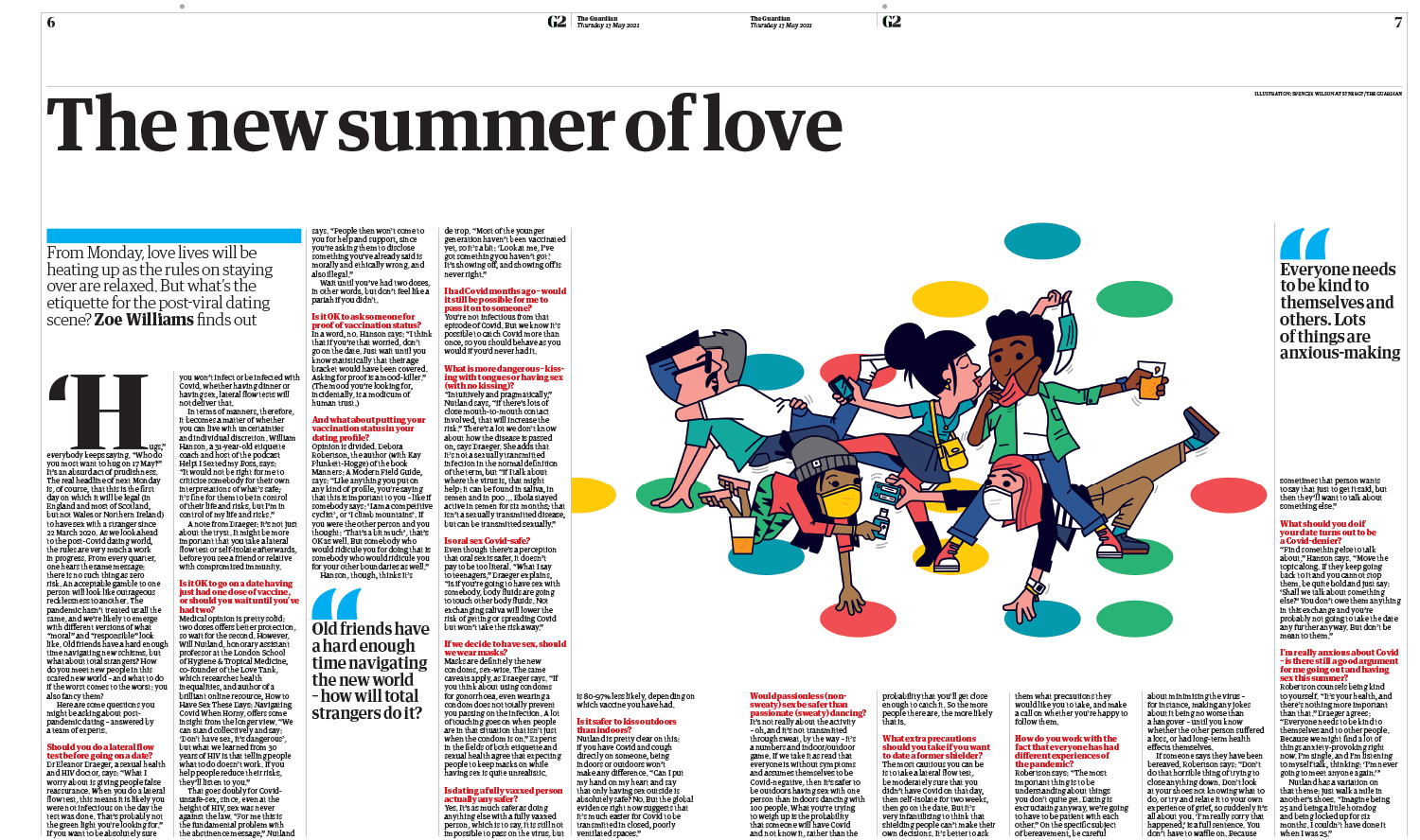
Choosing the right illustrator for the job is a crucial part of Sarah’s role. “The Guardian covers the arts extensively and our readership expects to see strong visuals.” Everything she commissions has to be of a high standard, but perhaps more important than an illustrator’s visual style is their original perspective shaped by their unique experience in the world. While Sarah presents a few artists to the editor who she thinks would be good for the brief, it comes down to who will grasp the nuance of the subject at hand. “I may know that they have an interest in the subject,” she says. “I need an artist who will really understand the copy and get to the heart of the story. They need the ability to interpret a story in an unexpected yet very relatable way.”
Working for print and digital
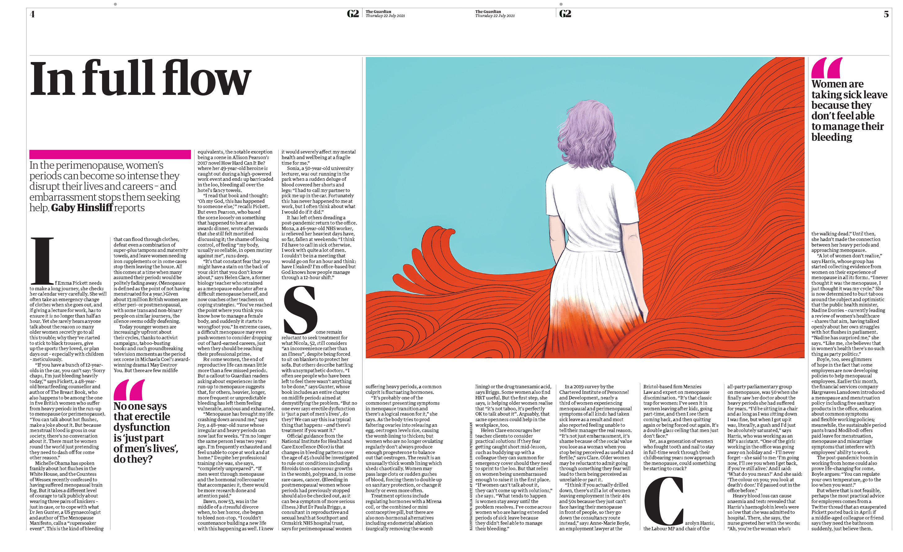
As a conduit of current affairs, an editorial image needs to possess clarity. A successful illustration provokes an immediate reaction. “I don’t think it’s worked if the reader struggles to see what’s going on,” Sarah explains. “You know that lovely feeling when you see something and think: ‘Wow! That’s clever! I get that!’? That’s what we always hope for.”
Sarah still works primarily in print and loves the luxury of lingering on a page. In contrast, a digital image needs to be more immediate to match the rate at which people scroll. While there are different considerations for online vs print, an image often has to work for both. “It’s an ongoing project to make illustrations work both online and in print,” Sarah says. “At the moment I use the illustrations I’ve commissioned for print, in a landscape format at the top of the piece online. You need resources of time and budget to use illustrations in an original way online, and we are liaising more and more with our digital designers. So that’s exciting.”
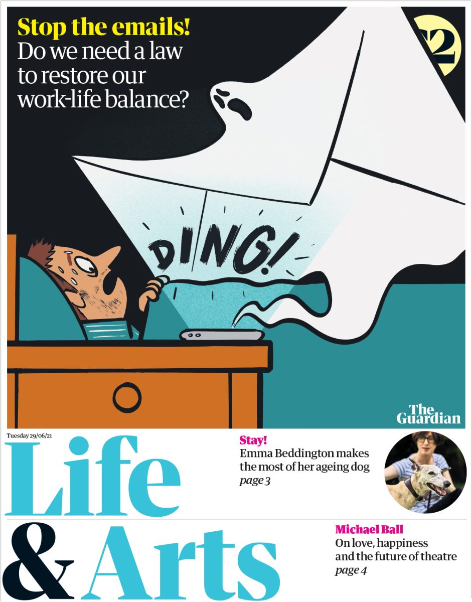
Regardless of where it’s viewed, an editorial illustration is most effective when it conveys a concept that can’t be achieved in the same way through writing or photography. An interview with a specific person might be enhanced by a portrait photograph of them while an illustration has the ability to communicate an idea. “Illustration is perfect for features about a type of behaviour, health, a social issue, psychology, technology, environment, finance etc,” Sarah says. “Illustration can really bring these pieces alive.”
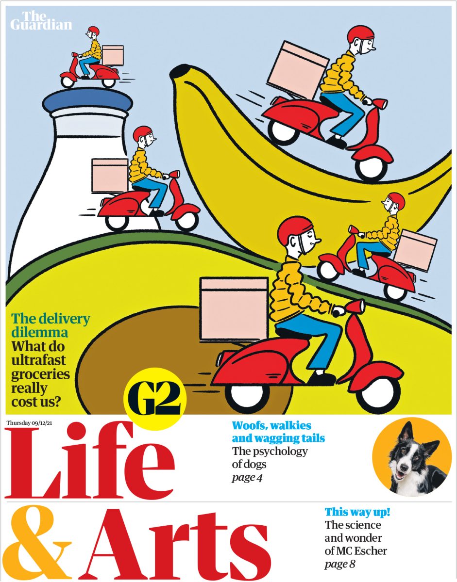
Having ideas
For illustrators hoping to get into editorial illustration, Sarah suggests being visible on Instagram (including a website URL in your bio), and emailing her a portfolio link. Her shopping list for a good illustrator starts with imagination. “I expect them to be confident about providing ideas,” she says. “I often have a starting point idea for an image (and that helps me choose an appropriate illustrator) but I love to be presented with an improvement on my suggestion in the roughs. I don’t always have a good idea and it’s fun to throw that open to someone I know has plenty of them.”
Ultimately, the illustrators Sarah enjoys working with spend time thinking about what they’re communicating to the reader. “At its best an illustration can show the reader something they didn’t think of before.”
Images courtesy of The Guardian
Read More
Site Specific Illustration interview with mural expert Sam Roberts here
Illustration for Children Season interview with illustrator Alex T Smith here
Branding Season interview with Uncommon Studio’s Jhy Turley here
