True to a vision
As part of the Branding Season of Inside Illustration, Jhy Turley, Head of Studio at Uncommon Creative Studio – Campaign’s UK Creative Agency of the year and UK Independent Agency – talks to Derek Brazell on commissioning illustration that is right for the brand and the story they’re telling.

What can illustration bring to branding for a product or company that makes it unique? Is there extra pressure on the visuals to deliver where branding is concerned (especially in branding for an identity)?
This is a very important question and one that needs to be thought about and considered during the development of any branding project. As with every part of the design system, logo, font choice, typographic application, colour and art direction. The illustration needs to have a role and purpose as part of that system. All decisions on these elements need to collectively support the communication of why the brand exists and what they value.
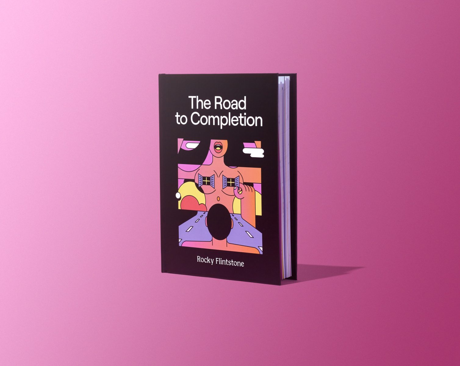
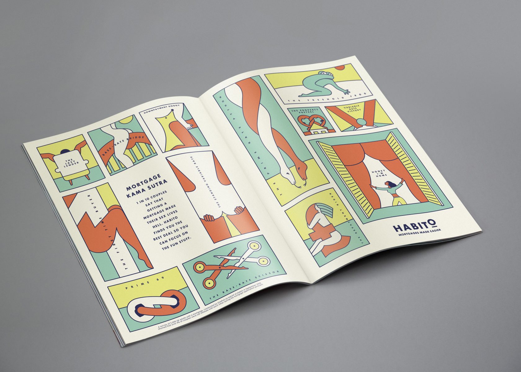
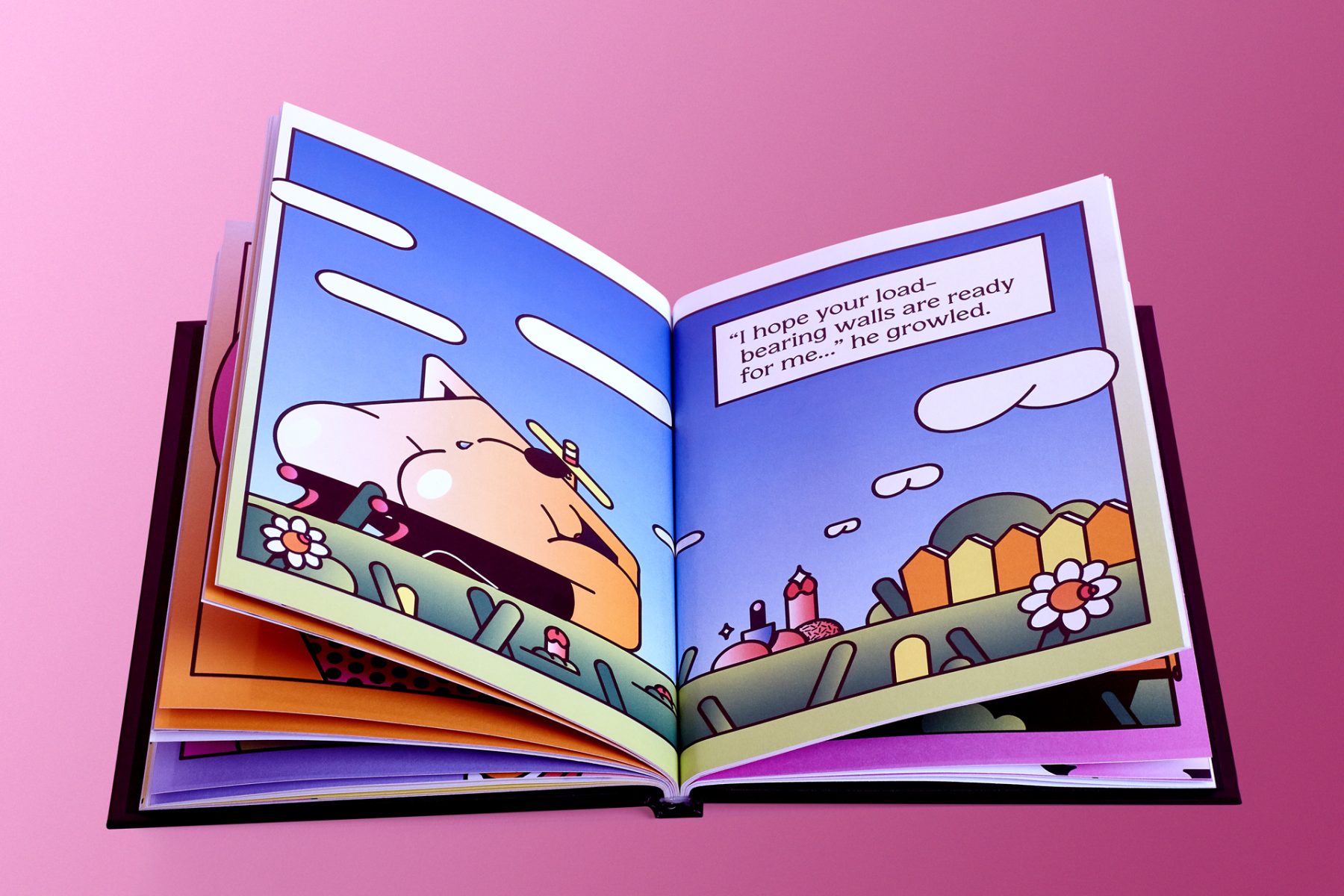
When we were developing the new brand identity for Habito, we started with the brand truth, if getting a mortgage is hell, then Habito should be heaven. From there we explored what should heaven look like in the world of Habito. We already had a strong illustrative art direction used across the brand and product work we had done for them, so illustration already felt like a natural area to explore.
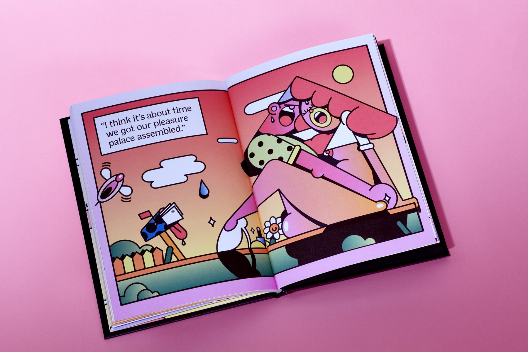
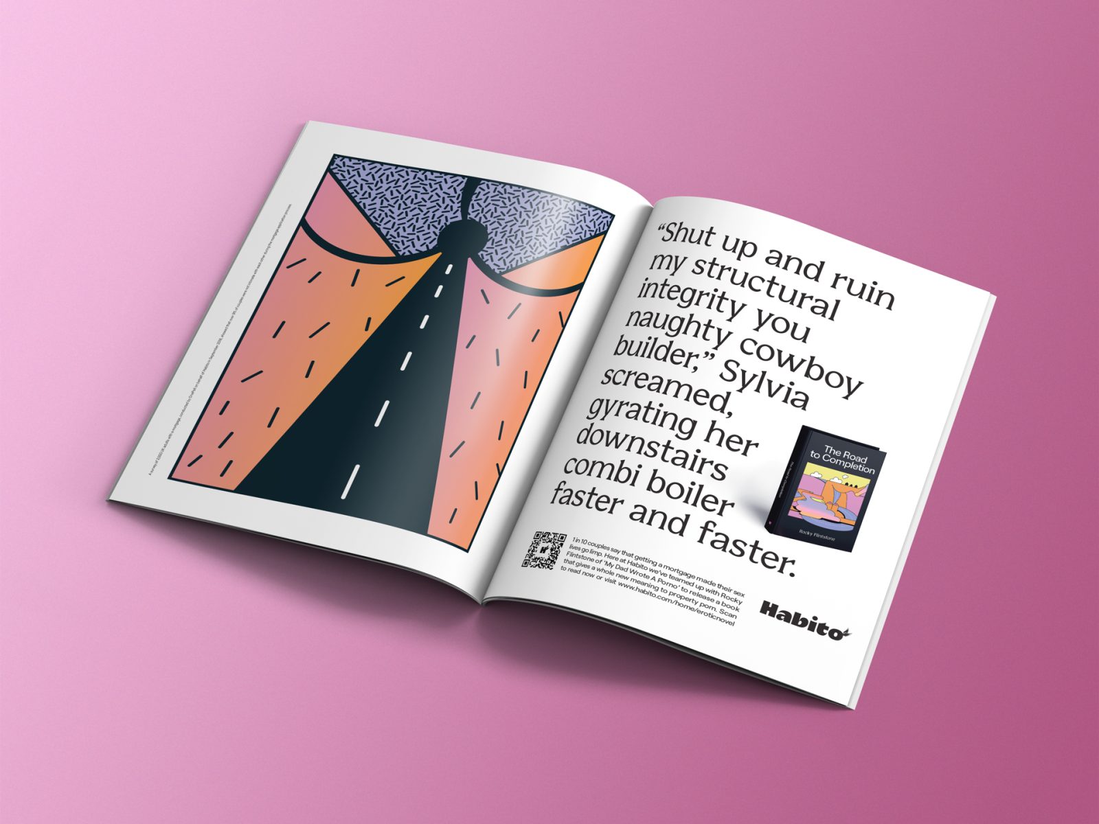
There were various articulations Habito’s Heaven during our exploration, and then when we discovered the work of New York based illustrator Saiman Chow, we knew his aesthetic and surreal visual storytelling would be an amazing fit for the brand, and become a cornerstone for the art direction of the brand moving forward.
What can the process be like when selecting an illustrator for this area of illustration – for example, do you look at a range of illustration styles, problem-solving skills, and design sensibility or would you have an artist in mind straight away?
At Uncommon, our projects always start from a strong strategic position and articulation of the brand truth. We will explore different ways to create brand worlds and how to bring brand truths to life. Our design and creative teams will collectively develop these closely with the strategy team. It is important for us that illustration does more than just convey individual pieces of information or messages. Brand worlds that take on an illustrative approach, must use illustration in a way that is integral to the visual tapestry that makes up the personality of a brand.
During development, we will find a bunch of illustrators that have a similar aesthetic, or land on a singular one as we did with Saiman. There really isn’t a formula to figuring this out. Early in the brand design process, we will have developed a story for the brand, and the illustration needs to resonate with it.
And where do you go to source the right illustrator – websites, social, agents, recommendations?
The simple answer is everywhere. Our design and creative teams are always looking for new and interesting inspiration. The more curious we are, and the wider we cast our net, the more diverse our choices become.
‘The illustration needs to have a role and purpose as part of the design system’
Jhy Turley
Are there essentials that an illustrator would need to show on their website to attract you? Would an illustrator need examples on their website of work directed towards branding, or can you see something in an artist’s work that may be less immediately obvious (e.g. if they mainly do editorial or publishing)?
A distinct iconic style and approach are vital. Illustrators that go beyond the literal, and bring something a little special to their work, like Noma Bar‘s minimalist yet bold interplay of negative space that creates iconic storytelling illustration, or Nick Dwyer’s intense sketchy illustrations of skulls and skeletons. We are always looking for a fresh approach, or an unusual point of view on the world.
What do you feel is the best way for illustrators to seek out work in branding – in terms of finding the right companies/art directors?
I think the work seeks out the illustrator. When we are working on a new identity for a brand, we are ultimately articulating who they are. We’re looking for a style that is true to that vision.
Tanya Holbrook – Uncommon Design Director: More and more we look to social feeds and self-published work rather than discovering talent through agent’s books. Especially as we often want to use artists who we haven’t necessarily seen before through other brands. Our colleagues in the production and art dept are a huge part of the process when we are looking for partners to help bring our ideas to life, so it’s always good to get your work in front of them as their black books are incredibly valuable to the creative department.
‘We would always commission an illustrator for their personal artistic style, but we’d have a clear brief for what is needed’
Jhy Turley
What are the challenges for an illustrator in this area (for example, approval process with end clients, less flexibility sometimes etc)?
When developing a branding system, the aim is to create a look and feel that has longevity. This can result in deeper scrutiny of all the elements. We would always commission an illustrator for their personal artistic style, but we’d have a clear brief for what is needed. We work closely with the clients because they will always have strong opinions on the work. Timings and the number of assets needed can often be very different to a campaign project.
Does the end client always get to approve the illustrator (and their final artwork)?
At Uncommon our ambition is to make work that is fresh and iconic, but more than that it needs to find a tension in culture or in the brand. To do this we need to work with clients who share that ambition. We bring them along for the journey, so they are on board with the vision from the outset.
Mack Leary – Business Director Uncommon: The Habito project was a really collaborative process – we blurred the lines between client/agency, utilising their UX team (who know their product inside and out) in order to get to the best result. It never felt like a series of approval processes, but instead, was a more fluid journey – allowing us to stress-test our creative ambition and make sure we were providing a series of illustrations that had longevity for the brand.
Have advancing technologies influenced the styles of illustration you select? You must require images to work in a variety of ways, including for motion.
The style of the work always comes first. We’ll work with the illustrator on any technical needs. If we needed animated assets, we’ll work with someone that incorporates that into their work. The main technical issue that arises is the ability to re-format to different size ratios, for example, Jimbo Phillips artwork is incredibly complex, so adapting to different sizes is time-consuming. Another more common issue is creating moving assets that work well on websites, illustration style (vector vs pixel-based) and animation approach are all factors to consider.
There will be trends and shifts in work selected for branding – would you always look for a style that appears ‘timeless’?
Ultimately, we’ll make work that is right for the brand and the story they are telling. For example, I don’t think the Saiman Chow illustrations are timeless, but they are fresh, iconic, and break category norms. They completely disrupt the mortgage category and represent Habito.
Images courtesy of Uncommon and Habito
Read More
Publishing: Book Covers interview with Xia Gordon here
Site Specific Illustration interview with mural expert Sam Roberts here
Illustration for Children Season interview with illustrator Alex T Smith here
Editorial Season interview with AD Sarah Habershon of The Guardian here
