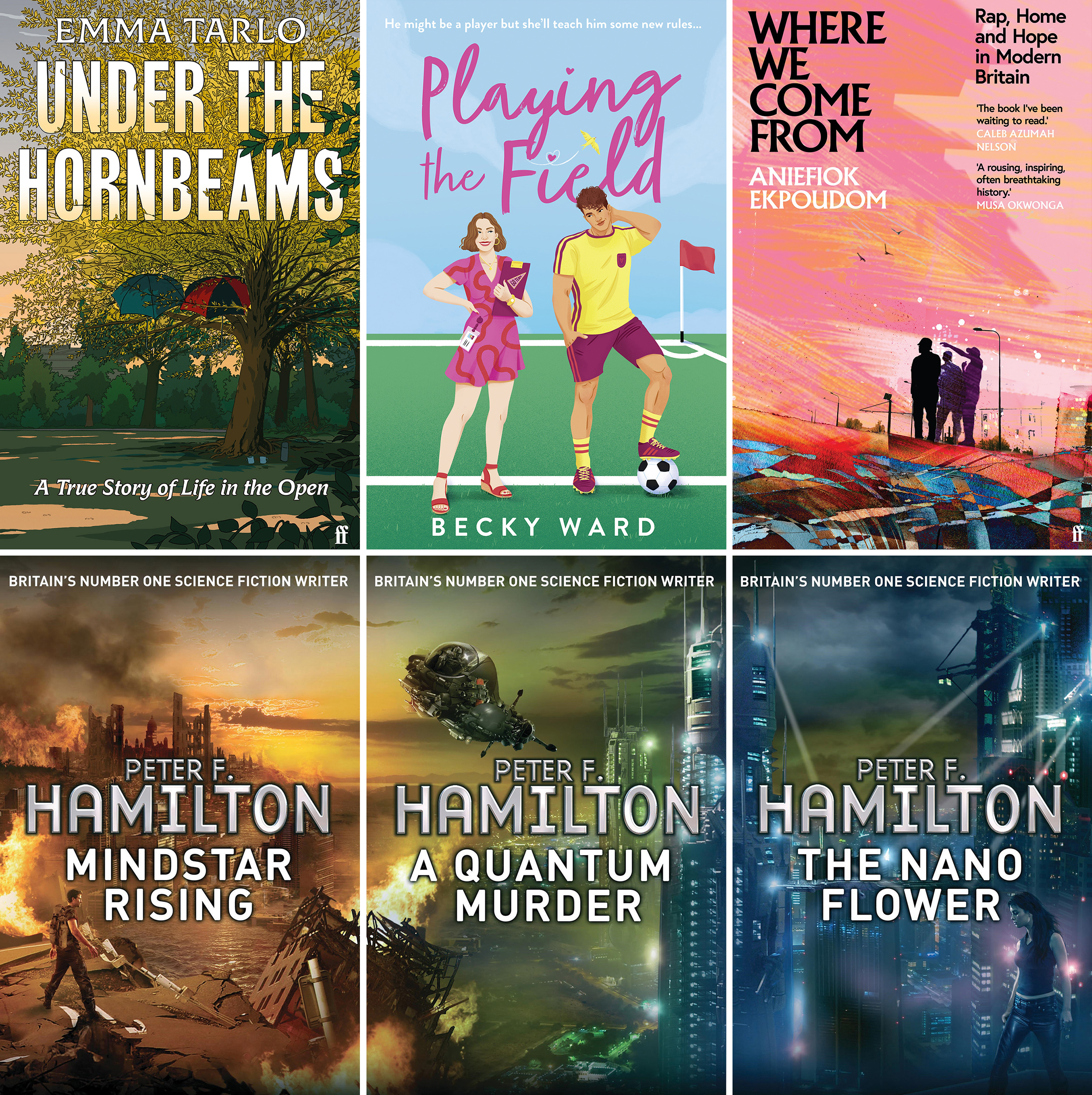
Depicting the story
Publishing art directors are on the front line of ensuring the books they design are eye catching and the right fit for readers across a whole range of publishing genres. Alix-Rose Cowie talks to three major book designers on how covers are put together, who has a say in them, the all-important brief and how they find illustrators to commission.
Book cover illustration is some hard-working art. For something we spend hours with - feeling for the last dog-eared page for a few chapters before bed, becoming so engrossed on a Saturday afternoon that the house slowly goes dark around you save for the glow from your Kindle, or finding company in the conversations of fictional characters on a daily commute - a book?s cover has only a fraction of time to call to us from the shelves (or thumbnails) of a shop. And it has a lot to say. Guided by art directors, illustrators working for publishers need to be able to create art that summarises a story into an image, fits into a genre while standing apart, represents a writer, and leaves clues for readers.

By the time a book is released, many people with different concerns will have weighed in on the cover: from the design team to the marketing department to the author. For Art Director at Faber, Peter Adlington, the story has to be the priority. ?It?s important to be true to the book,? he says. ?The book?s character needs to come through; it?s all about the personality.?
When does illustration fit the brief?
The very nature of Sci-fi and Fantasy lends itself to illustration, as an author is conjuring an entire world that doesn?t yet exist, imagining what it looks like as much as how i

