SEASONOFVICTORY aka Linda Baritski
I’m Linda Baritski, also known as SEASONOFVICTORY. I’m an illustrator and artist based in London, with a background in the US and Japan.
My work combines bold illustrations, vibrant colors, and psychedelic patterns to create a playful and optimistic style. I bring this distinctive approach to a variety of projects, including branding, public art, site-specific installations, and limited edition packaging. My dynamic style has attracted a diverse array of clients, from global brands to independent startups.
I’ve had the pleasure of collaborating with clients such as VitaCoco, LG Electronics, Kiehl’s, Harrods, Outernet London, Marks and Spencer, Transport for London, OLAY, Spyder, Adidas, Heineken, Beefeater, Google, Lush, The Washington Post, Universal, Monocle, LEGO, and The Guardian.
Before focusing on illustration, I worked as an Art Director at Warner Bros. and spent time at various digital and branding agencies in London.
I’m represented globally for illustration projects by IllustrationX [email protected]
Links
Contact
By email
 SEASONOFVICTORY aka Linda BaritskiKIEHL’S LOVES X Linda Baritski SEASONOFVICTORY 2022 global campaign
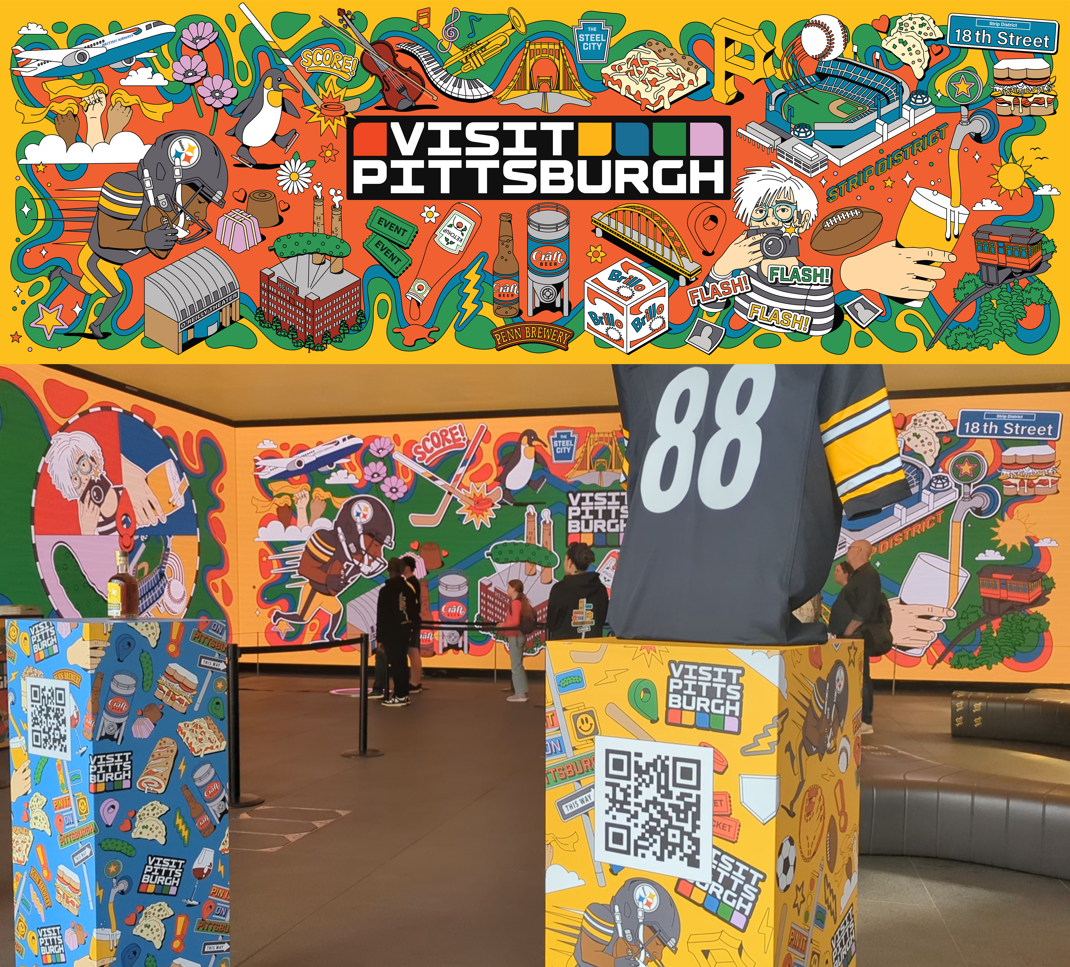 SEASONOFVICTORY aka Linda BaritskiPittsburgh city illustration for The Outernet LondonOUTERNET X
VISIT PITTSBURGH - Site-specific Installation illustrations. I was commissioned by the team at Outernet Global to create a series of illustrations for an immersive experience celebrating the city of Pittsburgh, Pennsylvania. The installation, developed in collaboration with Visit Pittsburgh, was part of a takeover at Outernet London, located at Tottenham Court Road — a cutting-edge venue featuring floor-to-ceiling wraparound digital screens. The concept, titled “Pin It on Pittsburgh”, explored the city’s rich history and vibrant present — from its industrial steel roots to its modern-day identity as a hub for arts, culture, gastronomy, sports, and community events (including the beloved Picklesburgh pickle festival!).
Concept Development & Sketching: I began with exploratory sketches to define visual themes that represented both the legacy and the evolving culture of the city.
Illustration & Vector Artwork: I created detailed vector illustrations for several large-scale digital walls, capturing key aspects of Pittsburgh’s identity — from icons like Andy Warhol and Heinz to the city’s sports teams and also the craft brewery scene.
Animation Assets: One of the walls (the South Wall) was developed as a layered illustration, later animated by the talented motion team at Outernet using my supplied animation elements.
Interactive Design: For the East Wall, visitors could trigger a spinning wheel animation via a sensor pad to discover facts about Pittsburgh — and receive themed souvenirs and merch.
Pattern Design: I also developed four custom illustrated patterns, each representing one of the themed pillars: Sports, Arts & Culture, Food & Gastronomy, and Events.
Artwork was also used for the event hoodies and promotional materials.
This was a fantastic opportunity to create site-specific, immersive illustrations that blend storytelling, history, and interactivity — and to celebrate a city from a state that means a great deal to me personally. View Folio
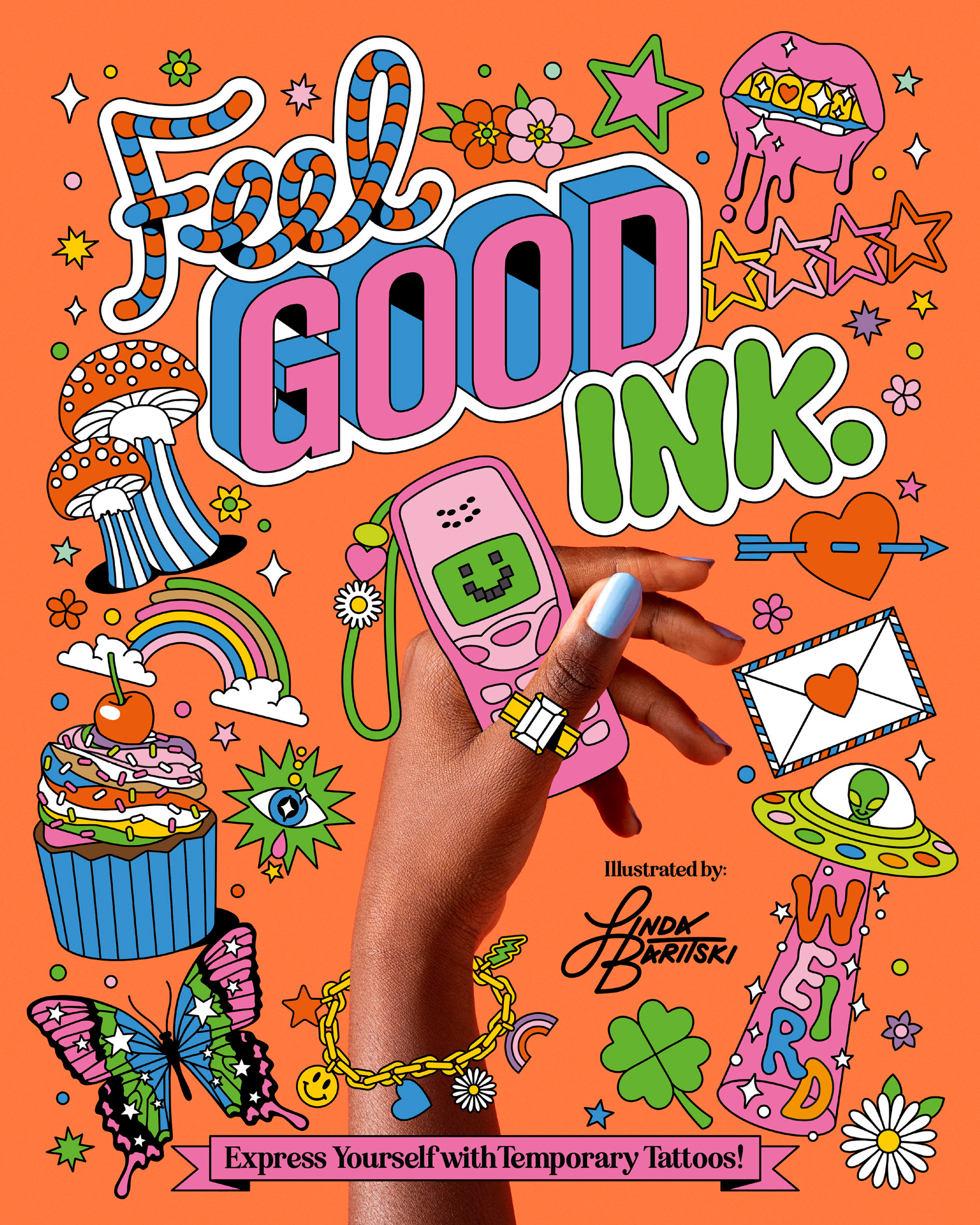 SEASONOFVICTORY aka Linda BaritskiFEEL GOOD INK TEMPORARY TATTOO BOOK ILLUSTRATION COVER DESIGNI was commissioned by Smith Street Books, an independent publishing company based in Melbourne, Australia, to design the cover and create a collection of illustrated temporary tattoos for their book, "Feel Good Ink".
For this project, I designed a vibrant and playful collection of over 70 temporary tattoos, suitable for all ages. The tattoos are quirky and colorful, with themes ranging from Love, Travel, and Esoterica to Color, Nature, and Food. View Folio
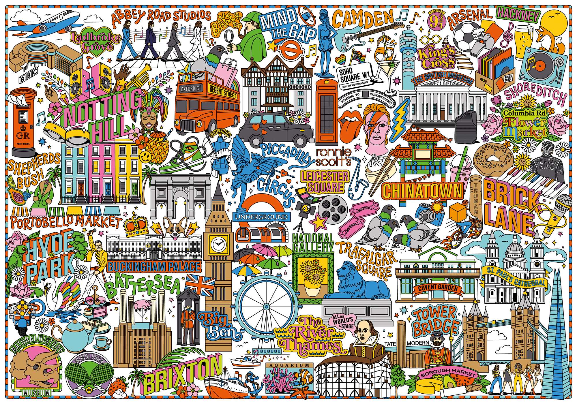 SEASONOFVICTORY aka Linda BaritskiLondon city map illustration View Folio
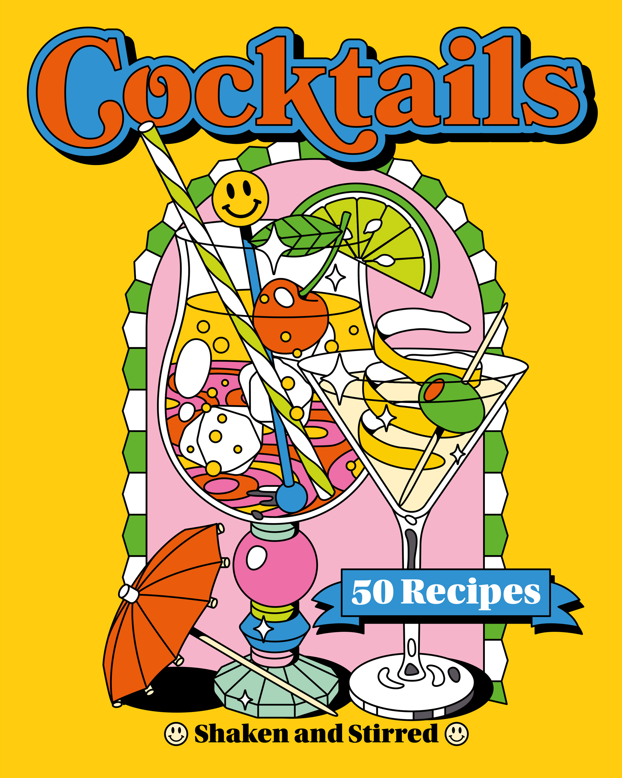 SEASONOFVICTORY aka Linda BaritskiBook cover illustration – Cocktails, DrinksA collection of illustrated cover designs for a series of recipe books for Nextquisite Publishers. Cocktails, Ice Cream, Burgers and Pizza – part of a continuing series of colorful recipe books. I created the illustrations, designed the covers, and created a fun, patterned end-page design for each. View Folio
 SEASONOFVICTORY aka Linda BaritskiSummer Travel stickersA collection of illustrated summer-themed stickers I created – inspired by vintage beach signs, beach holidays, palm trees, ocean life and tropical island vacations.
Examples show the flexibility: packaging, installation hoarding, pop-up truck graphics, box design, shopping bag, etc.
I can be hired to create a branded collection to be added to photos for a campaign, used for poster designs, packaging design, animated for Giphy stickers and digital assets for social media.
View Folio
 SEASONOFVICTORY aka Linda BaritskiUBER TEEN SUMMER ILLUSTRATIONSKey Visuals for Uber Teen Accounts Summer Campaign
I had the opportunity to collaborate with Special Group (Los Angeles) on a vibrant summer campaign for Uber Teen Accounts.
For this project, I created two key illustrations: one capturing a lively collage of summer activities and another blending food elements with iconic summer visuals.
The illustrations were featured across email marketing and paid social media campaigns on TikTok and Instagram, promoting Uber Teen accounts. View Folio
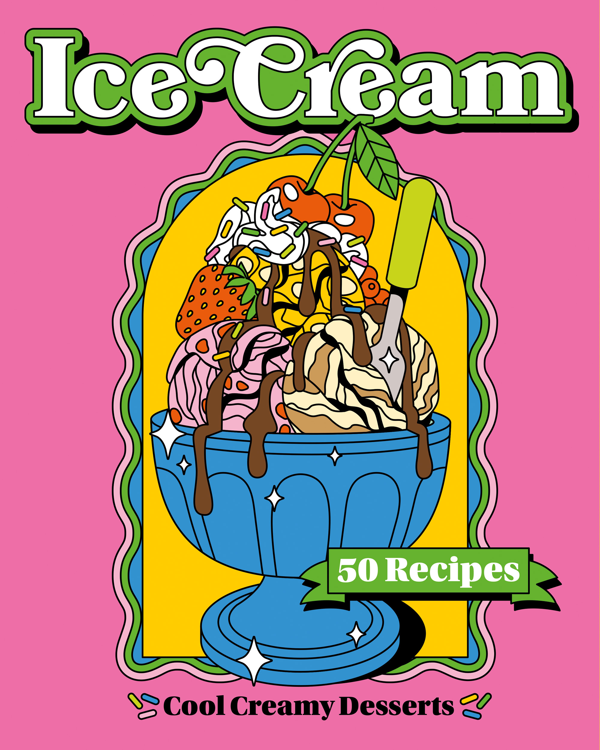 SEASONOFVICTORY aka Linda BaritskiBook cover illustration – Ice CreamA collection of illustrated cover designs for a series of recipe books for Nextquisite Publishers. Cocktails, Ice Cream, Burgers and Pizza – part of a continuing series of colorful recipe books. I created the illustrations, designed the covers, and created a fun, patterned end-page design for each. View Folio
 SEASONOFVICTORY aka Linda Baritskilunar new year chinese dragon – 2023 zodiac2024 Lunar/Chinese New Year Dragon illustration – mixing traditional and modern imagery. View Folio
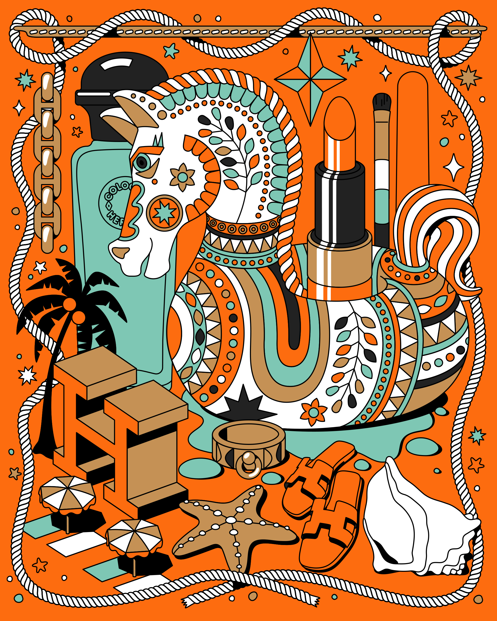 SEASONOFVICTORY aka Linda BaritskiLUXURY BEAUTY ILLUSTRATIONLUXURY BEAUTY ILLUSTRATION
KEY VISUAL ILLUSTRATION
Illustration experimentation – testing out mixing products, brand iconography and key colours of an existing brand with my style of illustration.
For this self-initiated illustration, I focussed on elements of the Hermès brand for inspiration: the tilted hand stitching, the iconic H monogram, jewellery and accessories, the iconic perfume bottle shape and cosmetics. View Folio
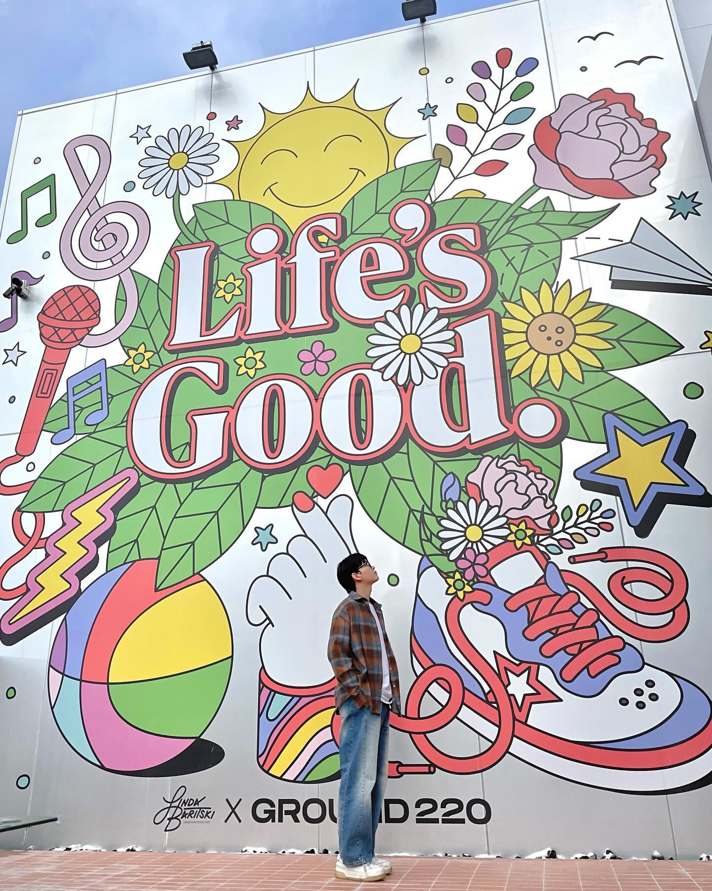 SEASONOFVICTORY aka Linda BaritskiLG Electronics cafe mural/installation illustration installationMy illustration collaboration with LG Electronics Korea and BE BIG COMPANY on the “Ground220” space in Seoul represents a dynamic project focused on fostering positive energy within daily routines that can lead to transformative life changes.
I created illustrations for the installation on both the front facade and terrace of the Ground220 building, setting the visual tone for the space. Additionally, I created interior installation illustrations, infusing the environment with a cheerful and engaging aesthetic. The aim was to create an inviting experience for visitors and users of the space. View Folio
 SEASONOFVICTORY aka Linda BaritskiLG Electronics site specific mural illustration installationMy illustration collaboration with LG Electronics Korea and BE BIG COMPANY on the “Ground220” space in Seoul represents a dynamic project focused on fostering positive energy within daily routines that can lead to transformative life changes.
I created illustrations for the installation on both the front facade and terrace of the Ground220 building, setting the visual tone for the space. Additionally, I created interior installation illustrations, infusing the environment with a cheerful and engaging aesthetic. The aim was to create an inviting experience for visitors and users of the space. View Folio
 SEASONOFVICTORY aka Linda BaritskiIllustrated self portraitIllustrated intro self-portrait for a larger upcoming project. I love creating artwork similar to this for magazine cover illustrations, editorial art, packaging and ad campaign key visuals.
To create an illustrated photodoodle image, I start with the initial ad campaign photo of the person, product or scene, and roughly sketch the elements, lettering and layout. I then create the final vector illustrations and add some of my signature elements and vibrant color. View Folio
 SEASONOFVICTORY aka Linda BaritskiKiehl’s Loves LONDON 2022 illustrationsThe mini kits I created for each of the 40+ destinations included a key visual, lots of poses of the Kiehl’s mascot (Mr Bones), patterns, and also a kit of icons for each destination. The illustration sets are used as a style guide for its location for limited edition skincare packaging, point of sale, signage, events, campaigns, products, accessories, animations and more. View Folio
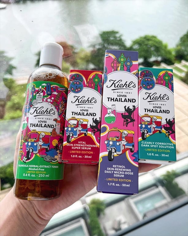
 SEASONOFVICTORY aka Linda BaritskiKiehl’s Loves THAILAND 2022 illustrationsKiehl's Loves THAILAND 2022 illustrations
 I loved creating this for #kiehlslovesthailand packaging and advertising. The illustration represents the colourful culture and distinct areas of the country.
The illustrated mini kits that I created for each of the 40+destinations are being used as mini style guides for each location's limited edition skincare packaging, point of sale, signage, events, campaigns, products, accessories, animations and more. View Folio
 SEASONOFVICTORY aka Linda BaritskiTransport for London TFL Giphy stickersCOLLECTION OF 20 ANIMATED STICKER GIFS
Transport for London recently commissioned me to create a collection of 20 engaging and impactful animated Giphy stickers for their Championing Value campaign. The collection mainly focuses on fast travel, 24-hour services, value and convenience, in my aesthetically vibrant style. View Folio
 SEASONOFVICTORY aka Linda BaritskiMARKS & SPENCER M&S Sparks Days Out illustrationsMARKS AND SPENCER SPARKS DAYS OUT ILLUSTRATIONS Marks and Spencer contacted me to create a set of key visuals and illustrations to help refresh their current Sparks Days Out loyalty programme creative. They wanted a season-less approach, and to target a wider demographic and all age groups.
Incorporating their distinct Sparks Green, I created a flexible key visual illustration that would be used as their main artwork but was also adaptable for a variety of layouts for print and digital use. I included a bank of illustrations to showcase different offers including entertainment, heritage, events, sightseeing, adventure, dining and more. I also created a variety of type lockups and banners to use alongside the illustrations.
View Folio
 SEASONOFVICTORY aka Linda BaritskiLIMITED EDITION SUMMER CAN ILLUSTRATIONPACKAGING ILLUSTRATION, SUMMER-THEMED LIMITED EDITION CAN DESIGN
BALL Corporation are a global aluminium beverage can manufacturer. They produce innovative packaging to elevate brands and to help them engage consumers.
I was approached to create an illustration that would be vibrant, colorful, and increase awareness of the infinite recyclability of aluminium and also utilise the special effect Day-Glo inks for my illustration.
The themes of my illustration wrap around an infinity symbol hidden within the illustration – it creates both a “road” for the road trip and also creates a path through the themes. I’ve included images in my illustration to reflect fun and socialising at festivals, with musical instruments, festival tents and vibrant images to create an impactful vibe. A festival camper van drives through the illustration with fun roadsigns and scenic imagery. Fruits are dotted throughout to imply Summer fruits and beverage flavors.
I wanted the consumer to be hit first with the overall fun and joy, images reflecting the excitement of being together – but then see more details throughout the illustration.
I’ve used vivid, Summery colors to create lots of energy – the green and yellow are printed in special Day-Glo inks to make the cans stand out. View Folio
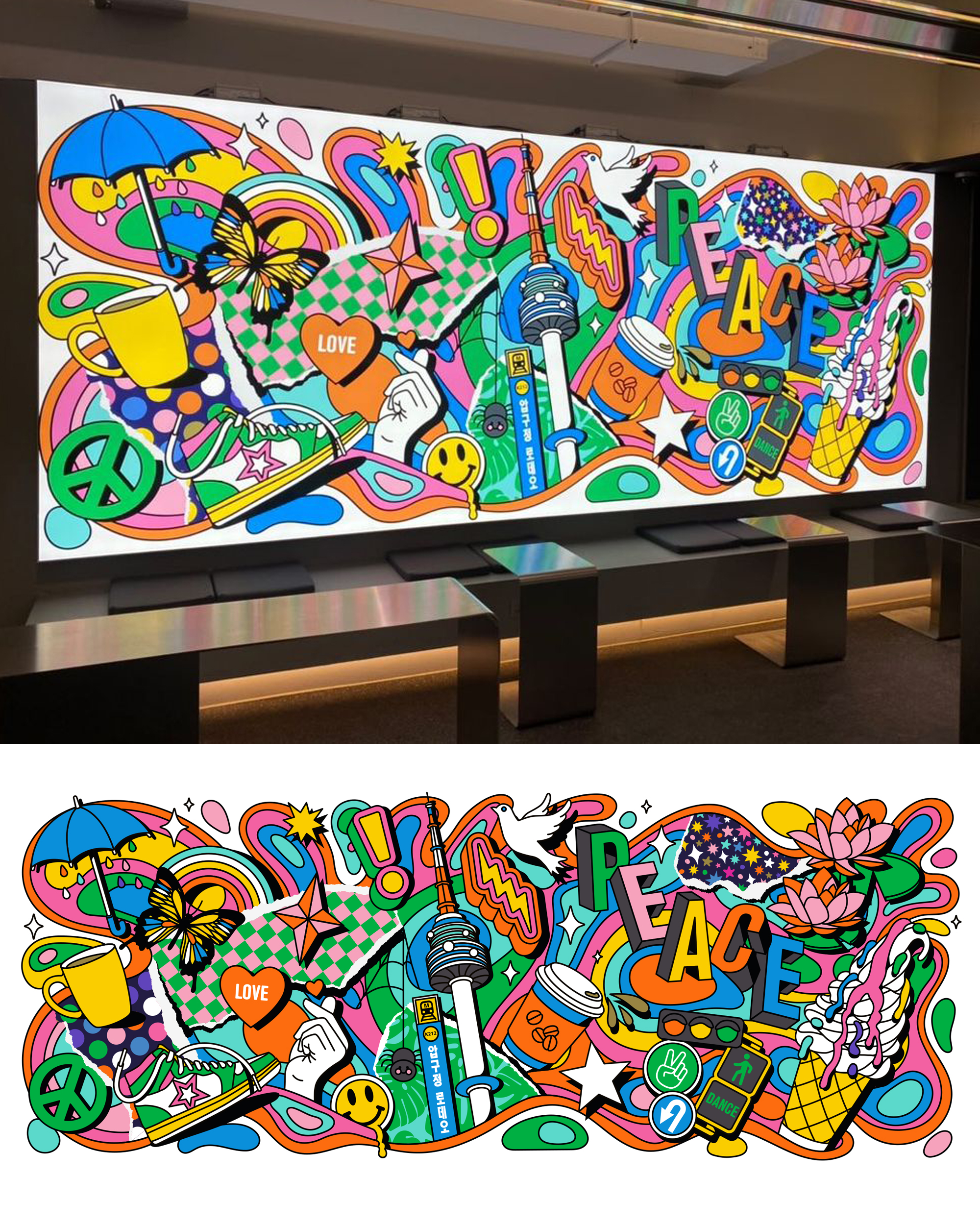 SEASONOFVICTORY aka Linda BaritskiSPYDER KOREA mural illustrationSite-specific in-store mural illustration, tote bag and event illustrations for Spyder Korea. It’s a psychedelic collage of imagery to reflect peace, fun and love in Seoul for the year ahead.
One mural is at the entrance of the Spyder shop location in Apgujeong, Seoul, Korea. The shop sells apparel but also has a coffee bar, a meeting place, a cycle mechanic service, and also a ju-jitsu area with mats.
I also created window illustrations that decorated the end-of-the-year party for SPYDERKOREAxSACxCHAANCE and matching canvas tote bags. View Folio
 SEASONOFVICTORY aka Linda BaritskiKiehl’s Loves THAILAND 2022 illustrations for packagingKiehl's Loves THAILAND 2022 illustrations
 I loved creating this for #kiehlslovesthailand packaging and advertising. The illustration represents the colourful culture and distinct areas of the country.
The illustrated mini kits that I created for each of the 40+destinations are being used as mini style guides for each location's limited edition skincare packaging, point of sale, signage, events, campaigns, products, accessories, animations and more. View Folio
 SEASONOFVICTORY aka Linda BaritskiShisa Dog 1 of 2 Good Luck Guardian Protector, Good Spirits, Fulfilment, Destiny,aapiShisa dogs are traditional Ryukyuan guardians, a cross between a lion and a dog, seen everywhere in Okinawa (my birthplace). They’re found in pairs, usually guarding doorways, gates and rooftops from evil spirits.
The one on the left always has a closed mouth and the one on the right always with an open mouth. It’s believed that one is male, one female, but there’s always debate on which is which.
Some believe the open mouth shisa is the male, scaring away evil spirits, and the closed mouth shisa is the female preserving calm. Others believe the closed mouth shisa is the male keeping evil out, and the female is open mouthed, spreading positivity and inviting good spirits. View Folio