L’Albero – Interview + Book Review
Written by Silvana D’Angelo Illustrated by Studio Fludd
Published by Topittori
Review and interview by Peter Allen
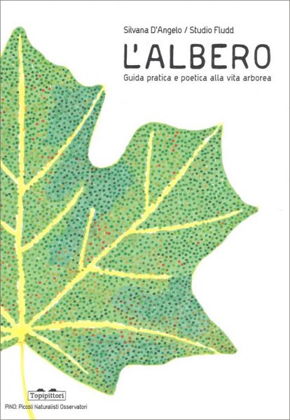
L’Albero (Trees), illustrated by Caterina Gabelli and Sara Maragotto of Studio Fludd was part of the official book selection on display at this year’s Bologna Children’s Book Fair. Travelling to Italy through Switzerland was, for me, an aptly poetic introduction to the subject, the snow white ground with winter forests of every shade of grey, silver birch, beech, larch, pine.
In Bologna’s gardens Spring had arrived before us. Pink cherry and white almond blossom, bright green leaf buds opening and dark green exotic evergreens had traversed the walls of the Inuit Gallery in pencil and felt-tip line drawings and photo collages from Studio Fludd’s most recent book riso printed book, Sylvatica. This collaboration is the culmination of two years work in different botanical gardens across Europe, during which time L’Albero – an exploration of the life of plants through images inspired by traditional botanical illustration – was also produced. The process and inspiration behind the commission is described by Caterina in the interview that follows.
Could you tell us a little bit about yourself and your picture-making, both individually and with Sara Maragotto, as a member of Studio Fludd?
I discovered my love for drawing while I was attending the Academy of Fine Arts, in Venice. At first, I was very attracted by colours and painting and I was sure I was bad at drawing, especially in black and white. It was a long process of discovery. I forced myself to forget the colours to become closer to the marks on the paper, to find something of me in the way the pen can flies and run and go on the paper. When I met Sara and had a look at her drawings, my first impression was “Wow, there is something so close to me in this”. She felt the same looking at my works. We started immediately to do some projects together.
We loved spending time to look at a lot of images. When we founded Studio Fludd, with another friend and designer (Matteo Baratto), our common pleasure was to spend time watching images and discussing them. We worked on different kinds of projects – graphic design, photography, complex projects that mixed different skills. Once we worked in a crazy auto-driven project called Gelatology: we printed a book with illustrations made by our three hands. Working in three different techniques: I worked with pens and markers, Sara with brush and painting and Matteo with photographic images and digital effects. Then, we mixed all this material, scanning the drawings, composing digital illustration and printing it with the help of a risograph printer.
Book sketches
I like the strange result of this book: it’s not really for children, and it’s full of humour, although the illustrations were selected for the Bologna Children’s Book Fair in 2014. We don’t have a specific method when we start a book, but I must say that we usually spend a lot of time doing initial research around the meaning, the possible analogies, the links that our minds can open and connect, and of course, in the meanwhile, we discuss the formal solutions of images that we like the most.
How does the book L’Albero fit in with what you have already achieved individually/Studio Fludd and with your immediate and long-term plans, both individual Studio Fludd?
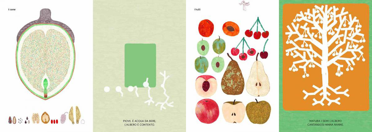
In 2015 we met the Topipittori Editors and they asked us to illustrate a book for children. They had this text, very poetical, written by Silvana D’Angelo, and they wanted to combine it with some quite scientific and precise illustrations, in order to create a kind of interesting contrast between the two things.
We were happy to be invoved because we love scientific illustrations, especially the oldest one. We had a huge archive of images from old scientific books in our computer, so it fitted perfectly. Sara and I decided to work specifically together on that project because we are more involved in the illustration. It was also our first book commissioned and we generally love very much all the Topipittori books.
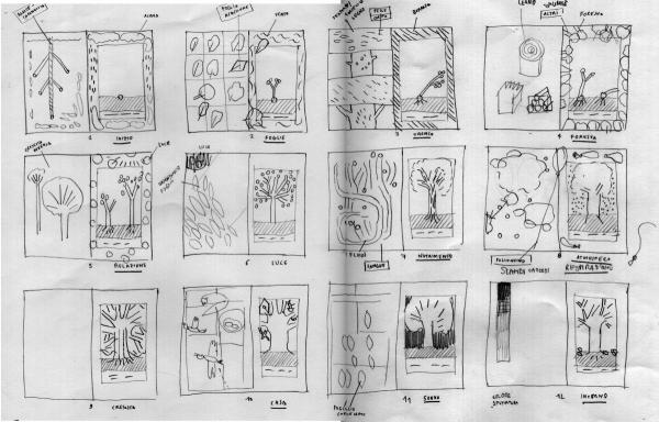
Storyboard
What came first the book or the interest in trees?
Well, the book of course. Then we became more and more passionate about trees.
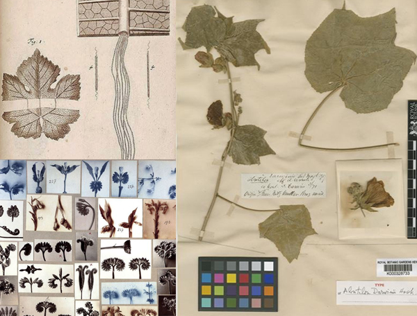
Research for the book
What did you hope to achieve when you started to work on this project?
Well, we wished to realise someting fresh, not boring. For children and for adults, without excluding anybody. The first difficulty was to find a way to be discretely narrative, to tell a little history among the pages that little children could easily recognize, but also to have at the same time very precise illustrations, close to the science, to real nature.
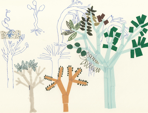
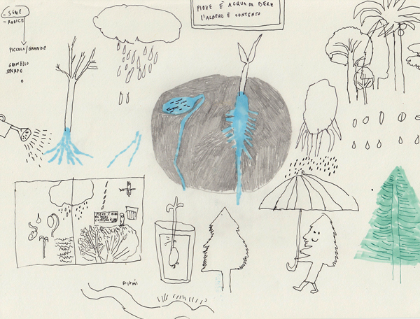
So the main difficulty was to combine these differents objectives, and after many storyboards we decided to separate the double pages in two different aesthetics: one page with a schematic three, growing, started to face another page with specific details connected to the texts. See our process here.
What influences come to bear on the design and style of your illustrations?
First of all a lot of ancient images from Herbaria, for the precise drawings and for the elegant compositions as well. In general, we were inspired by many different scientific images, especially the images that come with a classification (for example the successive shapes of the leaves, etc) or some very clear ways to describe a specific part of a tree. And then some contemporary Japanese illustrations, that suggested to us to use the white colour to make the tree on the right of the book more abstract, universal and schematic.
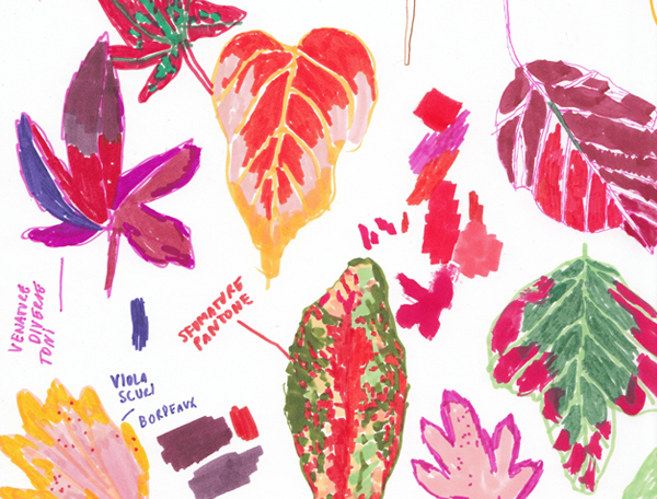
Sketches
How consciously did you work to suit the publisher’s taste in books, or did you have carte blanche to make what you wanted?
Paolo and Giovanna of Topipittori are very open to many different styles of drawing. They didn’t impose one style on us, they gave us a lot of freedom and time to look for the best solution in order to illustrate the book. They just asked to keep a sort of strong connection with nature – do not invent but observe and represent how the nature looks like. That was the guideline.
Was the book a new departure for the publisher, design, content, audience wise?
This books belongs to a series of book called PINO (Piccoli Naturalisti Osservatori) that aims to make the nature close to the children.
So, it is rather a sort of on-going process and we are really happy to be part of it.
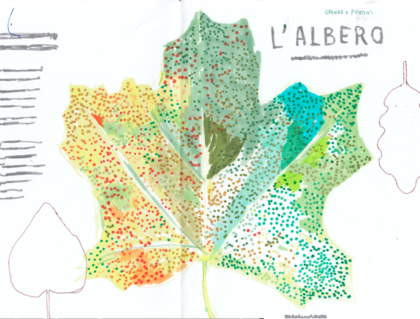
L’Albero cover visual
Back to News Page
