The Cantankerous Crow – Book Review
Written by Lennart Hellsing Illustrated by Poul Stroyer
Published by Thames & Hudson ISBN-13: 9780500650790
Reviewed by Karl Andy Foster
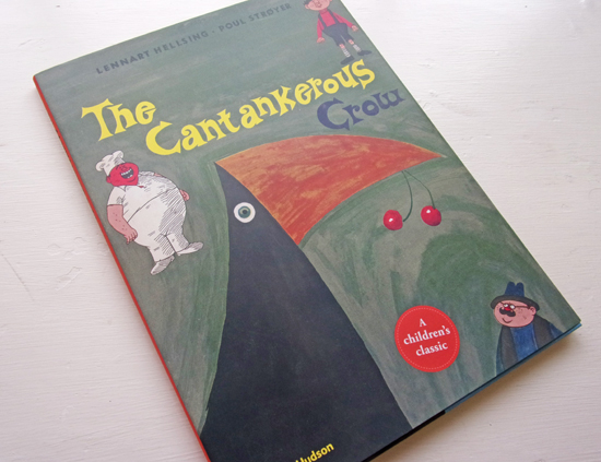
The Cantankerous Crow cover is a combination of geometric fields to delineate the Crow whilst the three supporting characters have been placed around the Crow and the hand-rendered book title. The overall effect serves to flatten the image. There is also a bold disc at the bottom announcing that this is ‘A children’s classic.’
The story appears simple enough. Naughty exuberant Crow steals cherries from the farmer as part of his daily fun. However he is caught by the farmer and then his trials begin. The trials are oppressive and remind us that the book was published in 1953 when childhood narratives tended to be more black and white in structure. However, before I’m tempted to put on my progressives hat, the author Lennart Hellsing pulls off the ingenious part of the story. Whatever the ‘owners’ of the Crow force him to do he subverts it and makes them regret his servitude. The Crow returns to his anarchic family and, like the prodigal son, they greet him with love and presents to show that he belongs with them in their world. What becomes of the ‘owners’ in the story can only be speculated upon, but I suspect they’ll think twice before they indenture a crow again!
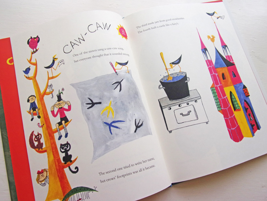
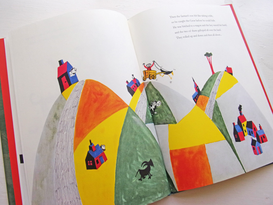
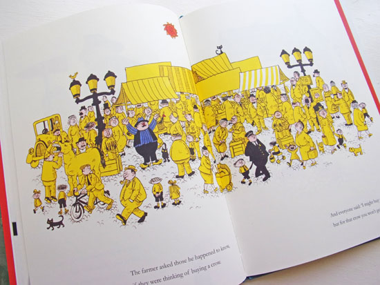
The pictures illustrate the text in a literal fashion with the exception of the market place spread. Today we are used to more subtext and additional visual elements that tell the story on another level. That said, the story is still satisfying. The style of image making varies throughout the book but some of the illustrations are quite exquisite. For example the cherry tree garden, the very fat Cockerel, the rolling hills spread and the market scene (the young boy mimicking the Policeman is well observed). There is a good balance of text to image ratio that allows the illustrations to breath in the space. The serif font of the text is set on extra line spacing to aid readability for young eyes.
The story rhymes, as this is a book aimed at the 3+ age group it will help young readers to remember the music in the words. This encourages them to read along too, an excellent way to engage early readers. The book was originally published in Scandinavia in 1953 and there is no diversity in the book but the supporting characters are varied in their psychologies and are distinctive.
Poul StrØyer’s illustrations are mostly painterly, using graphic description to help emphasise crowd scenes and detailing. There is something fresh and innocent about the illustrations. The book is printed on uncoated paper that adds to the sense of nostalgia that publishers Thames and Hudson are after. This sense of nostalgia might increase sales of the book. The reference on the cover to a children’s classic might be overstating things slightly – this is no Where the Wild Things Are or The Tiger Who Came to Tea. However the story has something special about it, conjuring a world long gone, that at times we still yearn for.
Author Hellsing has created a world where the upside down should be expected and this is a joyful conceit. It reminds us that nature cannot be tamed for long and that a cantankerous crow is best left alone to enjoy his share of the cherries.
You may also be interested in this book review
The Glass Mountain: Tales from Poland
Back to News Page