The Varoom Report: Fashion V28
Fashion
THE ILLUSTRATION REPORT Winter 2015
ISSUE 28
Varoom 28 is available to purchase here as well as other past issues. You can also subscribe to make sure you never miss out on the latest Varoom.
When is that perfect moment of Fashion, when you could be perfectly, ‘in Fashion’? That’s not a social anxiety, it’s just the kind offbeat musing that Fashion projects often provoke.
This issue features many extravagantly offbeat visual ideas, from Zoë Taylor’s feature on Fashion and Film which includes Fashion images created from a games engine, to Teal Triggs’ story of the uncommonly fabulous Flair magazine which ran for a single year, to our exclusive extract from Lucienne Roberts and Rebecca Wright’s book on nun’s habits. How could we talk about fashion, without mentioning Prada? Varoom 28 takes a look at how fashion and illustration came together at Prada’s S/S 2014 show , and Leanne Shapton, editor of Women In Clothes, explores our relationship with clothes.
New York illustrator, Richard Haines, brings his approachable feeling for fashion to street sketches of people on their way through the city, Bridget Strevens-Marzo discusses characters from our childhood and how image making fashions change within children’s picture books and Varoom enters the beautifully surreal world of Herself magazine created by Thorbjørn Ankerstjerne and his alter ego ‘Lula’.
1.1 Fashion’s Punxsatawney Phil
Once a year – in the Fashion world’s ritual equivalent of Punxsatawney Phil in Groundhog Day – there’s a modern-day oracle eagerly awaited by interior designers, magazine editors, textile and wallpaper manufacturers, which announces the Colour of the following year. It’s the annual Pantone Colour Report, and for 2015, the colour is PANTONE 18-1438 otherwise known as Marsala.
1.2 Futurism and Feedback
It’s announced by Leatrice Eiseman who as Executive Director of the Pantone Color Institute has been helping the company with their colour forecasting. I’m sure you’re not surprised that Marsala has a Pantone number (“Golly! It turns out we do have this year’s colour!”), or that the annual colour forecast is a highly effective piece of marketing, or the degree to which this ‘forecast’ is self-fulfilling.
1.3 Party like it’s 1987
On the release of the colour for 2015, Washington Post journalist Juria Koncius contacted various creative types for comment, including designer Annie Elliot, “whose firm is called Bossy Color. She quickly clicked on the Pantone Web site and called me back. ‘You can pair it with hunter green and you can be right back in 1987. It is so depressing,’ Elliott said ‘I hate burgundy, and it doesn’t even have the guts of burgundy.’” Yikes! ‘Just Like Burgundy, But Without The Intestines’, the strap line for Marsala isn’t looking good.
2.1 Political Colours
But it’s the epic, daft, imaginative, ambitious scale of this enterprise of this which makes it so appealing – I really do want 2015 to be defined by a colour, by Marsala, like an eccentric children’s book by Hervé Tullet where each year our mood, our psychology, our politics emerges from colour. The Green Party for 2015? Don’t think so, Emerald Green is so 2013, 2015 it’s the Marsala Party. In the open-ended metaphorical gestures of these signs and symbols, Marsala is all about earthy purples, Marsala is neither left-leaning red nor conservative blue, Marsala is robustly centrist and solidly rooted. Just speculating…
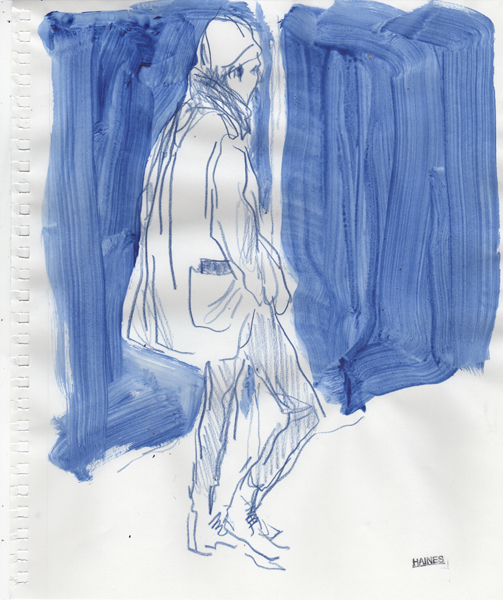
Richard Haines
2.2 Perception
Joking aside, illustrators, designers of all stripes, photographers, art directors, magazine editors, marketing types and stylists know, there are fashions in colour from year to year, from business sector to business sector (I dreamed of having shares in Corporate Blue). But what’s so appealing about something like the Pantone Colour Report is when it moves colour away from being mood music and gets a conversation going about the visual and perception.
2.3 Fashion as a Theory of influence
Yet the uniformity of these trends, their top-down ‘authority’ of what’s in and what’s out, as announced by designers and fashion editors, is slowly being eroded by the volume of visual information that doesn’t conform to the old rules, that is playing catch-up in the 21st Century world of fashion blogging, cool-hunting and social media sharing. There were always other ‘authorities’ other ‘tastemakers’ in the world of fashion, most notably fashion subcultures with their own ‘cultural capital’ (as the French thinker Pierre Bourdieu called the power of tastemakers, which in France came from a specific economic class). Fashion is also a theory of influence, of what’s hot and what’s not, taste-making is fundamentally about excluding and defining boundaries.
2.4 Mapping the Ugly and the Beautiful
Bourdieu writes in his famous book Distinctions, “Taste classifies, and it classifies the classifier. Social subjects, classified by their classifications, distinguish themselves by the distinctions they make, between the beautiful and the ugly, the distinguished and the vulgar, in which their position in the objective classifications is expressed or betrayed.” You could argue that modern Fashion has always been an aristocratic industry with its inner courts of celebrity designers and models, and the courtiers of magazine editors. And yet one of the dazzling attractions of contemporary Fashion is the fluid lines it draws between the ugly and the beautiful. The apparent fickleness of Fashion is also part of its attraction, and in a global digital culture with many different voices on Fashion, what’s fashionable is less obviously linear than it ever was.
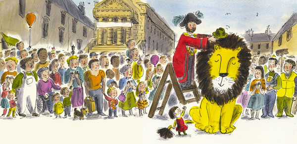
‘How to Hide a Lion’ – Helen Stephens
2.5 The Fashion for the Local
Bridget Strevens-Marzo points out, in her feature on fashion in children’s books, that in a world of increasing globalisation, imagery that expresses something ‘local’, increasingly has appeal elsewhere. Children’s book illustrator Helen Stephens tells Strevens-Marzo that, “publishers seem more open to giving a picture book a sense of place. How to Hide a Lion is set in the grey, wind-swept, walled town of Berwick-upon-Tweed, and has sold in 14 co-editions.”
3.1 Artificiality of Mind
Fashion has such a bad reputation for its ephemerality, its shallowness, its transience. I was reading my back issues of The Irish Penny Journal, as I do every Sunday after Mass, and my eye landed on an item in the May 15, 1841 issue, entitled “The Evil Influence of Fashion”, where a ‘Mrs Gore’ writes in psychological detail of how women are corrupted by fashion: “her simplicity of mind departs; her generous confiding impulses of character are lost; she is no longer inclined to interpret favourably of men and things; she listens, without believing, sees without admiring; has suffered persecution without learning mercy; and been taught to mistrust the candour of others by the forfeiture of her own… it is not alone the rouge upon the cheek and the false tresses adoring the forehead which repels the ardour of admiration; it is the artificiality of mind with which such efforts are connected that breaks the spell of beauty.”
3.2 The Insight of the Shallow
I forgot to add “artifice” and lack of candour, the deep cultural mistrust of appearance to the charge sheet against fashion, this mistrust of ‘appearances’ has a long history in philosophy and religions still being played out. A corrective is offered by Oscar Wilde in The Picture of Dorian Gray, “It is only shallow people who do not judge by appearances. The true mystery of the world is the visible, not the invisible…” The seductive surfaces of fashion, and the fact the word fashion itself is associated with change makes it the source of social and cultural suspicion.
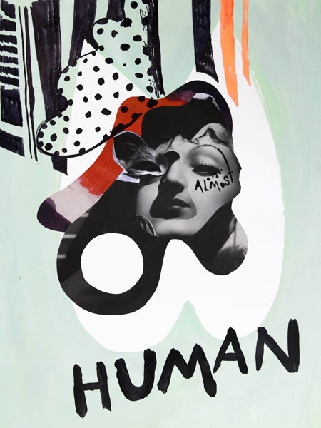
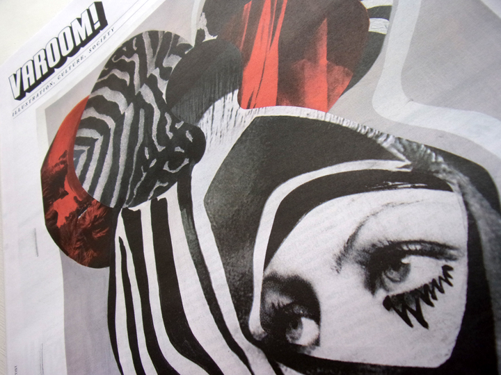
Quentin Jones ‘Almost Human’
3.3 Uncanny
Zoe Taylor’s feature on Fashion and Film is unlikely to allay this suspicion as she explores the work of Quentin Jones, who is well aware of the legacy of metaphysical suspicion around ‘appearances’ having done a primary degree in Philosophy before getting an MA in Illustration from Central Saint Martins. The collision of illustration and photography in her work generates an uncanny play of surfaces and depths.
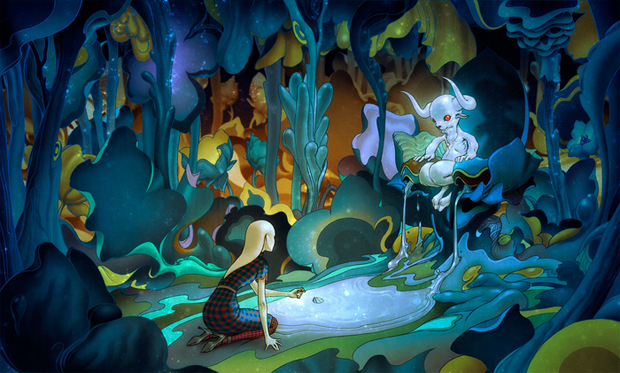
3.4 Augmented Self
Likewise Brooklyn duo Reed + Rader, who in 2013 created what is generally regarded as the world’s first fashion film produced with a games engine, generate an uncanny effect not just through the odd tones of their 3D environments, but also though playing with different speeds, of stillnesses and movement. They understand the attractive plasticity of fashion, “Fashion has always been about identity and masquerade. The promise of augmented reality takes this idea of manipulating the self and amplifies it to the next level.” All of Mrs Gore’s moral anxieties raised and magnified. The fear of the fashion image is bound up with a fear of its power – not as a mask, or even as artifice, but the image expressing a material force or power. The quality of both Quentin Jones’ and Reed + Rader’s images is partly because of the uncanny interplay and imitation of surfaces and depths in the collage and simulated 3D work.
4.1 The Material Image
This materiality of the Fashion image, how the Fashion image-maker disrupts and reorganises perception is played out in Teal Triggs’ feature on Fleur Cowles and Flair, a lifestyle magazine which ran from February 1950 – January 1951 (p.20). A remarkable adventure in image-making, the magazine included work by the likes of René Gruau, Sarah Braverman and Saul Steinberg, but whose Art Direction subtly deconstructed the surface of the image – Triggs describes one such technique of using a horizontal strip 1/6 of the page, where the main image flows over but also includes text and details the feature’s accessories.
4.2 Layers of Space and Time
The Flair feature “1951: The Dissolving Line” expresses a change in clothing fashion away from a sharply defined look through the arrangement of photography and drawing, weaving together different layers of time and space. Triggs describes the baroque quality of a sequence that imitates a new aesthetic, imitates textures, imitates the space and experience of reading and looking itself. “The story begins with photographs by Bellanca and Cesco of a single model posed looking directly at the reader: one in a studio setting and the other taken on a rainy evening on the streets of a city. These images are cropped and re-photographed as two individual images held carefully by another woman. All we see are freshly manicured nails of a woman’s hand; the body of this woman sits outside of the frame.” The layouts interrupt the readers sense of self, and the sense of the flatness of the image, inviting her/him into the space and identity of the mysterious woman holding the pages, holding the gaze of the models, holding an image (photo, illustration, text) made complete and incomplete with the horizontal strips along the bottom of the page. It’s the fashion image as a material ‘spell’.
James Jean
4.3 The Spell
On the Vogue blog Jeanne Detallante – who features in Ann Field’s article Illustrating Prada – uses the French word envoutement, meaning to cast a spell using an image, to describe an illustration she has chosen for her mood-board we will return Field unpacks how illustrators have been working with the Prada brand – from James Jean’s widely celebrated 2007 show to the Spring/Summer 2014 collection where the illustrated image occupied the surfaces of the fashion show space and on the clothes themselves. There’s an uncanny Prada advert (there’s no escaping the uncanny when we are dislocated from our familiar sense of space) where the 3D models and 2D illustrative portraits on the dresses and handbags begin to blend, the models skin tones and hair styled to look like illustrated stills.
5.1 How Uncanny? The Uncanny Again
It’s strange (uncanny?) how the word uncanny feels like such a precise descriptor of where fashion imagery is at this moment, at a moment when more than ever, Fashion celebrates the opportunistic play with the real and the fictional – and fashion when it gets interesting is when it blends the boundaries of what’s real and what’s imaginary. The German word for uncanny ‘unheimlich’ is literally ‘unhomely’ or unfamiliar, and for Freud the experience of the uncanny emerged from both the familiar and the strange – the conjunction of the two making it more unsettling (what’s interesting for illustrators, is that Freud’s exploration of the Uncanny, his case study is framed by a discussion of the Sand-Man and its folklore).
5.2 The Fabulous
Another case in point of this Uncanny is played out in Contributing Editor Jeremy Leslie’s highlighting of HERSELF an illustration-based fashion magazine which has included interviews with fairy tale princesses and dead, iconic celebrities, just as Fashion connects the real and the imaginary, re-thinking how we think of both – HERSELF is also a collage of the living and the dead. And as an extension of how Fashion makes unlikely connections happen, the whole magazine is created by Lula – the alter-ego of Thorbjørn Ankerstjerne. In email conversations with Ankerstjerne, he kept the ‘Lula’ idea live, when responding to the questions. ‘Lula’ is the point where making the distinction between the real and the imaginary is no longer interesting, creative, productive (like the idea as to whether fashion is a ‘language’ with a grammar). HERSELF takes the Fashion idea of the ‘fabulous’ (“it’s fabulous darling”) and turns Fabulous into a philosophy of creativity and way of conducting yourself in the world. Fabulous isn’t simply exaggeration or being theatrical, Fabulous, is where as an illustrator or creator I indulge the impossibilities of my creativity, where I let the imagination plant some life in the most inhospitable (unrealistic) places.
5.3 Professionally strange
And just as Miuccia Prada toys with the Ugly in a way that is kind of hypnotic, so ‘Lula’, a very professional woman no doubt, I’m assuming it’s a woman, allows herself to play out some very strange illustration throughout the magazine. So when Ankerstjerne/‘Lula’ answers the questions about difficulties in the creative process he/she writes, “Have I done this before? Should I repeat myself or contradict myself? Does this even make sense? Shall I stop or draw another hour? Can this be saved or shall I start from scratch? Is it right or wrong? I mean is it so wrong that it is right, or is it just plain wrong? I mean is it so right that is wrong, or is it just plain right?” The ‘Fabulous’ re-wires familiar ways of thinking to generate the creatively new and emotionally strange.
‘Faith and Fashion’ Illustration by Ryan Todd
6.1 Restless Relationships
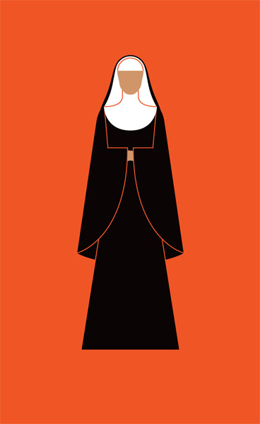
So whatever else, clothes and fashion and the fashion image are not simply social codes, or a means of social distinction, or an exercise in signalling power (from shoulder pads to the vogue for “Serious” spectacles). Clothes and fashion are much more complicated. As Lucienne Roberts and Rebecca Wright suggest in their piece on nuns’ habits, the religious habit is an active piece of clothing that registers events in its stylistic features (miracles) but is also an instigator, a way of shaping forces and networks in the world. “Variously incorporating visions and miracles, high drama and humble beginnings, persecution and insurrection, these tales are connected by the powerful emotional response that the habit has produced. As Veronica’s research (theology graduate Veronica Bennett) took shape it became clear that the history of the religious habit is a story of restless relationships – the struggles of the powerful and the poor; of politics, social care and the role of women; and of the interplay of culture, fashion and faith.”
6.2 Magic and Revelation
Likewise Women In Clothes, a book edited by Sheila Heti, Heidi Julavits and Leanne Shapton, is restlessly inventive in exploring the multiplicity of ways in which we respond to clothes, and the social, aesthetic, personal, material role clothes play in our lives. Women In Clothes is like the Big Bang in conversations about clothes, textual and visual, it sets out so many different ideas. Most of all it’s a reminder of how clothes, how fashion and how our own personal fashion, and its social and mental image is what Jeanne Dertallante calls an envoutement. In a survey entitled Glamour, actor Liane Balaban writes, “The word ‘glamour’, in its original 1700s definition, means ‘magic’ or ‘spell’. So it seems that for hundreds of years, our way of thinking about beauty and desire has been linked to revelation, insight, and knowledge. I think a lot of what we’re doing when we put on clothes, or create a personal aesthetic, has to do with the idea that we know something others do not, that we have a unique and sacred lens for seeing the world. When we see people who are put together in a certain way, it’s like they have their own special lens as well. Maybe they know something we would like to find out about, too.” Revelation, insight, knowledge – Fashion and the fabulous.
Varoom 28 is available to purchase here as well as other past issues. You can also subscribe to make sure you never miss out on the latest Varoom.
Back to News Page