“The animator gives the scissor characteristic with an unique perspective and style. I really like how the director combines both illustration and animation languages to convey his/her idea. This animation not only has the beauty of the illustrations with beautiful composition, texture, but also incorporates the rhythm and the dynamic language of animation, as well as the montages and music. The structure of the animation is also very clear, from the small animation chapter to the entire animation, they all revolve around the main theme and idea.”
Yawen Zheng – Animation Director, Illustrator and Lecturer
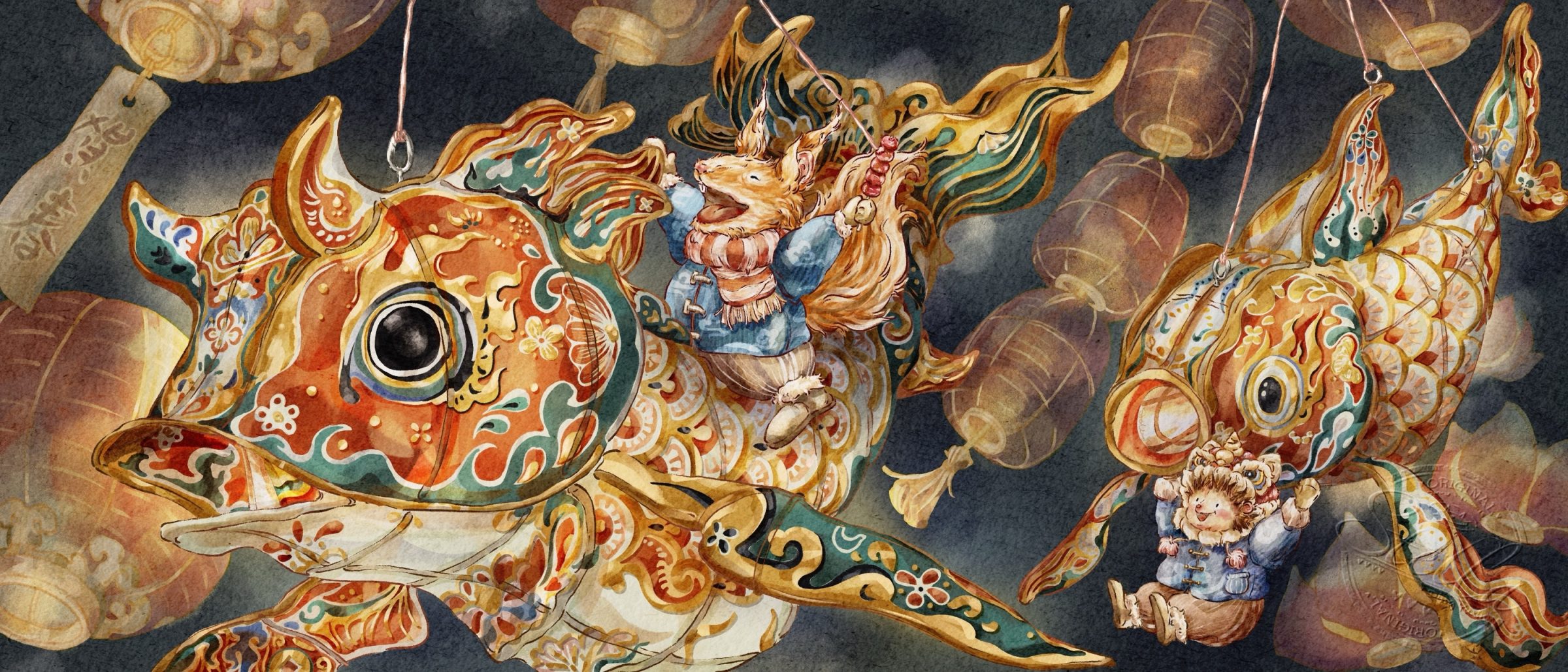
We asked Wang Lijun, from the cartoon Art Committee of China Artists Association of their thoughts on this rich and colorful piece.
“This is a work of art rich in colour and meticulous in its use of hues, where each illustration presents a marvellous microcosm with various details. It is also an artistic creation distinctly different in style from other competing works.”
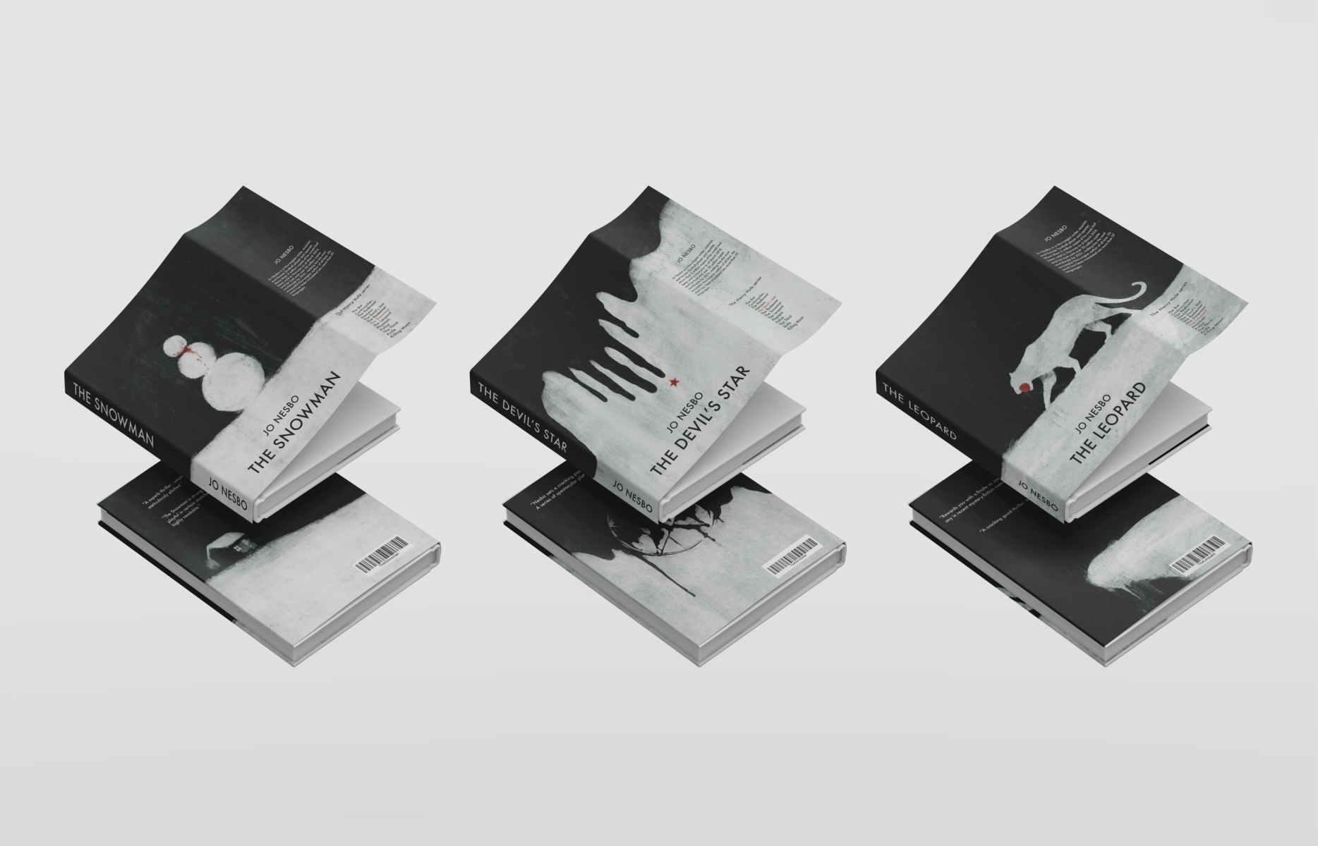
We asked Anna Ridley, Head of Children’s Publishing, Thames & Hudson Ltd for their thoughts on these gripping cover designs for Jo Nesbo’s crime novels.
“I thought this was a clever re-positioning of a crime author’s novels. The illustrations use a limited colour palette to maximum effect, and the added use of texture elevates this from a design that is purely graphic to something more nuanced. The way the landscape continues across the jacket feels very luxurious and I thought it was clever the way the illustrator aligned the horizon lines on all three to create a consistent spine design across the series.”
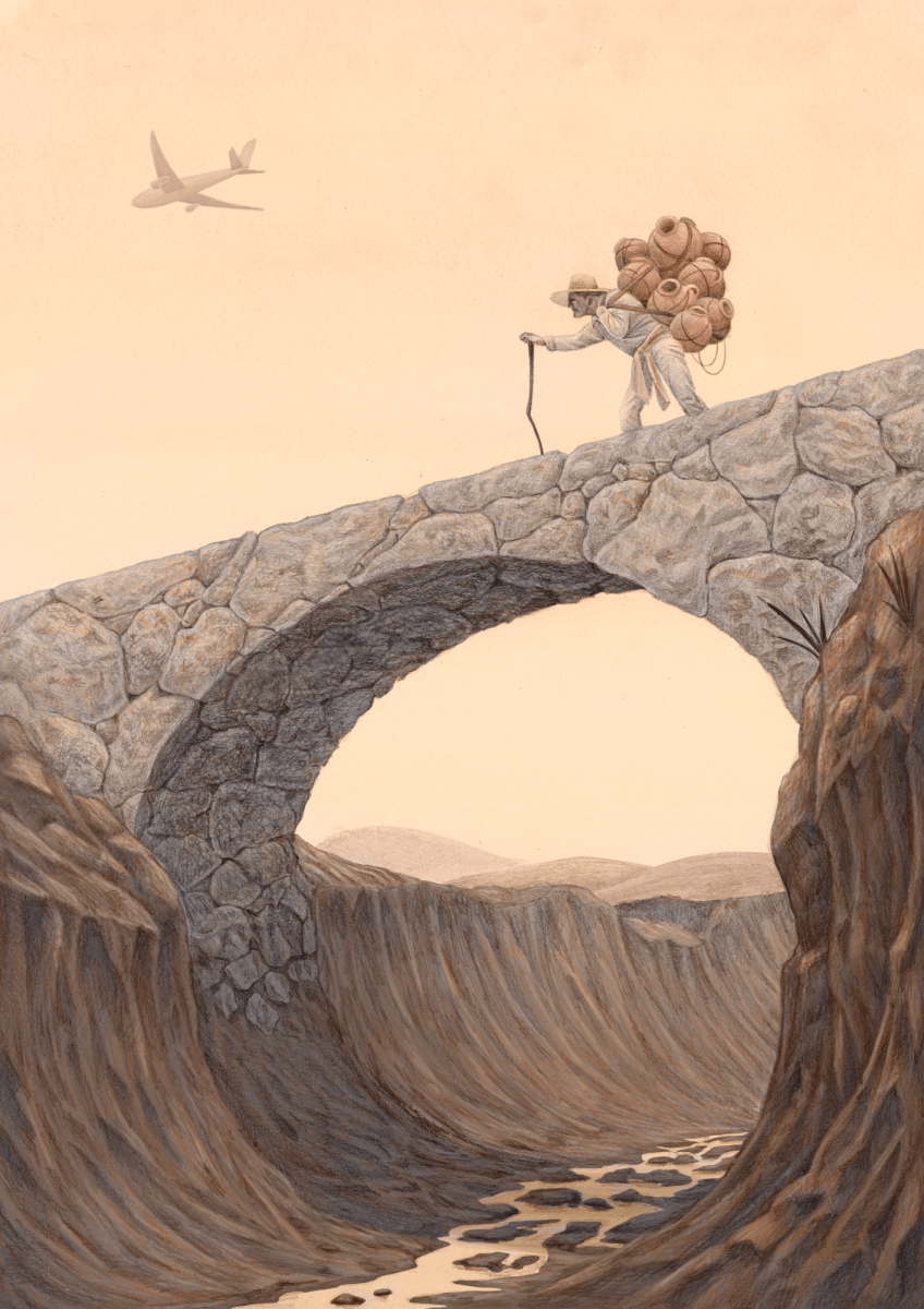
“I think it cleverly shows the impact that climate change has on developing nations through the use of the subtle plane in the distance, which seems (literally) worlds away from the foreground and the man on the bridge, but yet is the reason for the river being dry in his world.
I like the use of single tones, relying on the message and depth of the illustration to tell the story instead of colour. I think this would work perfectly for an editorial story on climate change, as suggested by the artist.”
Kelley Sheenan – Founder, Editor-in-Chief and Designer of Peppermint
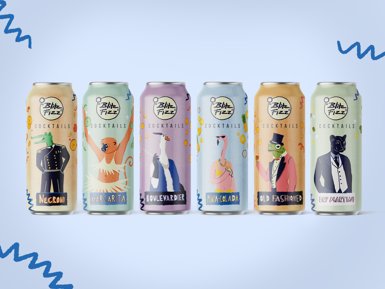
These playful designs evoking the feeling of being young were created as a final project for a packaging class. We asked Art Director, Aurelie Bert for their thoughts.
“The characters are funny, and the harmony is successful. It’s fresh and refreshing. It matches the product well!”
This beautiful story explores fighting back and finding your true passion. We asked Art Director of Hardie Grant Children’s Publishing, Pooja Desai for their thoughts.
“I think these illustrations and compositions are really emotive and the palette is really beautiful.
Although we can’t see the whole publication here and how the story/text feeds into it, I get a clear sense of the tone from the artwork and can see how these illustrations would work inside a publication”
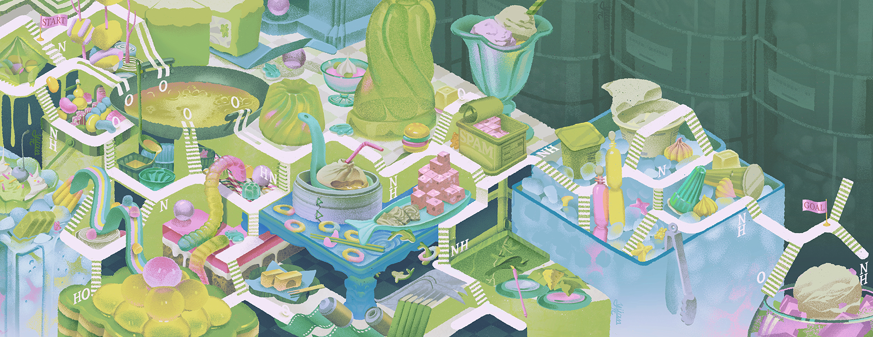
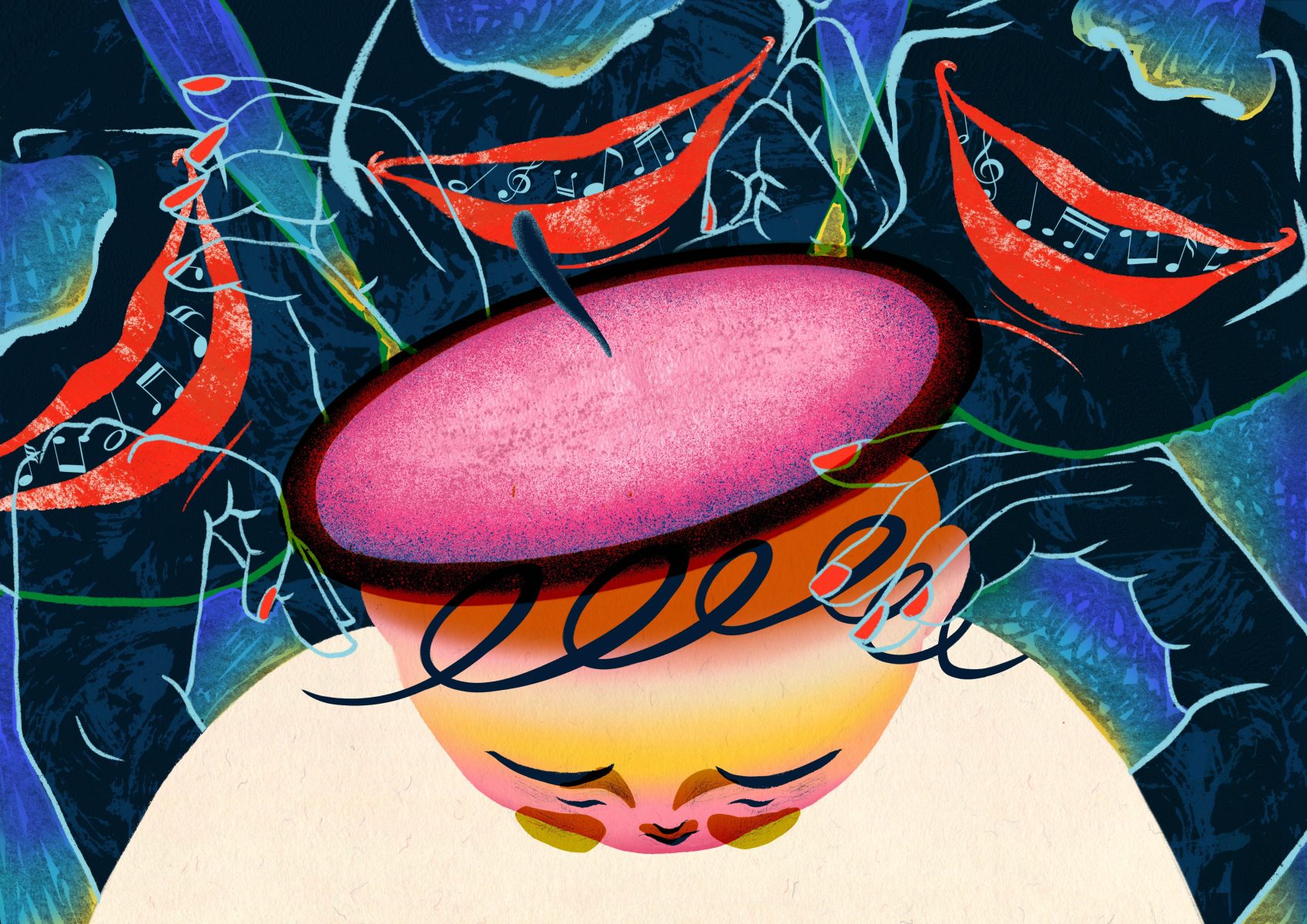
This detailed illustration explores exposure therapy, we asked Art Director Stephanie Violo for their thoughts.
“I appreciate the artist’s approach in addressing the issue of food additives and the health concerns they create. The abundant visuals compel viewers to delve into the images and identify the various chemical elements, thus raising awareness of this issue.
The artist maintains a distinct style that is consistent throughout the series.”
The World Illustration Awards is a global celebration of illustration.
The Association of Illustrators has run a juried illustration competition since 1976. The latest incarnation, the World Illustration Awards in partnership with the Directory of Illustration, has been going strong and growing since 2015.
WIA focuses on supporting and celebrating creativity internationally, by connecting illustrators with their peers and the global illustration industry.
The Awards are split into two groups: New Talent and Professional. All work, commissioned or self-initiated, is accepted across the ten categories as long as it has been created within the past year before the Call for Entries closes.
If you have any questions get in touch with the awards team awards@theaoi.com
The Association of Illustrators is the professional body for illustration in the UK. Established in 1973, the AOI champions illustrators and the illustration industry with education, promotion and campaigning to achieve a thriving industry for us all. Memberships are available for illustrators, agents and colleges with discounts available for students and represented artists.
Workbook’s Directory of Illustration, the world’s leading illustration resource, is distributed free of charge to thousands of art commissioners who regularly hire freelance artists and animators. Advertising agencies, corporations and publishing companies depend on the searchable directoryofillustration.com website and annual printed Directory to find top talent for their campaigns and projects. In print, online and on social, we help artists successfully grow and sustain their professional careers.