World Illustration Awards 2018: category Winner interview with Andreea Dobrin Dinu
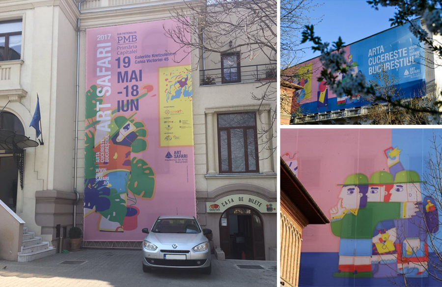
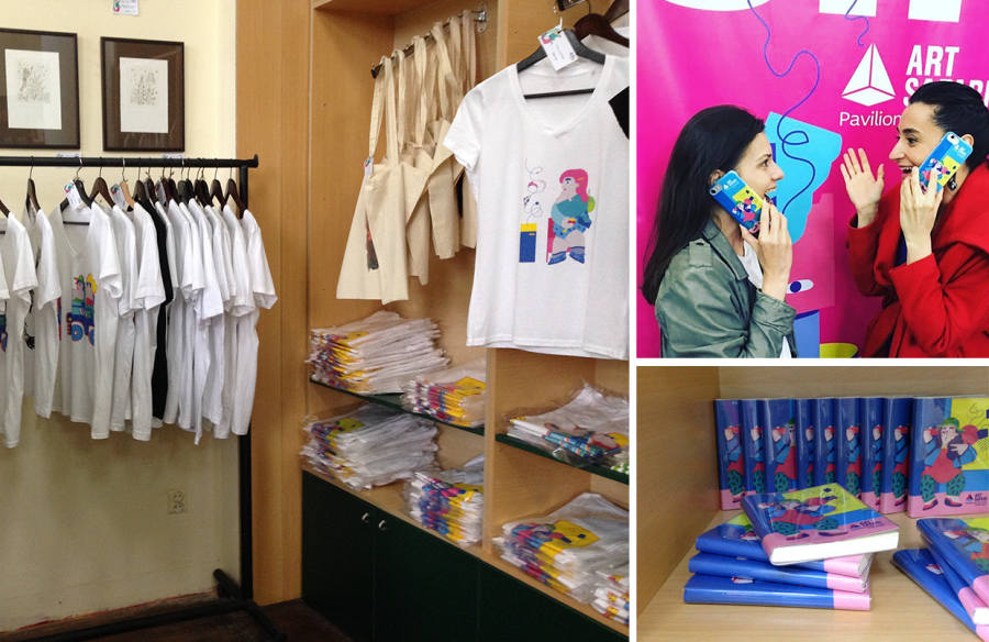
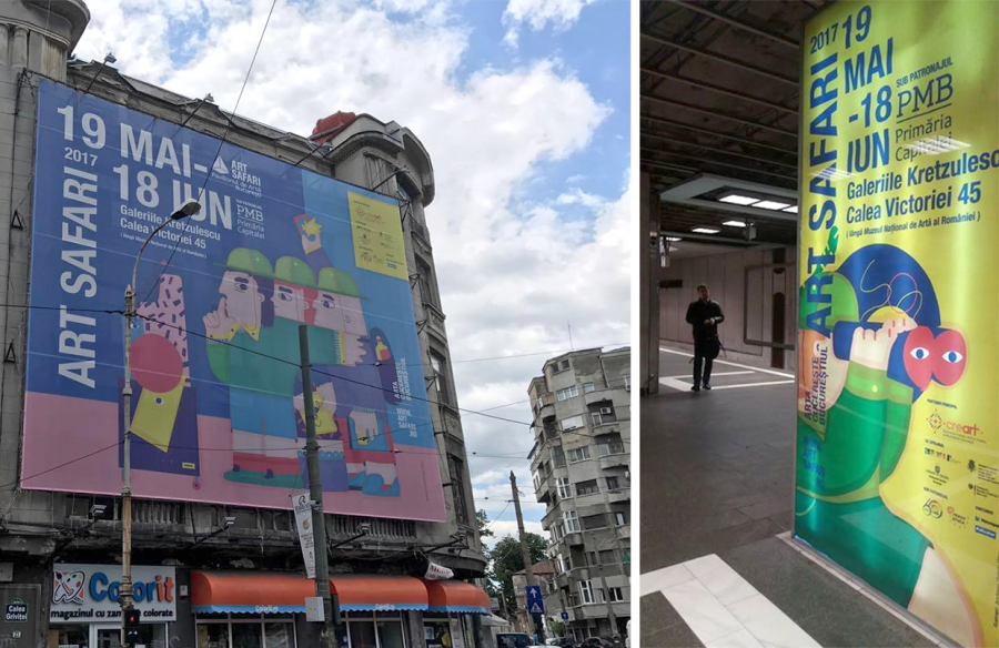
Andreea Dobrin Dinu is this year’s Advertising New Talent Category winner for her illustrations for Art Safari 2017, Romania’s largest art fair, featuring strong visuals to convey the fair’s tagline ‘Art Conquers Bucharest’. The illustrations were featured on posters, adverts, online, vehicles and promotional products.
About the Project
A series of illustrations were created to promote the Art Safari 2017 event in Bucharest, the biggest art fair in Romania. The illustrations represent different reactions or relationships that people have with art. They were used in a big promotional campaign on large banners, city buses and merchandise in the art fair’s shop.
Brief
The brief was not communicated in a very official, corporate way. The art curator and general manager of the art fair, Ioana Ciocan, allowed me a lot of freedom and the event itself did not have all the parameters set in place at the time I started the work. Location was not known, exact dates were not known, the list of exhibitors was not yet complete. I knew that in the end it would be a mix of contemporary artists and one large area dedicated to the great Romanian painter, Luchian (1868-1916).
The first thing I tried to keep in mind was that the public for this type of event is very diverse and its motivation to see or even collect art comes from very different places.
The second thing was that in all the illustrations I tried to catch a contemporary attitude towards art, one that may be considered a bit more superficial maybe, or less stiff. Art is surely a serious beautiful thing, but I was trying to portray that we as humans shouldn’t take ourselves too seriously in that context and for that reason to make art accessible to a wider audience, not just a thing for the elites.
Research
The best research was the fact that I had visited previous editions of Art Safari while I was still living in Bucharest. Additionally, I requested all the visual materials that had been produced to communicate the event up until that point.
Materials
Pencil and paper for the sketches (I’m a big fan of the 2B Caran D’Ache) and computer for the final illustrations.
Process
Nothing unusual, just sketching and then digital drawing.
Obstacles
Being in a different city and country than where the team preparing the event was didn’t create any special issues in the initial stages of the project, but as things developed and while the event was happening I definitely felt the need of a more direct contact.
Insights
It was and still is my biggest project so far in terms of public space exposure and with that comes a certain responsibility towards the city, one that I was not as aware of as I should have been until after it was over. Bucharest is a very crowded, visually mixed city. Having that combined with my very colourful illustrations may have been perceived as an additional aggression, especially when really large banners were used (there was one over 50m wide covering an entire building). While it was not me deciding the promotional plans, spaces and banner sizes I still feel now, in retrospective, that I could have been a better advisor.
Another thing I’ve learned is to be more careful or more informed about current socio-political and cultural events so that an illustration doesn’t transmit an inappropriate message by mistake. One of the illustrations in the series dedicated to art critics and their relationship with art depicted a man shooting his rifle at an artwork. In the context of art critique that may be funny, but just a few months before, a police officer in Ankara shot the Russian ambassador dead in an art gallery. Needless to say, the illustration was not used.
Distractions
While I was still working on a series of other small projects, this was the main one in the spring of 2017 and I was all in.
Numbers
10 illustrations / 3 animated GIFs / 1 coloring book / 50 m wide, the largest of the city banners / 2 city buses / 1 month art fair / 3 months of city takeover in total
Reflection
The project went beyond my expectations or better said it started very simple and ended up at a scale of exposure I did not fully understand in the beginning. And this was much better because I didn’t feel any pressure. It was just me and my sketchbook. A few months later, friends from Bucharest or even people I didn’t know started sending me pictures of my illustrations from all over the city and I was so surprised. Nobody knew about me in the illustration world before that as I had just officially started as an illustrator that previous summer. It definitely raised the awareness.
Advice
I never feel like I am in the position to give anyone else advice, I constantly feel like I have so much to learn. But I could answer this question by pretending that I’m giving the advice to a younger me: be brave, draw what makes you truly happy and put it out there. Maybe it sounds cheesy but it’s really that simple.
Notes
Andreea Dobrin Dinu is a Romanian illustrator, graphic designer and artist, currently living in Hamburg, Germany. Being first a Business Management Graduate, then a self-taught graphic designer, then a Fine Arts Graduate, finally she gathered up the courage in the summer of 2016 to start her own one-woman illustration graphic studio, called SUMMERKID, to refocus her professional practice and officially become… an illustrator. She invented a new bright visual language especially for her studio that could be summarized as a certain joie de vivre that only a kid knows in summer vacation. She now “speaks” SUMMERKID with like-minded life enthusiasts from various magazines, publishing houses, events and products.
See the work of all the shortlisted and winning projects for the World Illustration Awards 2018 here.
Back to News Page