Printmaking and collage allow for a unique richness and complexity, with the added creativity that the immediacy of these techniques can bring to a project.
Printmaking and collage techniques can be used for illustration in many ways, from incorporating found images and photographs, to exploiting the textural qualities of printmaking techniques such as screen printing and risography to create to create tactile, layered effects.
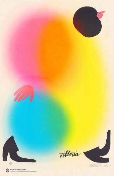
Amber was commissioned by Facebook for their Designer In Residence program for this project showing how women experience the workplace. Using Facebook’s onsite Analog Lab facilities, each piece was printed by the artist in a limited edition using a Riso 591 U printer. The number of colours varies from 3-5 spot-colours per print. This exciting project utilises the bright colours and bold shapes made possible by risograph printing to great effect.
Amber Vittoria is a Forbes 30 Under 30 artist working in New York City; her work focuses on the portrayal of women within art, and she has collaborated with like-minded brands, such as NBC, Warby Parker, Gucci, The New York Times, and Instagram.
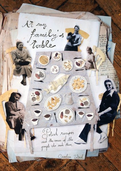
Cecelia’s book cover uses copies of her family’s original recipe collection including handwritten notes, and family photos, as collage material to create this illustration. The collage was assembled by hand, using layers and different heights to create depth, and then photographed in dusty sunlight to create the final image which is celebrates the past in a contemporary way.
Illustrator/Designer Cecelia Wood is currently studying in at EINA Centre Universitari de Disseny i Art de Barcelona (UAB). Originally from Yorkshire, she graduated from BA Illustration at Cambridge School of Art. Cecelia loves to stretch the idea of illustration into 3D, and sees anything around her as a material.
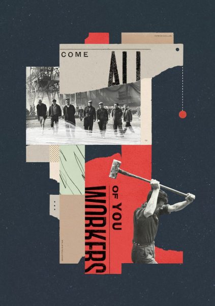
Matthew was commissioned by the food and history magazine Fare to create a series of collages for their “Glasgow” edition that ran alongside the lyrics to Ed Pickford’s folk song.
Using collaged materials including handbills, newspaper and photographs, this illustration uses the aesthetic of mid-century design to create an atmosphere reminiscent of the colourful social history of Glasgow. The collages use a constructivist style creating a bold, impactful design using red as an accent colour to communicate the socialist politics of the article.
Matthew Hancock is an award-winning designer and illustrator from London. Over ten years he’s worked with clients ranging from tech giants to charities, scientific research bodies to fashion houses; and on products ranging from fine china crockery to legal marijuana. He is represented by Bright Agency.
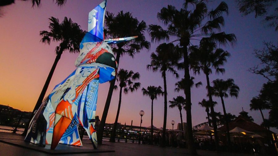
Nancy Liang and Fiona Lu were commissioned by the City of Sydney to design the rabbit lantern for the The Sydney Lunar Festival 2020, one of the 12 animals of the lunar zodiac. The festival features a series of illuminated sculptures installed in an outdoor display. This 3 dimensional piece uses collage of cherished candy wrappers, traditionally given to children during the Lunar New Year. The rabbit takes the form of a huge lantern, echoing the traditional Chinese lanterns displayed at New Year. The collage takes the form of a map, using colours of red, white and blues to mark out the land and ocean, with details added in cut paper.
Nancy Liang is primarily a collage artist who uses drawing, paper cutouts and animation to explore Australian urban landscapes, while Fiona Lu is an interdisciplinary artist that explores the ‘in-between’ of Chinese and Australian culture through her art practice. Collaborating together, both Australian born Chinese artists integrate their Chinese cultural experiences of growing up in Sydney. They explore icons of childhood nostalgia through re-imagined forms that spring to life.
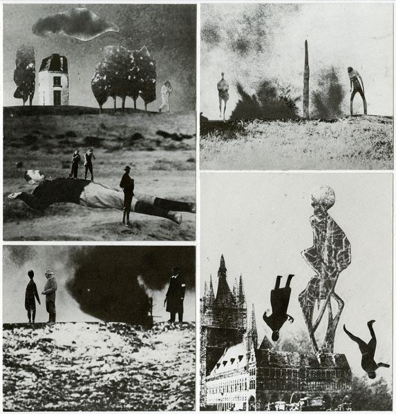
Nick’s collaged illustrations were made to accompany his album titled The Fall of The Human Empire. The collages use traditional collage and photomontage techniques using images from old books found in charity shops. The works are led by the theme of the album, approached intuitively depending on the images found The black and white images have an almost nostalgic quality underlined with by a sense of foreboding.
Nick Mott is a senior lecturer at Falmouth University, where he has worked since 2011. He previously worked as a freelance illustrator with clients including The Guardian Weekend magazine, IPC Media, Resurgence magazine, Policy Press. His visual practice runs parallel with a long music career as a founder member of the underground music group Volcano The Bear.
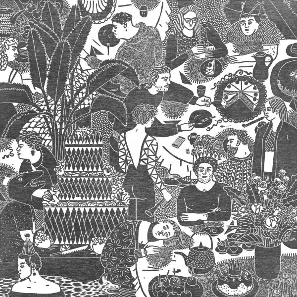
Rosanna’s portfolio piece depicts people celebrating in a variety of ways, in this highly detailed, patterned image. The work is created by woodblock printing, with the image drawn and then cut, and finally printed on paper. The woodcut technique is perfect for this arrangement of complex patterns, while the texture of the woodblock adds depth and warmth.
Rosanna Merklin was born in Berlin and studied illustration at the Academy of Fine Arts in Leipzig. She returned to Berlin in 2013, where she specialises in the technique of woodcut printing.
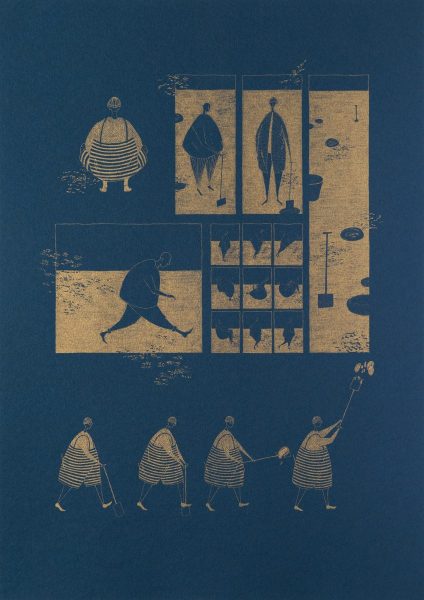
Rosie’s illustrations for the ‘The Distance of the Moon’ use risograph to reimagine this short story by Italo Calvino as a comic. While risography is usually favoured for it’s clear, bright colours, Rosie instead chose to use flat gold ink on dark blue paper to create an evocative and otherworldly feel. The illustration began as pencil drawings, which were then scanned and printed using the quality of risograph printing to create texture and depth.
Rosie Leech is an illustrator and designer currently based in the UK. A recent graduate of Edinburgh College of Art, she has illustrated for Salt and Wonder, Like the Wind, and Counterpoint Magazine, amongst other work.
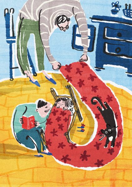
Severus Lian’s children’s book project shows an ordinary joyful life in a family that has two dads, Jack and Mike. The images are created using both monoprinting to create textures, with collage and digital drawing, a great example of the vibrant and charming effects that can be achieved using mixed media.
Severus Lian is an illustrator from Taiwan. She studied MA Children’s Book Illustration at Cambridge School of Art, due to graduate in 2020. She loves using mono print and digital art medium to combine and create new art works. Severus is dedicated to creating picture books, and she especially loves designing characters and creating fun stories full of humour.
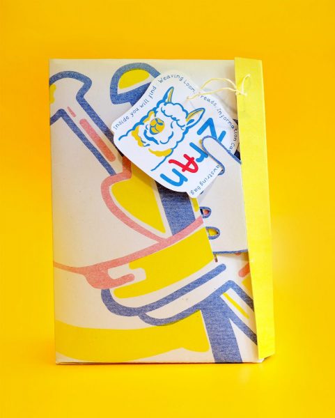
Sophie Cane’s project is an educational kit for children that aims to raise awareness of the impact of the textile industry and fast fashion on the environment. It’s created using completely sustainable and recyclable materials, with the illustrations screen printed onto fabric using natural vegetable dyes made by the artist, and the paper elements are risograph printed using soy based inks. The colours and shapes are playful and the final product is tactile and inviting for children to use and engage with.
Sophie is a recent graduate of BA Illustration, which she studied at Norwich University of the Arts. She is now continuing her studies on a one year Masters Degree investigating Communication Design. Her work explores environmental and historical themes and is always executed through the use of vivid, striking colours and playful designs.
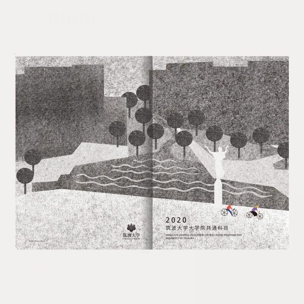
Zhang Wen Jun’s book cover is made using traditional printmaking techniques including woodblock printing, which were then scanned and collaged digitally in photoshop, with freehand drawn elements added on top. The textured printed papers have an understated elegance, with the handmade quality clearly in evidence. The tiny pops of colour for the cyclists add another interesting dimension to the work.
Zhang Wen Jun graduated from Xi’an Academy of Fine Arts in 2015, majoring in printmaking, and she is now studying at the University of Tsukuba, Japan, Graduate School of Visual Communication Design.