Image Type: multiple
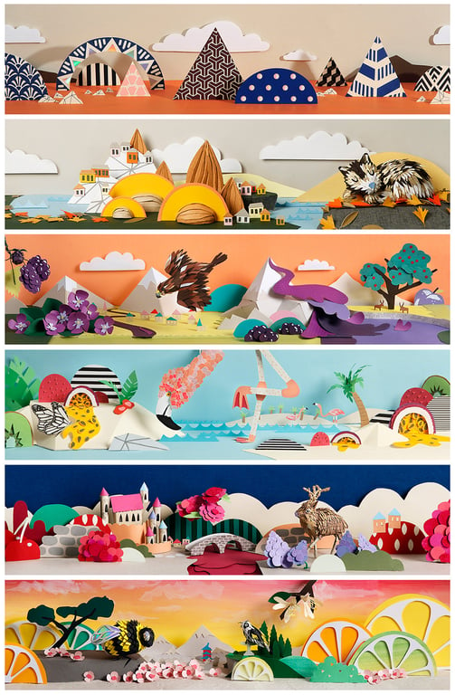
Usage: x6 Wine Label illustrations; Website full page + spot illustrations; Social media; Promotional flyers; Product set design used for social media. Original 3D artwork displayed in perspex boxes at Ten Miles East's offices in Australia. All Ten Miles East wine is selling in Australia, Asia and Europe.
Process: I initially came up with a mood board for each of the six different wines after I had all of the information about their character. The mood boards helped me to form a clear idea of the content and colours that would need to be included in each illustration.
Based on the mood boards I drew lots of thumbnail sketches and choose the ones which worked best in terms of composition.
I chose the final colour palette with x7 colours for each illustration. Consciously keeping the colours true to the wines character. I coloured the sketches in digitally so I had a clear idea of how they were going to look.
Each of the six final sketches were blown up to the full size on Silhouette Studio. I separated the work into layers by colour coding the lines.
Most repetitive shapes were cut out on the cutting machine and for one off unique shapes I drew and cut with a craft knife by hand.
Most objects were cut out on scrap white card to allow for mistakes and final refinements before they were all cut out in neat.
I layered all of the final cut-outs onto a platform. This was then professionally photographed and edited to arrive at the final images.
Materials: Paper, Foam board
Formats: Six different 65cm x 20cm x 20cm paper sculptures were professionally photographed and the artwork exists on six different wine labels.
Also for the set design - six different sets were made using selected colours from each piece of artwork and a few elements from the artwork was used.
Brief Requirements: Ten Miles East are an artisan vineyard and winery tucked in a Norton Summit valley within the cool climate of South Australia’s famed Adelaide Hills.
They created six small-batch wines, handmade in the European way that they fell in love with whilst travelling the world.
I was contacted by The PDCO who created their branding and they gave me the following brief: Design six illustrations which will go on the wine labels for Ten Miles East's six small-batch wines. Each illustration needs to capture the unique identity of each wine. They should look friendly, quirky, magical and also show elements of the natural world.
Wine characters and descriptions:
Riesling - Fresh and zingy citrus and florals, limey character with honeysuckle.
Arneis - Crisp and textured, with stone fruits (apricots) and sweet nuttiness (almonds). A lovely floral white variety from Northern Italy.
Sauvignon Blanc - Tropical: lychee, passionfruit, Green fruits: gooseberry, kiwi fruit, figs. French in style, echoing Sancerre.
Pinot Noir - Mid-weight red variety from Burgundy: Lifted berries, ripe strawberry, and structure of tart cherry.
Saperavi - Red variety from Georgia (as in former USSR, not the American state famous for peaches). Bunches are huge with only 2-3 per vine so the wine is super concentrated. Savoury in flavour with good tannins and structure. Only a handful of varieties that has red flesh as well as red skins, which means that the inky purple red colour is really deep and intense. Violet aroma over dark fruits like cherry and mulberry.
Syrah - Planted on really hard, inhospitable, gravely ironstone soil. These vines really struggle like they do in Cote Rotie, which makes superbly savoury and complex wines. We are slowly winding back the irrigation to make the vines dig deep so they can tolerate the hot summer days better. At our site the Syrah looks completely different to the big, sweet traditional styles; ours has a good tannin structure with savoury fruit. Leather, peppery, plum and blackberries.
Key Brief Ideas: After learning quite a lot about Ten Miles East as a brand, their philosophy and their range of wines, the ideas seemed to fall into place quite easily.
Ten Miles East firmly believe that great wines are grown, not made which made me think a large part of the illustration should be themed on the natural world.
Each of the wine’s characteristics are summarised in a brief description and these descriptions are based on where the grape comes from, what flavours it inherits and what types of soil it's grown in. For example: Crisp and textured, with stone fruits (apricots) and sweet nuttiness (almonds). A lovely floral white variety from Northern Italy. So these are the what I based my illustrations on. I decided to make each illustration into a panoramic landscape representing where the grape comes from and showing some of the flavours that are associated with each wine. Panoramic landscapes worked really well with the wide dimensions that I had to play with. Oversized fruit representing some of the flavours, and animals native to the grape’s source were added to the landscapes to create a rich and descriptive scene with an element of surrealism and wonder.
Commissioned For: Ten Miles East
Commissioner Company: The PDCO


