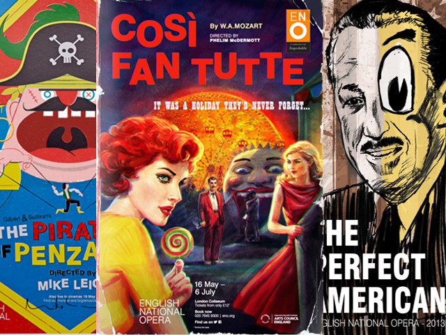
English National Opera (ENO) frequently use illustration in their promotional imagery with the aim to make opera open and accessible to anyone. For Varoom‘s Play issue we spoke to Claire Round, Director of Marketing and Brand at ENO, who says, “Appealing and engaging illustrations that capture people’s attention are certainly one of the methods that we use to communicate that message.” Commenting on the playful sides of Cosi fan Tutte and The Pirates of Penzance she adds “Both productions are comedies and have a light, humorous tone, so it’s important that the poster images reflect that – while also working as a great piece of art in their own right.”
Varoom online shows the ENO posters created for Cosi fan Tutte, The Pirates of Penzance and The Perfect American, and asked the three illustrators involved, Sam Hadley, Toby Leigh and Dylan Hewitt, about the poster commission and how play comes into their work. This includes pulling faces into a webcam, messing about with colour and just being silly. Their responses, along with more comment from Claire Round on the creation of ENO’s marketing visuals, are below.
Claire Round – Director of Marketing and Brand at ENO
Varoom: What brought you to commissioning illustration for this season of operas?Were you looking for a lighter tone?
We frequently use illustration in our promotional imagery, and that decision is usually taken on a production by production basis. The marketing department, who commission the poster designs, think about the message we want to convey to potential audiences. We also liaise with the production’s creative team for the production – usually the Director – to understand their vision for the work on stage. Following those conversations, we work with a designer to develop a concept for the poster and the most appropriate image style to create that.
With Cosi fan tutte, we wanted to reflect the production’s playful concept and stylish design. The poster concept was inspired by 1950s pulp fiction and was an interesting way for the world of the Coney Island boardwalk (where the production was set) to be displayed in an advertising environment. We were really pleased with the way Sam Hadley’s illustration achieved this.
The Pirates of Penzance is an incredibly silly and playful comic opera, so it was only fitting that the poster image reflected that.
Varoom: Did you want to inject a sense of playfulness into the poster/promotion campaign?
Both productions are comedies and have a light, humorous tone, so it’s important that the poster images reflect that – while also working as a great piece of art in their own right.
Varoom: Was this approach appreciated by the opera audience and ENO?
The images had a great response from our audience, with many people tweeting photos of the images or writing in asking to purchase their own copies. We were also delighted when Creative Review selected the poster for The Pirates of Penzance as one of their ads of the week saying it was ‘doing a great job of cheering up the hallways of various stations on the London Underground’
Varoom: How does Play manifest itself in the world of opera? (it can appear quiteserious from the outside)
It’s true that some productions can be serious, as opera is often dealing with big themes. But not always – Toby Leigh’s illustration is for our recent production of Gilbert and Sullivan’s The Pirates of Penzance, which is a quintessential British comedy. Mozart’s Cosi fan tutte is a comedy about desire, deceit and mistaken identity – and Phelim McDermott’s production certainly had many playful elements, including a troupe of circus sideshow characters and line-dancing cowgirls! ENO’s goal is to make opera open and accessible to anyone, and part of our task is to try and remove the cultural barriers that can exist around it, and show people what a brilliant and memorable experience it can be to watch one of our productions. Appealing and engaging illustrations that capture people’s attention are certainly one of the methods that we use to communicate that message.
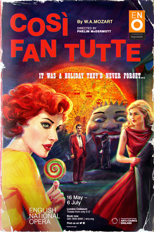 Cosi Fan Tutte
Sam Hadley at Artist Partners
Illustrator
BRIEF:
A 4-sheet poster to advertise the English National Opera’s new adaptation of Cosi Fan Tutte.
IDEA:
This new version was to be set in 1950’s America. The poster should have the warm retro feel of a 1950’s pulp fiction book cover. I was given descriptions of the main characters and a thumbnail layout from the Art Director, Michael Brigdale.
MATERIALS:
After initial pencil sketching I used Photoshop to paint the final artwork.
RESEARCH:
Obviously there are a huge number of incredible classic pulp fiction book covers out there. I picked a few to give me the right ‘feel’ of the brush strokes and colours etc. Then I needed some generic fairground images.
PROCESS:
After the sketch stage I photographed someone in the pose of the main character to help me place the lighting. The other smaller characters were just worked up from the sketch. I work in much the same way as if I were painting on a canvas. Blocking in the background and underpainting first, them moving forward adding detail as I go. Michael applied the worn paper effect to the edges and designed the type.
RESISTANCES:
There was some discussion about the expression of the girl on the right. Initially I had her looking uneasy, but we decided she shouldn’t be feeling threatened, she should be ‘knowing’. I was quite happy with the outcome.
INSIGHT:
As ever, good reference is invaluable when painting faces. If only for the lighting.
DISTRACTIONS:
Twitter. (@SlumberBean)
NUMBERS:
2 sketches, 3 days to paint
PLAY:
Playing with paint. Even if on screen. Messing about with colour combinations. Rough broad strokes and fine considered ones.
Sam Hadley website Artist Partners website
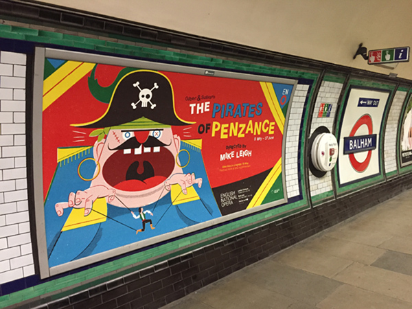
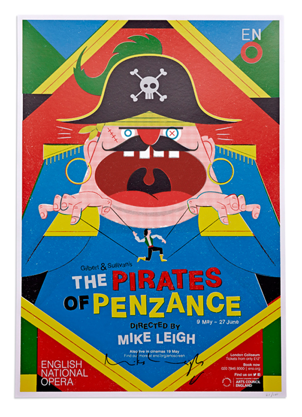 The Pirates of Penzance
Toby Leigh
Illustrator
BRIEF:
To create a poster for Mike Leigh’s production of The Pirates of Penzance. The ENO were keen to appeal to wider audience than the normal ‘opera’ crowd. It also needed to reflect the comic nature of Gilbert & Sullivan’s opera.
IDEA:
I wanted to create a poster that created a visual slap in the face. It was primarily going to be seen within the crowded environment of the tube, so it needed to be bold and simple.
The main theme of the show is the overbearing, larger than life Pirate King controlling Frederic, so I wanted to capture that narrative in an instant.
MATERIALS:
Pencil, illustrator and Photoshop. I also created a limited edition run of 100 four colour screen printed versions of the poster all of which were signed by Mike Leigh. They can be purchased here. http://www.tobatron.com/shop.php
RESEARCH:
I looked at lots and lots of examples of past posters for the show from the last 100 years. I also looked at costume designs and watched versions of the show on YouTube and DVD.
PROCESS:
I always begin this sort of piece in my sketchbook, drawing lots of different versions with a 0.3mm mechanical pencil. They are then scanned and traced in illustrator. Then coloured in Photoshop.
RESISTANCES:
Mike Leigh also happens to be my dad, so there was the added pressure of wanting it to be really good. Also you don’t won’t people saying, “That poster is rubbish, and he only got the job ’cause his dad is the director”. Thankfully most people seem to like it.
INSIGHT:
I learnt a lot about how hard it is to create 4 colour screen prints. Puck studio in Dalston, East London helped me out.
DISTRACTIONS:
When I’m working I like listening to podcasts: RadioLab, WTF, Hardcore history, This American Life..
NUMBERS:
30
Number of oranges squeezed into juice by Mr Portakal aka Mr Orange during the project. He’s based opposite my studio and sells orange juice out of a cupboard. I go there most days.
PLAY:
When I’m drawing characters with exaggerated expressions I often act them out at my desk as reference and look at myself on my webcam. Proper oddball stuff.
Toby Leigh website
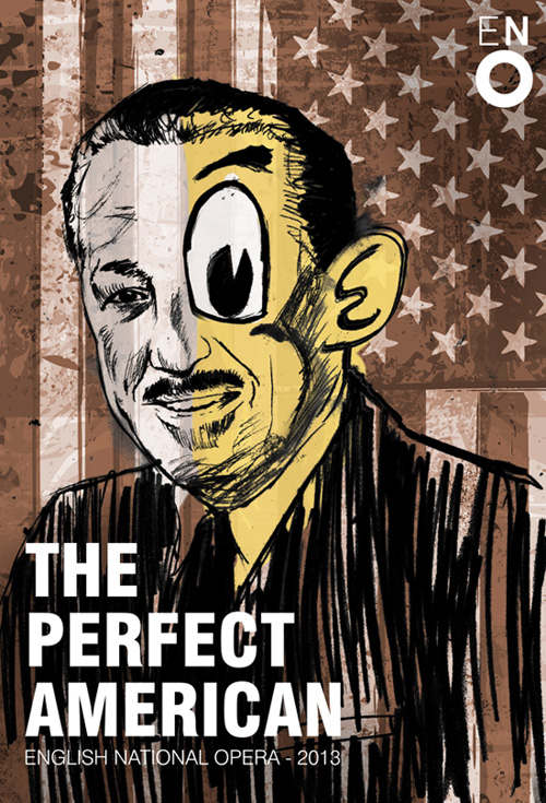
The Perfect American
Dylan Hewitt
Illustrator and Creative
BRIEF:
The ENO briefs were always very open. It was always going to be a poster but other than that it was pretty much – ‘do an ad for this opera’. I work in an advertising creative team and for all the ENO posters we did (illustration or not) the general brief was to make the operas more accessible. Giving people a better idea of what the opera was about from the poster seemed a good start.
IDEA:
Clearly the opera was going to be a dark take on Walt Disney’s life. So the idea was to hint at a darker side behind the super perfect Disney technicolor persona.
MATERIALS:
Very rough Pencil drawing. A scanner. A touch of Photoshop for some rough colouring.
RESEARCH:
As the opera hadn’t been performed at the time of creating the poster, all there was to go on was some great conceptual stage designs, a synopsis and the original book itself. And a lifetime of Disney film watching too.
PROCESS:
The process on this one was fun. A lot of doodling. A lot of rough drawings of different Disney characters and then eventually Mr Disney himself. The drawing needed to be rough and far from the cutsie-perfect Disney animation style. The merging of Walt and Mickey came about from the doodles. Adding the bulbous Mickey Mouse eye seemed to say it all.
RESISTANCES:
There really wasn’t any resistance on this one. In fact on any of the ENO posters. Certainly not from the client. Always open to whatever was presented.
INSIGHT:
Sounds obvious but it’s nice to have it re-confirmed – It’s often best for the illustration to be simple. The idea is the most important thing.
DISTRACTIONS:
The heat in the room with no air-con. I think it was summer at the time.
NUMBERS:
3. The number of walks to the fold-up bike shop during the project.
PLAY:I’m not too bright. So I try to be silly as often as possible. I’ll always go for something playful over something clever. Again, probably because I done not be too bright.
Dylan Hewitt Behance