With the Tour de France in full swing Peter Allen interviews Nick Higgins on his new cycling book, ‘Racing Bicycles, The Illustrated Story of Road Cycling’ published by Laurence King ISBN: 9781786271662
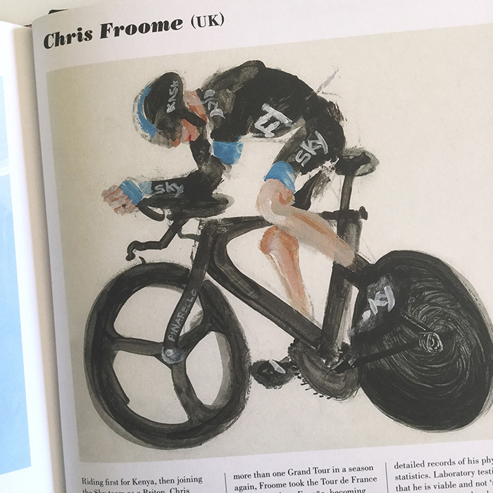
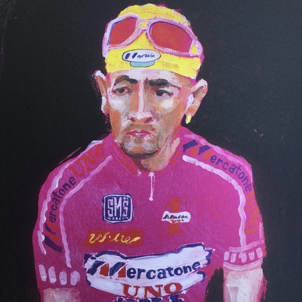
In his book Racing Bicycles, Nick Higgins describes in both words and pictures what cycle racing looks like from the inside, what it feels like to be a cycling fan. It succeeds, like Nick Hornby’s Fever Pitch, in describing a passion, in all its nerdiness, in such a way that it appeals just as much to those who are a part of it as those who aren’t at all. Watching cycling on the telly is not quite the same experience as seeing riders go by from the side of the road, not only do you witness the spectacle of the riders incredible strength, but also you become conscious of a rider’s weakness and fragility. There is a remarkable quality in the paintings and drawings that combines both expression in the looseness of the brush marks with almost photographic like accuracy. Nick Higgins set out to make a book that is both vision and insight into the sport of road cycling that looks just as good as it feels…
How did the book come about, was it a personal project to start with or did the publisher commission a whole new body of work?
Nick Higgins: My commissioned work had been digital for several years and I wanted to work with ‘dirty media’ again, on a drawing project. I set out to do pencil portraits of every winner of the Tour de France as I have followed the Tour for years. I did all the portraits in series of A5 Moleskine notebooks and when finished I worked with the whole set a little, colouring them in Photoshop, then put them all together as a ‘poster’ and collected on a card a few of my favourites which I sent around to art directors. Angus Hyland, at Pentagram sent me along to Laurence King Publishing where I was invited to put together a proposal. I came back with an outline for a book on racing cycling. They asked if I wanted to write it, expecting that as an illustrator I would basically just do captions, but I was way over, they did not however cut much at all.
Incidentally, the ‘Every Winner of the Tour de France’ was all made in the little pieces of time that are otherwise lost. I try always to have something to do that it immediate and easily handleable, that can be done in the odd 2, 5 or 10 minute bits of time the between things. I’ve sewed a lot in these times, did Every Cyclist… and several other projects. These are things that otherwise I would not have devoted time to, but in fact evolved into some significant pieces.
How do you connect with the subject, are you a keen cyclist and illustrator, or a keen follower of the sport and illustrator, or illustrator without prior knowledge of the subject?
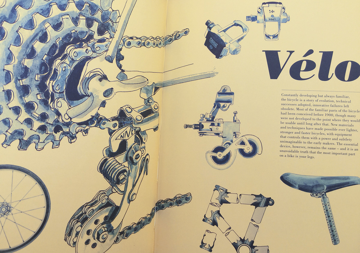
I am a very keen cyclist and this was what made the whole thing take so long to do – this was personal. It mattered to me greatly that a wheel should be seen to be tangentially laced; radial lacing is so often the illustrators easy way out. I have always felt that it is hardest to work on material that is closest to you. You care so much more that you get it right, and you have so much that you want to say in your work, to communicate the complex and important relationship you have with it. The bulk of the commercial illustration I have done has not had personally significant content in it, however much effort is put in to provide a high quality and satisfactory solution to the client. It really was very different doing this book, it did not feel like an illustration commission at all, in that it was so open ended.
I had to do a lot of research for the book, a lot of technical and narrative stuff, and I hadn’t written a book before. I needed to come up with some unfamiliar facts, items, histories, because there are many stories of cycling that everyone knows as soon as they take an interest, I needed this to keep the attention of people who already knew the obvious stuff. I suppose all along I was trying to get down in words my excitement and enthusiasm for the sport and the machines. Having been an illustrator for a long time it was also exciting to take on something completely new, in writing the text.
How tight was the brief?
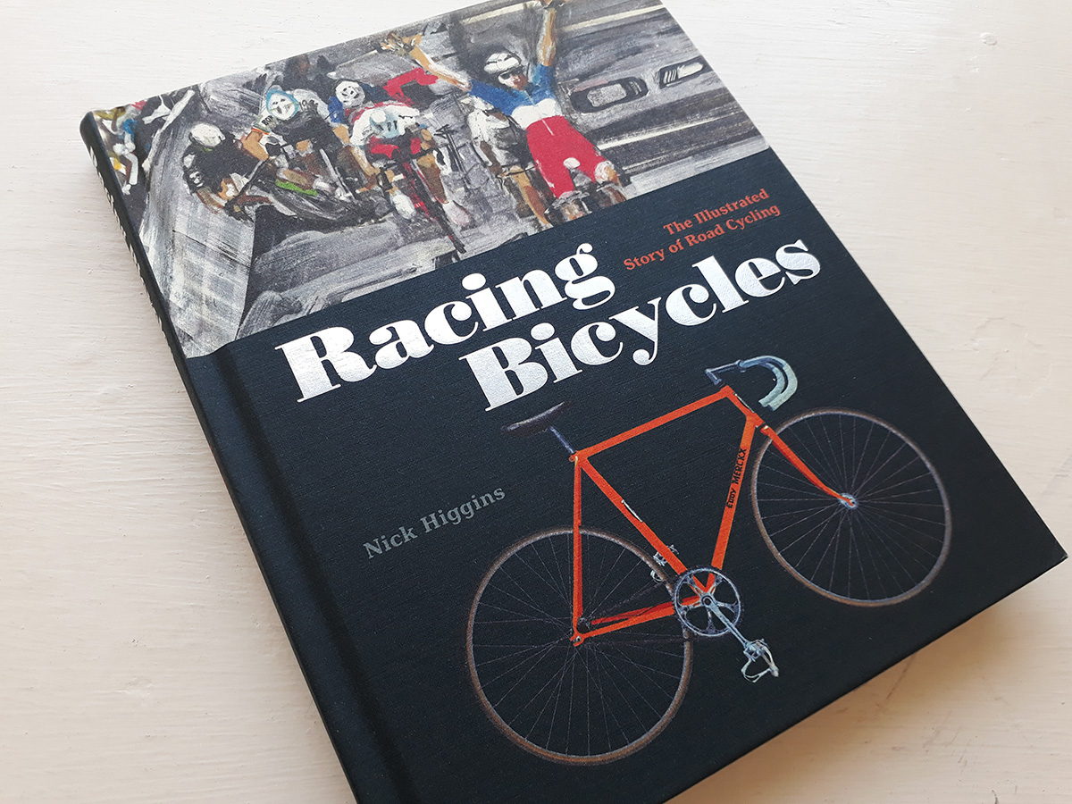
Really as loose as it gets. ‘Write a proposal for a book on cycling.’ I started to work on images straight away, but the structure took a little longer to be worked out, so there are some pictures that just sort of fell into place later, often put there by the designers. The cover was achieved by accident when Angus happened across a picture in a notebook I had left at Laurence King. Never having done a whole book before, I really had to make it up as I went along, getting faster and more focused as it continued, and I had a more exact knowledge of what I needed.
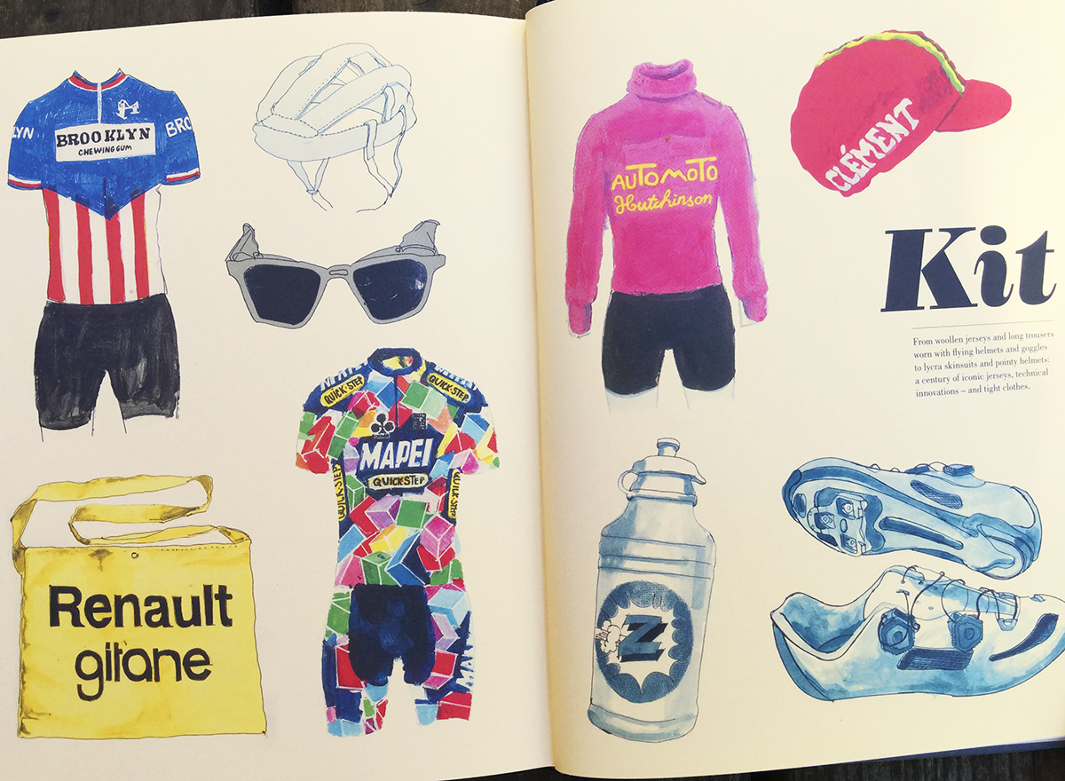
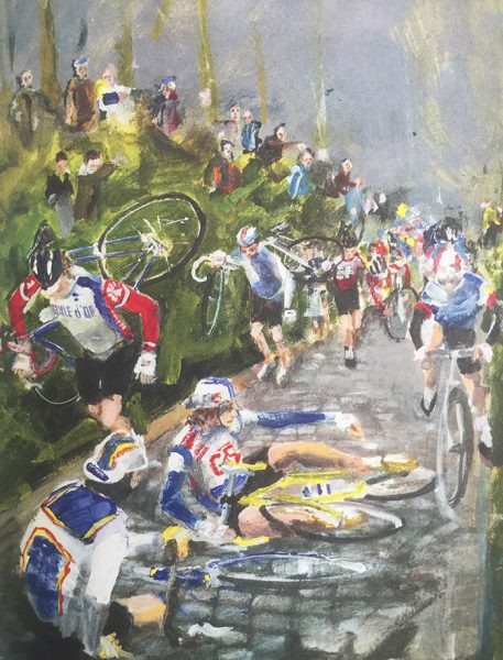
The illustrations in Racing Bicycles range from very technically detailed line drawings to atmospheric, painterly impressions. Did you have free range to treat each image intuitively or did the AD specify where to employ a particular style?
I had pretty much no art direction on this at all. The book is split into sections, some quite technical, some more narrative. The different styles suited the different areas of information, and give the book variation in tone as you go through it. The only picture they did get me to drop was a melodramatic representation of Luis Ocana’s crash, rendered as a very dark crucifixion. I had wanted to do this for some time, but they were right, it did not fit this book.
Why do you think illustration was preferred for this book in place of the more usual photographic imagery?
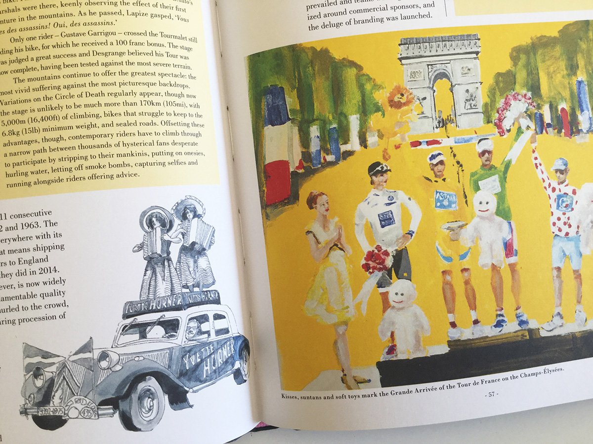
There are many photographic books of cycling, and many of the images are genuinely iconic, in that they are so familiar and have become the ubiquitous view of a particular event or person. There are also a lot of very graphic, digital cycling themed artworks around. I think approaching it with illustration meant I chose other images, and adapted many away from the familiar. Painting and drawing gave it a more personal feel: it is a book by a fan. As a history, it also gives it a different feel as a book, closer to a lot of the historical material it describes. Similar images might have been made in past decades, and in fact in my mind the illustrated encyclopaedias of the 1960s were an inspiration. The cover I was very happy with as it turned out, it showed that illustration could work with the most up to date events. It showed something that happened in 2017, but I moved things around a bit to actually present more than a photograph could have shown.
How does the book relate to your work in general, for what particular qualities of yours do you think you were chosen as the illustrator for this project? theme? portraiture? technical detail?
In general…hmmm. I am all over the place really, but commissioned work is so rarely closely related to personal obsessions. It was a rare coming together of commission and personal interest, a fabulous opportunity. Nerve wracking, in that having got the chance I then had to come up with the goods. It took me some time, some way into the project, until I really believed that I would be able to do it technically. I had painted and drawn a lot before, but the tight, technical stuff was very new and different. I had always been a very loose, gestural painter, so had to learn some new skills, like putting a paintbrush into a compass, and cutting paintbrushes down to a few hairs to draw spokes. I had to find my inner nerd.
Does it signal a new direction for your work compared with previous work?
It does. I have a couple of good regular digital jobs, but it re-introduces me as a painter, and as someone who can generate original material. And write. I would like to do more cycling work, for reasons which are obvious, and I would be happily commissioned to make similar work on other sports. I have done some work for Rouleur magazine since Racing Bicycles came out, which is very satisfying as it’s such a great magazine and so well served by great photography. I would also like a high end bike company to give me free bikes, but I don’t know why they would do this.
What have you learnt from working on this book that broadens the scope for future commissions or might inspire new (self-initiated perhaps) projects?
I have always made self-generated projects at various stages, but not had them published. I have an almost complete version of the Epic of Gilgamesh which has never seen the light of day. Having done this I know that I can conceive, structure and produce a sustained piece of work. The main problem with moving on with personally generated projects would be economics. Racing Bicycles took so long to produce and there is so much material in it that it’s a wholly uneconomic proposition. It really is a labour of love as it stands, and would have to become extraordinarily popular to earn back the time and effort spent on it. I think we can all come up with projects, but to make them pay is hard. A new book would be a tighter concept. I am lucky that cycling has never been so popular, so I can expect some advantage from that. My book on lacrosse might be harder sell! Being quite various in my attentions though, the closest I have come to a pitch for another book is a quite technical one on sewing. Really.