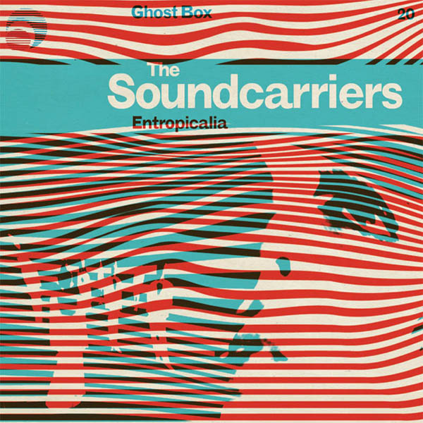
Designer Julian House for his Ghostbox label. Great sleeve art is a sound carrier.
For our Hermenauts issue, we asked illustrators Ellen Weinstein, Ian Wright and Olimpia Zagnoli, designers Mario Hugo and Silvia Sfligiotti and journalist and editor Mark Richardson to reflect on the interpretive power of great sleeve art. John O’Reilly reflects on the creative fold of sound and image
Great album art sits between communication and the conceptual, it needs to deliver a commercial need but what great illustrated sleeve art also does is deliver to the fan the visual tools to understand the music.
Peter Blake’s Sgt. Pepper’s collage had images of the Fab Four, but it also pictured a relationship between art and world, between the semi-fictional Beatles and fully fictional Sgt. Pepper’s.
It visualized a relationship between the chemical and aesthetic, between the real and the surreal and most of all, the collage signaled an experimental production process that glued together different sonic layers and different kinds of storytelling. Through Blake’s collage the cover introduced the pop listener to sampling, to the sampling of sounds on the songs, and to the horizontal dynamic of pop culture and new technology, where history could now be re-arranged.
Blake’s cover was a map that guided me through an expanded soundscape of pop, his image was an interpreter that helped me understand the rich pop pageantry of Pepper’s.
Then again, like any music fan, our favourite artwork is often the image of a current obsession. Hence the sleeve art above by Julian House for The Soundcarriers, a woozy, shimmering wave of motorik, entropic psychedelia currently shaping my listening – great sleeve art as a sound carrier.
So we asked a really interesting mix of creative people – illustrators, journalists and designers – to tell us the story of a piece of sleeve art that made an impact on them. So below, there’s great insight into creativity, dreamy drifting on precious moments in time, and most of all a celebration of the power the image-maker and musician has to transport us emotionally to very a different place.
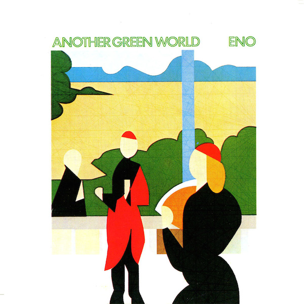
Sleeve design by Brian Eno and Tom Phillips
1. Olimpia Zagnoli
Brian Eno, Another Green World
Sleeve design by Brian Eno and Tom Phillips
The first time I came across Another Green World it was summer. I’ve always listened to Brian Eno, distractedly before, but eventually our satellites collided. The weather outside was nice enough to be able to listen to music and keep the windows open at the same time. I think this element was crucial for me. I’m a real snob when it comes to music and album covers, and this is an album that doesn’t fail on both sides. Musically it’s genius mixed with banana leaves and digital snakes. Eno composed most of it guided by his Oblique Strategies cards, which together with Earl Grey are like the bible of every contemporary artist. The cover is a detail from artist Tom Phillips After Raphael, a painting he did in 1972. Phillips was a professor at Ipswich School of Art when he met his student Brian Eno and introduced him to the music of John Cage. I like how clean the cover is with its white border and the thin green typography. The figures remind me of a Raphaelite version of Devo. And I think the word “Eno” goes well with any picture shot on this planet. If I had to pick three artists I would love to work on an album artwork with they would be Bowie, Byrne and Battiato. I don’t know why I said that, I thought they sounded nice together.
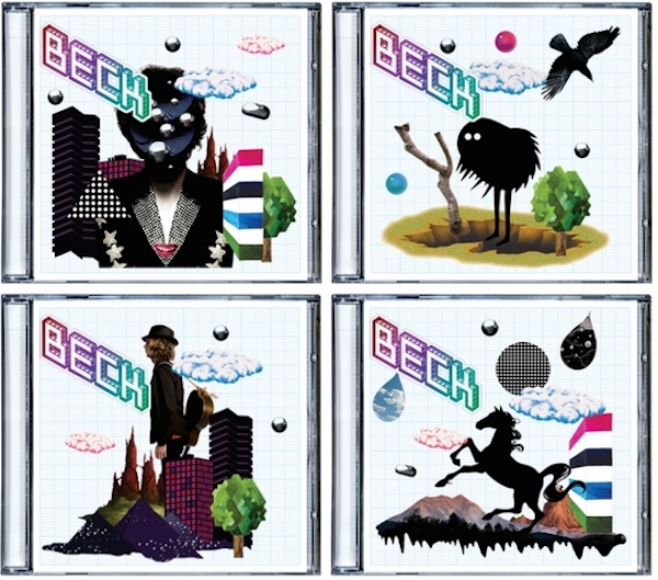
Sleeve design by Beck and Big Active / illustrations by various artists
2. Silvia Sfligiotti
Beck, The Information
Sleeve design by Beck and Big Active / illustrations by various artists
The Information’s cover is not an illustrated one – or at least, the one that was seen in record shops wasn’t. It only had a Lego-style Beck logo and a graph-paper background. A sticker was placed in the corner; it said “new album – stickers inside.”
I bought it out of curiosity and trust in its author, and found out that the promised stickers were a collection of diverse illustrations – ranging from intentionally amateurish to clip-art style – plus the song titles in a variety of display type: an invitation to users to produce their own covers. Soon enough, the fan-made covers started to appear on the web, and made the “empty” one just a reminder of all the potential images that could be produced within that structure.
The illustrations were not so relevant in themselves: they did set a tone (an early-21th-century one) but mainly worked as suggestions, as props. Looking at the sleeves produced by fans, it was clear that most of them used other images, or made illustrations themselves: once they decided to participate, they didn’t think it was necessary to use the provided images. The grid gave the structure, the fixed element – along with the logo – that made any artwork recognisable as a ‘possible’ sleeve for The Information, whatever the content.
Which illustrations can be considered the ‘right ones’? The ones commissioned by the designers and included in the sticker set, or the many more made by the users?
Overall, the imagery produced for the album sleeve doesn’t necessarily give access to the music contained in it, but hint at an attitude shared by the musician and his audience.
3. Ellen Weinstein
Led Zeppelin, Houses of the Holy
Sleeve design by Hipgnosis
“Over the Hills and Far Away” was exactly where I wanted to be as an adolescent. Sitting on the floor of my friend Lauren’s bedroom, I held the album sleeve and stared at the cover for what felt like an eternity. What better way to while away the hours of a young stoner’s life than to be hypnotized by a record cover that raises more questions than it answers. Although it had been years since the album’s release, to be a Led Zeppelin fan had long been a rite of passage for every drug addled youth, especially those who attended my art high school, where having the cover painted perfectly on the back of your denim jacket was an art in itself.
I was not aware at the time that the famous design studio, Hipgnosis created the album art or that the sleeve was inspired by Arthur C Clarke’s novel Childhood’s End, but the image was compelling and open to multiple interpretations. What at first glance appears to be a straight photograph is an odd juxtaposition of brightly coloured nude children climbing on ruins creating a world that felt real but couldn’t be. There was something oddly empowering about the kids and how they dominated the space. Since I was at the age where one sheds their childhood skin, but can still remember it clearly, it was easy to relate to.
Looking at the album art again now, I still admire the craft involved in making it, especially knowing that no computer technology was involved. But I admire the open-ended storytelling even more, giving the viewer credit for interpreting the image and coming to their own conclusion. At once, bluesy, head banging and with nods to reggae and funk, the music itself was open and harder to narrowly define than previous albums. Searching for my own musical taste at the time, I embraced the diversity.
4. Ian Wright
Cream, Disraeli Gears
Sleeve design by Martin Sharp
Being hooked at a young age, the magic of Martin Sharp seems to have stayed with me forever. He was an early art hero to me – even though I didn’t realise it at the time, and it seems I’m still referring to him all these years later.
An Australian artist closely associated with Oz magazine and London’s other leading psychedelic poster designers, his work represented the new vision of light, explosion and colour emerging in the late 60’s. He created a hand drawn language of type and image that evoked a world beyond – encapsulating a spirit of the new oncoming mood that was to erupt into psychedelia, of which he would be at the forefront.
Discovering his work in the Sunday Times magazine in 1967, Sharp’s Jimi Hendrix Explosion painting leapt out of the page at me, I made sure I kept it and I still have the cutting. His magical vision of Jimi has stayed with me all these years – seemingly as a certain touchstone lodged in my head.
I’m always excited about pictures that capture something beyond a likeness, and the Hendrix portrait, which was based on a photo by Linda McCartney, catches an undeniable moment of attitude, his characteristic stance then emphasised by Sharp’s gesture and perception. Hendrix as always, was all about a sonic and visual Experience (pun intended) and I felt Sharp captured that perfect balance – a rioting alchemy of line and colour.
As mod went psychedelic and my favourite bands grew their hair, there I was looking on from within the relative safety of my bedroom, just me and my record player, and only the fragile ceiling separating it from Mum and Dad downstairs,
“Turn It Down!”
Denied access to the evolving onslaught outside I got my fix from the world of music papers, TV and radio.
I was starting to make my first steps in visual connections too, more excited by the home grown rather than the graphics far away in the USA – Alan Aldridge’s The Beatles Illustrated Lyrics compendium and his sci-fi covers for Penguin, Roger Law and Dave King’s covers for Track, Michael English and Nigel Waymouth aka Hapshash and the Coloured Coat and that sleeve – exploring record shops and mate’s older brothers enviable record collections – not always understanding what I saw and heard, but hungry to grab and assimilate it all on my own little voyage of discovery, and make some sense of what was developing.
To my young ears the music I was responding to represented a stepping up – in taste and commitment – moving from my local Diamond Records in Catford to Chris Wellard’s legendary shop in New Cross, sneaking out in the school lunch hour to pursue my habit – the attraction of which I started to understand, seeing older boys strolling around school displaying the covers encasing the new sounds, deliberately poking out from their slim line briefcases showing their peers their unquestionable taste.
As if delivering a lightning bolt to the brain, Sharp delivered a visual to match the developing sound of Cream. Their second LP Disraeli Gears seemed to cement the visual connection with the electric sounds on the record in the look of the sleeve – presenting a clash of amplified psychedelic colour from somewhere very new and very different – or more modestly put by the man himself, “I was aiming to reproduce visually the warm electric sound of Cream.”
Using a mix of techniques I didn’t yet understand, the cover seemed to be a signifier of the new musical revolution accelerating towards us, a radical changing of perceptions and stance.
Running wild across the back was a technicolour photo collage, re-assembled from found Victorian cuts. It provided perfect fan fodder to be poured over endlessly – Check those boots! (I was a bit of an Eric trainspotter in terms of hair and clothes and had always coveted a particular shirt worn by him – spotted in a shop on Kensington Church Street – 13 quid! I was getting a sixth of that from my Saturday job, Oh, teenage times, and now recurring mid-life dreams…)
The seductive intensity of those front cover fluorescents inspired us to take the record cover round to a local paint shop and ask for matching colours to decorate our newly acquired basement in New Cross – ‘loaned’ to our little gang providing our own hangout, by a benevolent Mum and Dad. Undeterred by the bemused yet negative response in the paint shop, we painted the very low ceiling a deep red, decided the walls should be orange and pink, and possibly a most radical move for a bunch of 15 year olds – the floor white. We certainly tried to embrace that new mood, but what were we thinking!
He followed it up for the next Cream release, a double LP called Wheels Of Fire – combining a silver foil blocked typographic cover with a contrasting Day-Glo centre spread with shop bought day-glo stickers! Stationers obviously more progressive in stocking the new colours than paint merchants were – yet more explosive pen action – mirroring the developing musical dynamics.
Must have caused a nightmare for the printers?
Best mate Steve and I were fortunate to witness the Cream Farewell Concert at the Royal Albert Hall. Wearing school macs over Levis and sporting embarrassingly short hair, we watched them deliver a total assault live on stage. It was probably the closest we could have got to safely having our youthful minds blown. On the way back to South London, sitting side by side on a Green Line coach, staring into space and clutching our souvenir posters we were shocked into a stunned silence all the way home. We had glimpsed the future and wanted to be part of that action.
Looking at the Disraeli Gears cover now it is more about the journey for me. It then represented a little gateway to a world slightly beyond my grasp and therefore elusive – to where I reside now and how I got here, seemingly by a random timeline of musical and visual links – many hours of listening explored through the medium of sound on plastic, from the radio and live performance.
It becomes not about one singular image but the whole essence of the resonance of that period still pulling at my eyeballs – from the contemporary work of Bob Lawrie and Gary Panter, to Tadanori Yokoo and John Byrne (who was then working under the pseudonym Patrick). They still excite and inspire. How can an image discovered at such at young age still resonate all these years later? Or do I imagine the connection?

FKA Twigs, LP1
Sleeve design by Jesse Kanda
5. Mario Hugo
FKA Twigs, LP1
Sleeve design by Jesse Kanda
I’ve always coveted sleeves as artworks in and of themselves – there is some je ne sais quoi to the format’s limitations – decades of twelve square inches to tell stories as rich as many minutes of music. My favorite sleeves look like the music sounds, and there isn’t really a way to quantify why or how.
I first saw the FKA Twigs artwork in posters throughout New York City – the portrait is confessional, inviting – clearly composited in beautiful 3D at first, but a quick search of her makes you question that conclusion, if only for a moment!
Her dimensions are so subtly caricatured here that nothing is certain. Indulge the curiosity, inspect it closely, and you’re suddenly staring intimately, deeply through an uncanny valley with the artist staring right back at you. I’ve been a fan of Jesse Kanda’s work for some time now. Observing this cover is similar to listening to the music – and I think that is really the nature of art and music – to establish patterns, humanise the media, invite us in, to only then surprise, contort, and turn that humanity on its (beautiful) head.
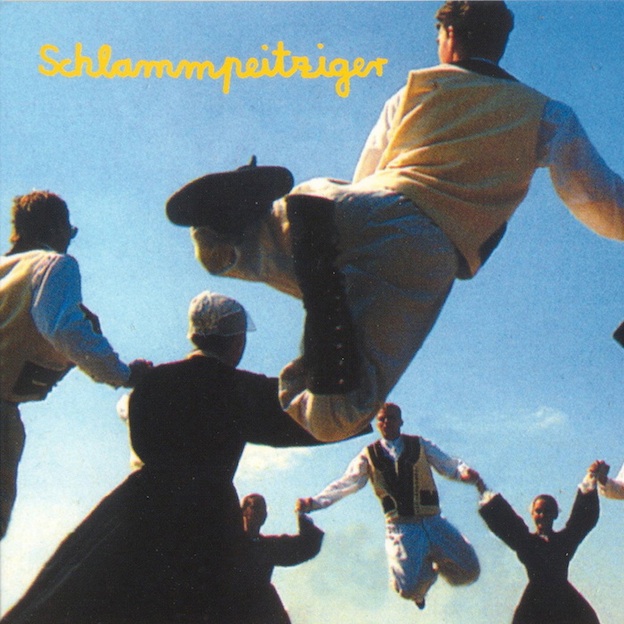
Schlammpeitziger, Augenwischwaldmoppgeflöte
Sleeve design by Frank Dommert
6. Mark Richardson, Editor Pitchfork Magazine
Schlammpeitziger, Augenwischwaldmoppgeflöte
Sleeve design by Frank Dommert
Schlammpeitziger was an electro-pop project by led by German producer Jo Zimmermann, and in 1999 he released an album with the unwieldy title Augenwischwaldmoppgeflöte. From the moment I laid eyes on it that year, after I received a copy of the LP via mail order (I was already a fan and bought the new record immediately), this sleeve has had an unusual pull on me.
I’m not sure exactly what the image is or where it comes from, but it shows a group of young men and women, dressed in old-world clothes of some kind, playing a jumping game as they hold hands in the circle. We can see that this game likely involves the men and then women all jumping up in turn, perhaps using the tension of their opposing leaps to propel themselves further toward the sky. We also see the band name in its characteristic flowing script, reinforcing the unassuming homemade quality that underpins the project.
The music of Schlammpeitziger generally consists of melodic electronic instrumentals played on common consumer-grade keyboards; it’s formal in its structure, but also light, funny, and above all playful. The power of the sleeve comes from the contrast of the conservative dress of the players and the uninhibited nature of this game, and this quality is mirrored in the music. It’s as if there’s always a child lurking inside of us waiting to burst out, an inner joy we can access when we most need it.