Change
THE ILLUSTRATION REPORT Autumn 2011
ISSUE 16
“They always say time changes things, but you actually have to change them yourself,” said Andy Warhol. Varoom Editor, John O’Reilly, introduces each issue of Varoom with his Report, drawing together the different elements of the issue which are grouped around it’s theme.
Picturing the world as an illustrator changes how others see it. Making images, learning from our craft, changes how we understand ourselves. Irish illustrator David Rooney, who used scraperboard to create titles for the BBC’s Story of Ireland series highlights this creative truth, “My own family’s history has been shaped by the events I was illustrating, but it never seemed very real to me until these figures from the famine and strife of our past emerged from the tip of my scalpel blade.”
1. The Tourist
In August 1954, at Milan’s Design and Architecture fair, illustrator Saul Steinberg’s 33-foot-long drawing The Line, was enlarged for a mural on a children’s labyrinth. One can imagine design critics strolling around the labyrinth (shaped as a three-leafed clover) a real-life echo of Paul Klee’s idea that “a drawing is simply a line going for a walk.” But Steinberg’s isn’t going for a walk. Steinberg, as a thinker/illustrator takes one further step back. The Line defines what it is to make a journey, what it is to make a creative journey. The illustrator is always a tourist on someone else’s brief. And what’s more important making great creative is only possible at all by being a tourist on your practice, rituals and habits of mind. The Line is Steinberg as a tourist on his own making of an illustration.
1.1 Illustrative Thinking
The Line beginning with the nib of Steinberg’s pen unfolds as a picture of an illustrator thinking; it’s the surface of a canal in Venice; a laundry line; a railway line; now I’m looking down from the top of a Parisian apartment building to the line where building and pavement meet; a Spanish table-top; a bridge; the dividing line in a math sum; a horizon line. The line’s meaning is in a constant state of change, flexible, innovating new spaces, framing itself and its content in new ways, but its linear form doesn’t change as it unfurls it’s journey over 33-feet to its final destination, its starting point, as a pen-nib. A 33 feet-long thought.
The Line, Saul Steinberg, Nieves, $24 30 Pages Leporello Foldout, 585 x 25.5 cm, b/w Offset, First Edition, 2011 (Original: Saul Steinberg, The Line, 1954, ink on paper, 45.7 x 1026.2 cm The Saul Steinberg Foundation, New York) www.nieves.ch
1.2 Change and Permanence
The Line is a semiotic exploration of creativity, of thinking, of what changes and what remains permanent. Steinberg’s line changes, transforms, and stays the same. The Line is the issue of change presented as a visual thought. In our working lives how do we adapt and change to become better illustrators, better colleagues, better resources for our clients, and what must keep as we change? What dare we not lose, that defines us as an illustrator, or designer, as a creative individual?
2.0 Value
You will have noticed we’ve changed, to A3 and newsprint. Newsprint echoes crunchier economic and political times, and the change also signals a turning point in illustration (and Graphic Design). Whether we agree with digital age sceptic Andrew Keen’s thesis that our internet age fosters a ‘cult of the amateur’, the fact is that the technology to produce illustration and design is increasingly accessible to a wider range of people. The older crafts of traditional media are being squeezed – fewer sub-editors, citizen journalists, amateur news photography/footage, website design. The same dynamic is at work in agencies, where clients are increasingly happy to accept ‘good enough’ when it comes to craft-based skills and will often look to either user-generated content for social media campaigns or resort to the dark Darwinism of the open-pitch. It’s also a problem for Graphic Design which has spent some time trying to assert its professional status at the very moment creative industries are being de-professionalised. In an age when ‘creative’ is being squeezed it’s more important than ever to understand that great illustration adds considerable value to communication and products.
2.1 Tracking Change
The format of the new Varoom has two elements. We have enlisted a team of contributing editors from various fields of illustration (not all featured in this issue) to keep us up to date with noteworthy work from the previous few months. A useful feature to keep track of the kinds of work illustrators are making, the work clients are buying, and the work that has some buzz around it.
2.2 Field of Knowledge
Alongside regular journalistic features, the second element of Varoom will still explore how illustration is understood as a discipline, as a field of knowledge. It’s not an academic question, it’s an aid to creative practice, and a vital aid for those who fund illustration, whether it’s fee-paying students, the University, or the clients who buy work who need to understand the value of illustration. We will explore this in the magazine and also through developing a system of peer-reviewed articles which will help define the field of knowledge that is illustration, give it the academic credibility that funding depends on, and open up thinking about illustration as a tool for business and commerce beyond its common understanding as making pictures. Good clients already have a experiential sense of how much more illustration brings to their magazines or products, we need to encourage more awareness around this.
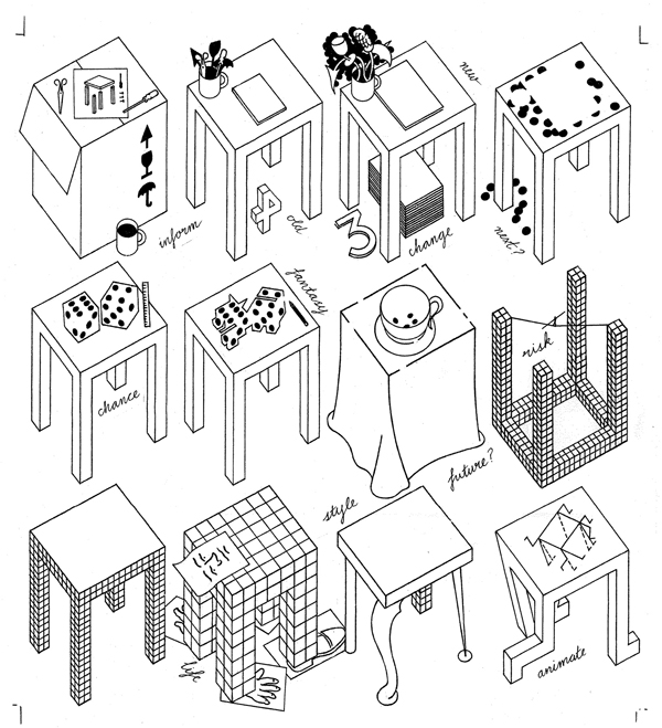
Rough by George Hardie
2.2 Beyond Critical vs. Creative Thinking
The current business-buzz at the moment is around the idea of ‘Design Thinking’ and it highlights a fuzziness around the ideas of ‘Design’ and ‘Thinking’. Sometimes it confuses ‘Thinking’ with managing information, and ‘Design’ with a kind of collaborative process. Like Marx who argued ‘the point isn’t to understand the world but change it,’ and needlessly opposed to forms of activity, the problem with Design Thinking is that it opposes critical thinking to creative, transformative thinking – as if they are mutually exclusive. Exciting critical thinking always activates. We need to formalise how illustration can open up a space for genuine visual thinking that’s an aid to education and business (see Des McCannon’s feature ‘Lacking Vision’ in issue 15, and Chris Hatherill ‘Thinking With Pictures’ issue 14, and Tom Barwick’s Uncharted Oceans of the Future, issue 14). We need to explore what we mean by illustration, for thinking through where ‘illustration’ sits in relation other academic, commercial and vocational arts, but how illustration can help businesses and citizens understand and transform their world. Steinberg’s transformative line is the model. How do we understand the world, visualise it, and change it at the same time?
2.3 Inventing Visual Syntax
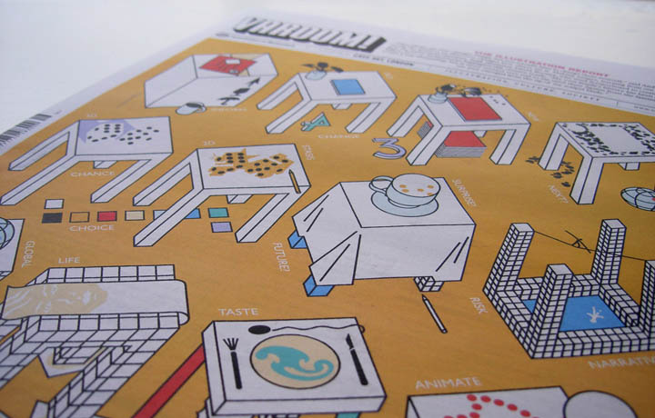
Part of the problem of sketching out a field of knowledge is discovering the right questions. Steinberg understood this as central to his practice. On the occasion of a major exhibition at the Whitney Museum of American Art in 1978 he pointed out for art critic Robert Hughes in Time magazine, that writing and drawing have different modes of thinking. “The nib has an elasticity meant for writing, and that is why I have always used pen and ink: it is a form of writing,’ said Steinberg. “But unlike writing, drawing makes up its own syntax as it goes along. The line can’t be reasoned in the mind. It can only be reasoned on paper.” As it unfurls Steinberg’s Line challenges expectations and assumptions, creating a set of rules for the reader. Like our cover by George Hardie, which poses the issue of change within the discipline of all the different aspects of illustration while also reflecting on the creative process of the cover. It’s a kind of animated thinking that sets the rules and enables the reader to jump on board a creative thought process.
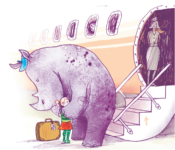
Rhino’s Don’t Eat Pancakes by Anna Kemp and Sara Ogilvie, 2011. Published by Simon and Schuster
3.0 Contextualising
“What is Illustration?” is a very abstract and general question, and not really an aid to understanding – too open-ended. We need to ask what does illustration do? Making pictures is part of what it is to be an illustrator, but it’s more than that: using pictures to create a point of view; contextualising information, whether that’s as a sequence in children’s books, a graphic novel, in the satire of political cartoons, in packaging a product experience for the consumer in an image, on book covers, on record sleeves…
3.1 Forms of Communication
Mimi Leung, an illustrator on the books of the Big Active agency, explains how she changed from being a professional illustrator for editorial and advertising clients to being a sexual assault worker dealing with intensely difficult social problems. What she brings with her as an illustrator to her encounters with these woman, what stayed with her, was an imaginative sensitivity, enabling her to gently unpack the hidden meanings, the gestures of women who not only often speak in a different language but need to speak about these private matters in a guarded way. “This makes communicating through observation and body language really important,” says Leung, “as well as devising creative ways to engage people in discussing issues in an oblique way. This is where I find my training as a visual artist to be most effective. Having an awareness of the fluctuating meanings of things according to context and being sensitive to this despite not understanding it completely, as well as being able to explore subtle forms of communication with people of different backgrounds really helps me to build relationships with our clients.”
 Mimi Leung
3.2 Before “Interdisciplinarity”
A sensitivity to context, and an ability to frame information with a point of view is an illustration skill. It’s why when in colleges, the idea of “indisciplinarity’ is a hot ticket (as Ian Massey points out in his feature on The Cloth) we need to define what illustration does. It’s often been defined, and occasionally patronized, in terms of simple figurative representation, but that’s just a side-effect of what illustration does, which is to give a perspective.
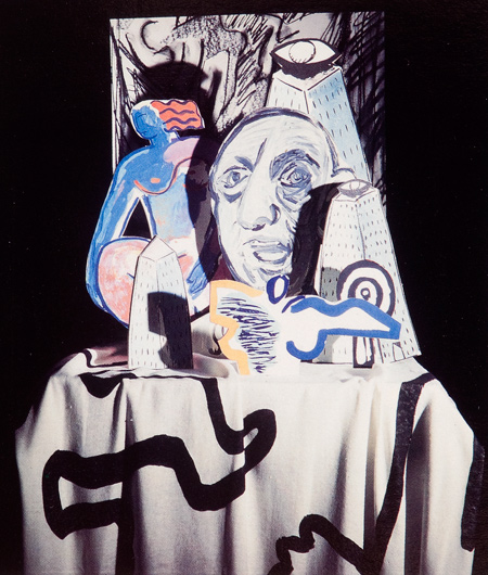
By members of The Cloth 3.3 Perspectives
In the light of this, and the recent debates around the relationship between graphic design and illustration we should also look at how graphic design has been positioned in debates. In an interview in It’s Nice That issue 4, Neville Brody head of the RCA asks the question “what is a graphic designer today?”, alluding to all the different communication techniques from moving image, to illustration to typography that are available to a young college student. If Brody seems unsure about what is a graphic designer today it may be because arguably a large part of what has historically been called ‘graphic design’ may in fact have been illustration.
3.4 Authorial Design as Illustration
In some instances it’s clear that what some people have been troubled by in editorial design, such as David Carson’s Ray Gun, whose layouts, images and typography– illustrating the idea of decomposition, breaking up the conventions of looking and reading – made the visual part of the editorial perspective. There is a word for graphic design self-expression and authorship – illustration. And indeed Neville Brody’s own editorial work for The Face, with its visual architecture of Russian Constructivism clearly framed a way of looking at the world for 1980s youth culture – that of avant-garde rebellion. It editorialised to kids who had no future in Margaret Thatcher’s Britain, Brody’s palette of influences for the visual furniture of the magazine illustrated the idea that there was a history of youthful rebellion that the readers were connected to, they weren’t isolated, on their own. Maybe it would be more productive to think of Brody’s most significant work is as an illustrator.
3.5 Layouts as Concrete Poetry
The idea that editorial designers are illustrators isn’t new. Marshall McLuhan said it over 40 years ago in Culture is our Business describing the newspaper as a “mosaic’, a kind of collage, connecting items which have no formal connection other than they happened on one particular day, “the mere juxtaposition of items without connection, save by dateline,” says McLuhan, “makes the press a huge time harp of poésie concrete.” Concrete poetry. In practice, picture selection, choice of pull quotes and headlines, and the perennial conflict between ‘editorial’ and ‘design’ confirms that what is at stake is not design but illustrating an idea or a feeling.
4.0 Discourse
In the language of French philosopher Michel Foucault, the words ‘Illustrator’ and ‘Graphic Designer’ are part of a ‘discourse’. Discourse is a kind of systematic ‘spin’, a network of language, institutions, organisations, that sets the terms of the debate and regulates it. It positions people, defines relationships and activities, it is a subtle exercise of power. It names things ‘he is a graphic designer’, ‘she is an illustrator’. A Discourse consolidates power, a colleague who has worked in the deign filed for many years pointed out recently that there is a value attached to being a graphic designer rather than illustrators because being able to hire illustrators makes them one step higher on the creative food chain. Some illustrators prefer to be considered artists because of the cultural kudos attaching to art. And equally in the University Art departments there are deeply-embedded assumptions of the value of different art practices. Discourse sets the criteria for what counts as knowledge, it’s the invisible assumptions we have about things that seem so obvious we take them for granted as being real. It’s partly why Graphic Design has been identified so much with Typography (whereas Typography is but one increasingly fertile area of illustration).
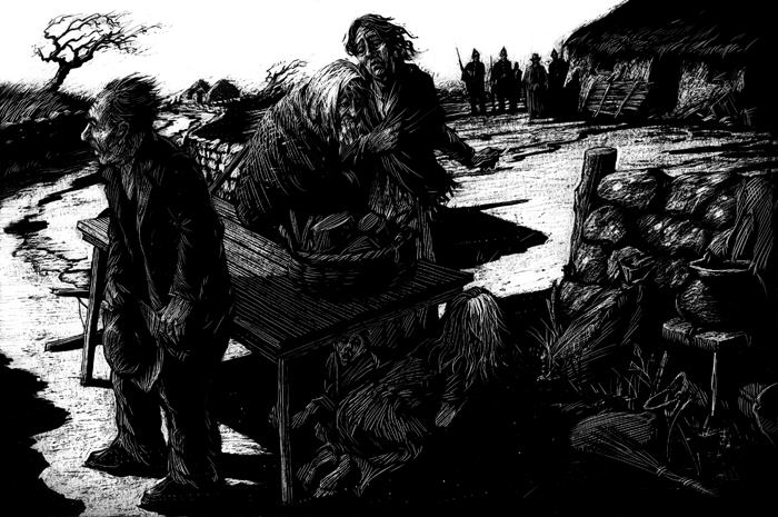
David Rooney, Eviction for BBC’s story of Ireland, 2011
4.1 Concrete Thinking
At this moment, when ‘interdisciplinarity’ is seen as a useful approach in colleges we need a richer, more productive understanding of what those disciplines do. We need to change our definitions, to define our field of knowledge. Graphic Design neutralises information, coding it visually, calming it down. Graphic design creates boundaries, illustration activates them. When I am driving down the motorway I’m thankful that Jock Kinneir and Margaret Calvert devised the signage system. Walking through the new terminal of Dublin airport last week my sense of dislocation was soothed by some simple, clear environmental signage, thankful the Airport information design wasn’t in the style of a Paul Davis flow charts (“Baggage? Only emotional”). In an airport, in a restaurant looking at a menu, on my bank statement, I don’t need invention, thinking, innovation – I need information with as little visual noise as possible. Illustration on the other hand is about thinking: thinking in a narrative sequence in children’s books; thinking as the presentation of an idea on a magazine cover, thinking as a reflection on iconography. Or David Rooney’s illustrative process for his title sequence for the BBC series The Story of Ireland. “I quickly realized,” says Rooney, “that there was an analogy between the process of scraping away at the ink covered scraperboard to reveal the chalk surface beneath and the uncovering of the nation’s history through the narrative unfolding in the documentary. There are echoes of archeology in the process too of course.”It is the visual, concrete, manifestation of a thought. It is Saul Steinberg’s Line.
4.2 Taking a Line
Illustration as with Saul Steinberg, gives visual form to an artistic judgement, it’s an art of thinking, and needs to devise it’s own a language of reflection. One colleague recently argued persuasively that the use of cultural theory is a useful toolbox for graphic design and illustration students to understand the context for their work. But the other side of that is that it can produce a one-size-fits-all academic Esperanto, where understanding of work, or your own practice becomes just another example of the theory. Any orthodoxies produce slavish thinking and bad writing. Illustration needs to find its tools for thinking from illustration, such as The Line, a visual thinking that is both is both critical and creative.
The Line, Saul Steinberg, Nieves, $24
30 Pages Leporello Foldout, 585 x 25.5 cm, b/w Offset, First Edition, 2011
(Original: Saul Steinberg, The Line, 1954, ink on paper, 45.7 x 1026.2 cm The Saul Steinberg Foundation, New York)
www.nieves.ch
Purchase Varoom 16 here