The Hermenauts Issue
THE ILLUSTRATION REPORT Autumn 2014
ISSUE 27
Varoom 27 is available to purchase here as well as other past issues. You can also subscribe to make sure you never miss out on the latest Varoom.
Hermenauts seek to interpret, and this is the theme of Varoom 27: how illustration is able to interpret text narratives, gender in images, the commissions received from clients, software glitches, Japanese comics and more.
Chris Campe examines how gender stereotypes are played out between client and illustrator for two German commissions, and Minna Alanko visualizes the disappearance of The Redheaded Man, a story of the impossible by Daniil Kharms. How the new publication, Fifty Years of Illustration, and its treasure-trove of images was put together is revealed by author Lawrence Zeegen, and Japanese illustrator Seiichi Hayashi tells Zoë Taylor that he’s “interested in the limits of each medium” and “where those limits touch one another”, as he discusses the style, process and exploration within his comics. This issue also features great artwork displayed in a round up of 2014 Awards images – from the AOI Illustration Awards to the British Animation Awards.
1.1 The Go-Between
In Greek mythology Hermes was the messenger of the Gods, the go-between, the intermediary between the Gods, and between the divine and the human, the interpreter of signs and codes. From Hermes is derived the word Hermeneutics, the study of methods of interpretation, originally rooted in such practices as the Talmudic interpretation of the Jewish Torah, and in secular form, in philosophy and social sciences in the 20th Century. Hermeneutics argued we weren’t remote witnesses, we were part of the world we were analysing.
1.2 Image Magic
Laurindo Feliciano, winner of the Editorial category in the AOI Awards writes that, “As Hermeneus, the illustrator needs precisely, through the creation of the image, to develop concepts that go beyond the text, beyond the simple definition of words. In the creative process, when an illustrator finds the key elements of this relation between the text and the image, something magic begins.”
1.3 The Hermenaut
When the illustrator invents this relationship: between word and image, between format and expression, – between what the brief says, what the client wants and what the audience will be moved by – then the illustrator becomes a Hermenaut – an adventurer, a traveller, a map-maker, in the uncharted territory of creating something unseen, not experienced before. (With a nod to Joshua Glenn’s 1990s culture ‘zine Hermenaut).
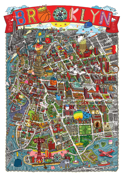
Aaron Meshon, Brooklyn
2.1 Mapping
Perhaps a little like the map of Brooklyn created by Aaron Meshon who re-imagines the territory and architecture of a city in terms of how the space is recreated by people, through sneakers and basket-balls, ice-creams and milk-shakes, bongos and pickles. The Hermenaut doesn’t just interpret space, they re-invent it, they map it differently.
2.2 Visual Entrypoints
Many of the image-makers featuring in Lawrence Zeegen and Caroline Roberts’ Fifty years of Illustration created new maps for how people could experience music, cinema, books, fashion, automobiles, products and politics, providing visual entrypoints for how people might engage with these things.
2.3 Progress or Hope
And sometimes illustrations don’t necessarily lead in one direction, the same image can help us think different things in different ways. The impact of such images slices reality in many different ways. Like Shepard Fairey’s screen-printed poster for the 2008 US election, featuring Barack Obama. Originally a personal project, Fairey had pictured Obama over the word ‘Progress’, but when asked to change the word to ‘Hope’, the Obama campaign got on board.
3.1 Reductionist
Both posters work because they are visually reductionist. Fairey, the Hermenaut, condenses, compacts and codes the clarity and necessity of voting for Obama (also a Hermenaut) into the red, white and blue of the American flag – a colour palette whose ‘America-ness’ seemingly transcends race and ethnicity. On the other hand the word ‘Progress’ also connotes the fact that for the first time there may be a Black President in the White House.
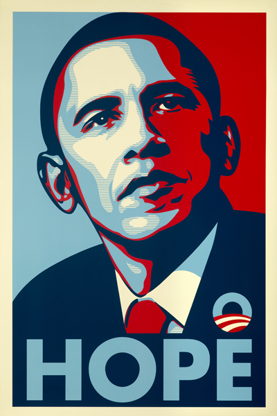
Shepard Fairey’s Obama Poster
3.2 From Politics to ‘Hope’
The poster, like all great political posters, harnesses visual simplification to generate emotional heat. And yet it is fascinating how the ‘client’ demanded a change that shifted the aspirations of the poster – from the sense of a political journey and political assertiveness of the word ‘Progress’ to the visionary, the messianic and, by definition in the long-term, the doomed-to-fail empty absolutism of ‘Hope’.
3.3 Visionary Icon
It shifted an image from the depiction of the practical mechanics of ‘man-in-suit-and-tie’, to man as visionary icon. Fairey’s original instincts were correct, the easy, apolitical notion of ‘Hope’ may have worked in the short term (advertising is the art form of the short-term) it failed to flag up the idea that politics is something demanding, debated, negotiated, argued over. ‘Progress’ allied to Fairey’s simple graphic stirred up the plain-speaking codes of a 1930s New Deal message created by the WPA Federal Art Project.
4.1 Using Codes
This issue of how we interpret cultural and visual codes was at the heart of Andy Ward’s Advertising and Design-winning work for a mental health awareness campaign for the University of Santa Cruz campus. Using the familiar codes of brands such as My Little Pony Ward writes, “The agency wanted to use a series of saccharin animals characters suggestive of retro TV/cartoon/toy characters from the childhood years of the target group. The idea was to set up a false sense of security by referencing something familiar and safe and then flipping assumptions by linking these characters to a subtle underlying mental health issue.” The graphic language flags up the imaginary audience, while Ward’s unexpected narrative makes the image and the audience travel in a different direction.
4.2 Coding Gender
But as Chris Campe suggests in her nuanced Girls Go First? Feature, the fact is that ‘meaning’, ‘semiotics’, ‘interpretation’ are only part of an illustration process that extends from: the visual codes we have in our heads as individuals; to the personal and professional relationship with the client; to the format. Campe analyses the process of two commercial projects in Germany, looking at how clients and illustrators dealt with the semiotics of gender. She describes the case of illustrator Stephanie Wunderlich asked to create an image about preparation for Christmas, for the supplement of a German Daily. The original image featuring a woman preparing dinner and the man putting up the tree was deemed too stereotypical by the client, so Wunderlich re-worked the image and reversed the roles. What did the reversal do?
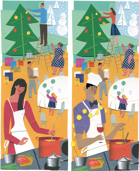
Stephanie Wunderlich. Left: original design. Right: revised design.
4.3 From Kitchen Labour to Cuisine
When Chris Campe asked the audience about the two images at the recent Varoom Lab conference at the Arts University of Bournemeouth, a voice in the audience pointed to the glass of wine in the hand of the man. And of course as Campe writes in her piece, despite Wunderlich’s reversal of roles it is arguable the new version reinforces them. “In the revised version Stephanie showed the man somewhat ironically, wearing a bow tie, a white chef’s hat and a chain of lights around his shoulders. He casually holds a glass of wine and with an exaggerated gesture adds a pinch of herbs to the pot.” While the woman is engaged in the unshowy labour of cooking, the man is doing ‘cuisine’. The image now has some neat and funny visual commentary by Wunderlich but it’s likely to be read literally, supporting well-established gender roles.
5.1 Book Revolution
Interpretation isn’t just about symbols and graphic language. The Hermenaut needs to step into the future, to plug directly into the tools and technologies and formats that shape how an image is made and generates its impact. As Vicki Wilden-Lebrecht points out in our Mediators piece on agents, “for children’s book publishing, not since the invention of the printing press, have we seen such a dramatic impact. The move towards e-books and children’s apps is changing how we develop content for this market. Traditionally, print publishing uses novelties like ‘pop-ups’, and ‘lift-the-flaps’. The best books that use novelty is when the novelty is intrinsic to the story.”
5.2 Technology Re-Interprets Us
The Hermenaut seeks to re-interpret the medium of the book for the new platforms of the digital age. Or to put it another way, we need to think how new media re-interprets us. Place two photos of an urban street scene from 10 years ago and today side-by-side. Now we are people with crooked necks staring into our hands at a small oblong device.
5.3 Pop-Up Rhythms
And also remember there is nothing ‘natural’ about the page flap or the ‘pop-up’, it’s just a material device, the material thought of an illustrator, that moves the story along, reveals something about character, or changes the rhythm of the user – new technology makes readers into users, though the word user includes many different kinds of cognitive and cultural experiences. And while storytelling apps are no longer new, up until recently, new technology, suggests Vicki Wilden-Lebrecht, has really been just digital special effects.
5.4 Narrative Novelty
As Wilden-Lebrecht explains in Mediators, “If you look at Spot, one of the most famous lift-the-flaps books, the flaps work. Where is Spot, can you find him? Is he there…? Is he here…? No try the basket – yes he’s there. The novelty of looking to find Spot by lifting the flaps is part of the story and how it’s told through print. Developing apps initially saw a lot of print publishing novelty brought into the app, but they were novelty for the sake of being novelty: flowers growing in the background or a flap being lifted.”
Doras Flame by David Szauder
6.1 Glitch and Synthetic Life Forms
When the Hermenaut – as creator, interpreter, traveller – equips himself/herself with new technology they need to re-orient how they make their work, and how in a strange way their work remakes them. Hermenauts seek to understand this new digital material. In his feature Re-Thinking the Mystery of Glitch, Tom Barwick writes of a discovery in his own research, “Image-making software at this point in the research feels like a successful synthetic life-form, chemical rather than biological, less complex than its half-cousins – the art materials we use in the real world – but built on similar principles. And crucially observable in a comparative way that means there is still much to be found out.”
6.2 Noise
As a word Glitch can be traced back to astronaut John Glenn writing in 1962 during the NASA space program, “Literally, a glitch is a spike or change in voltage in an electrical current.” It has over the last decade become a visual aesthetic (see Darryl Clifton’s “Animation’s Brave New Worlds” in Varoom 12, on moving-image makers Quayola, Max Hattler and Richard Fenwick). A Glitch is the ‘noise’ in a communication system, and increasingly refers to a digital error, either an accident or manufactured accident, it interrupts the flow of communication or information. It’s become fashionable enough to become a manufactured aesthetic in music promos such as Kanye West’s 2009 promo for Welcome to Heartbreak.
6.3 Otherworldy
In The Glitch Moment(um), cultural theorist Rosa Menkman writes that, “Experiencing a glitch is often like perceiving a stunningly beautiful, brightly colored complex landscape of unexplainable, unfathomable and otherworldly images and data structures. A glitch represents a loss of control. The ‘world’ or the interface does the unexpected. It goes beyond the borders of its known and programmed territories, changing viewers’ assumptions about technology and its assumed functions.” For the experience of colourful and shuddering glitch as loss-of-control, think of your screen breaking up, pixellating as you complete your final edit before delivering the brief.
7.1 Studio as Laboratory
The Hermenaut maps out for us, gives us a guide to how technology can shape our interaction with the world. And often will interrupt the dominant way of seeing things. Think of the Beatles as Hermenauts whose new sonic message was mapped out for fans by another Hermenaut, Klaus Voorman. His sleeve art for the Beatles’ Revolver – crunching photo-collage with drawing – with a multiplicity of Beatles faces on the cover, who since they had given up touring, were for the first time using the studio as a laboratory.
7.2 Uncrafted Experiment
The album is a chemistry (to use Tom Barwick’s analogy) of reverse guitar, tape loops, playing with the new technology of Artificial Double Tracking where the vocal track could be duplicated out of phase (see Walter Everett’s The Beatles As Musicians: Revolver through the Anthology). Commentators have noted how with the follow-up album of Sergeant Pepper’s, the band and producer George Martin had a handle on the tech, worked it up and crafted it. Revolver is fresher in its raw experimentation, the creative pleasure in not quite being control.
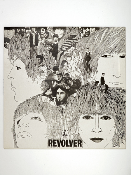
Klaus Voorman’s album art for the Beatles record ‘Revolver’
7.3 Mop Tops Stripped Back
Voorman’s black and white illustration strips away the previous visual language of pop, of the Fab Four, the loveable mop tops (strips and stripes). The flow of the drawing is interrupted by photography – not least in the uncanny effect of George Harrison’s eyes – samples of the band at different points in time. And at the centre of Voorman’s image Lennon and McCartney give us new ears to listen with. Voorman’s cut-outs gives the listener the visual tools to start working with a different kind of sonic experiment. “When you cut into the present the future leaks out,” wrote William Burroughs.
7.4 The Hermenaut’s Paint-filled Balloon
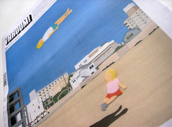
Like our cover by Takeru Toyokura who cuts into the beach, launching the Hermenaut into space, creating an image that is magical and strange. In Toyokura’s picture the human shape on the surface felt escapes the original figuration. It’s the image as the imagination in flight, it’s the image of how imagination changes reality The Hermenaut is more than a interpreter. In their image-making, the Hermenaut doesn’t just interpret the world, they change it. Like New Talent award-winner Thoka Maer suggests, sometimes the world needs to be seen a little differently, and you need send a client to many different places, many different possible realities. through many different interpretations of an idea. “It’s like standing on the starting line and throwing paint-filled balloons to see how far they can land on the field.”
Varoom 27 is available to purchase here as well as other past issues. You can also subscribe to make sure you never miss out on the latest Varoom.