Politics
THE ILLUSTRATION REPORT Spring 2015
ISSUE 29
Varoom 29 is available to purchase here as well as other past issues. You can also subscribe to make sure you never miss out on the latest Varoom.
Varoom 29 highlights new directions in tackling the idea of politics, from the expanding platforms for American political cartoons in the 21st century, to politics and images presented together in the Graphic Design Festival in Breda and the challenges certain children’s books face when attempts are made to remove them from libraries – including And Tango Makes Two which is in America’s top ten of banned books of 2014.
One of the ideas driving this issue of Varoom is that ‘politics’ and illustration has multiple, alternative lines of thinking, subject matters and ways of expression. Issue 29 builds on this with a range of approaches, which includes the illustrators who were bucking against prevailing illustration trends in 1981 to forge a new direction, the experimental directions for three fashion illustrators and an animated fictional propaganda of North Korea’s guide to the USA.
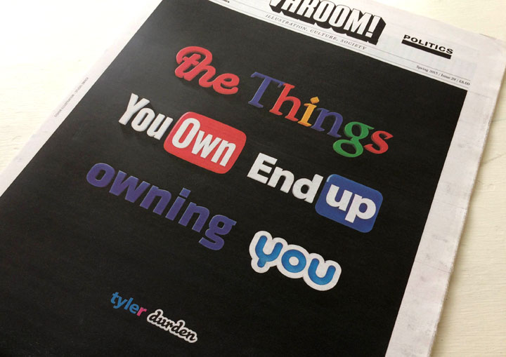
Our cover image by Studio Stack moves Fight Club‘s Tyler Durden’s rage against the system into the digital age via the logos of the corporations that harvest our information and extract value from it.
1.1 The logotype storm
The launch of Hillary Clinton’s logo/mark/symbol for her 2016 campaign for the Presidency, designed by Pentagram, ignited a now familiar social media storm, including inspiring a whole new typeface – ‘Hillvetica’. Sol Sender, who designed Barack Obama’s campaign logo – a blue ‘O’, sliced horizontally by the red and white stripes of the US flag – remarked how the Clinton logo didn’t say much. While in The New Yorker cartoonist Emily Flake pictured a young couple commenting staring at it, “I’m not sure a big red arrow pointing right is the best logo for a Democratic candidate is all.” (In the US, political party colour codes are opposite to the conventional political associations of red).
1.2 Accelerated shorthand mapping
On the AIGA website (American Institute of Graphic Arts) designer Milton Glaser weighed in on the media buzz. If there was a Mount Rushmore for designers, or a similar logotype etched into a mountain, Glaser’s face or one of his iconic images would be on it. Glaser has his own history in creating a logotype that maps a political, economic and geographic space. In 1977 the “I ‘Heart’ NY” logo both mapped New York’s sophisticated modernity in its accelerated shorthand, while practically demanding an emotional response via its visual symbol of the heart.
Gavin Strange
1.3 Commissioned and Uncommissioned New York
The “I ‘Heart’ NY” inscription played a serious role in defining the emotional and cognitive responses to New York for tourists and financial investors spooked by rather different kinds of mobile inscriptions – the ‘uncommissioned’ imagery of subway graffiti – as New York City teetered on the edge of bankruptcy in 1975. Glaser observes of the Hillary Clinton logo that, “the difficulty of such a mark is the requirement to be ambiguous in order to avoid alienating any part of your audience… At another time, I wrote that most of design consists of creating affection for an event or a product. In regard to all of the logotypes developed so far (for the candidates), one can truthfully say that none of them has the potential to create affection. From that point of view, they all fail.” But perhaps more important for social media, is the ability to create disaffection.
2.1 Marketing Stamp
I remember seeing a debate circulating on Twitter, ‘Can Design Change the World?” and I had to slap my prosthetic Tyler Durden hand from retweeting (“Yeah, one typeface at a time baby!” Comments by champions of Environmental Design/ Social Design/ Design Thinking/ Urban Planners / Landscape designers duly noted. In fact, completely ignore Tyler. Stop it Tyler!). And of course our cover by Studio Smack is both a sharp reminder of the privacy issues citizens have with large corporations, and of our complicated relationships with brands. But it would be a mistake to see the discussion around the political logo as simply a trivialization of ideas, the ultimate reductionism of politics, policy, philosophies and belief systems into a neat little logotype that functions as a kind of marketing stamp.
2.2 Cognitive politics
Indeed, one of the unexpected new purposes of such logos is to ignite social discussion, to create media heat stretching far beyond the borders of the professional designer. The necessity of the logotype inscription as a visual directive and political anchor is as much a function of the multi-platform, mobile media age we move through as citizens – and which moves through us. As far as Pentagram’s Hillary Clinton logo is concerned, this non-US-non-voting-non-designer found the energy and movement in the intersection of horizontal and vertical lines strangely compelling. In this cognitive political battle, the anchorage of the parallel uprights and the movement of the plane that cuts through them, communicates direction without being weighed down by lazy appeal to national stereotypes.
2.3 Landscape sentiment or abstract mobility?
Unlike the Obama logotype’s visualisation of the sunrise and landscape with its sentimental appeal (as the Reagan campaign famously said in 1984, “It’s morning again in America”) playing to nostalgia around America, I love the fact that Hillary’s landscape is not a representation, but a vector, abstract, an image whose political territory is mapped while on the move – ‘America’ not as a backward-looking nostalgia-scape of sunrises, but as a country still to be created. Arrows ultimately proved little use to Native Americans, but Hillary’s thinking is on the move.
3.1 Extracting Value
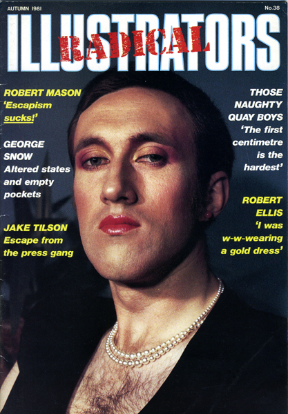
When Rob Mason, Ann Howeson and their fellow travellers created Radical Illustrators in the early 1980s (the special issue of the AOI’s Illustrators magazine), the ubiquity of the formal/corporate/brand logo for political parties at the beginning of the style/design decade had barely started – the Labour party’s Red Rose logo for the 1987 election campaign was invented by either Neil Kinnock or Peter Mandelson. A softer and broader appeal than the traditional red flag – who could argue with pretty vegetation? But like the logotype in the age of social media, new technology always finds ways of attaching itself to us. Our cover image by Studio Stack moves Tyler Burden’s rage against the system into the digital age via the logos of the corporations that harvest our information and extract value from it.
3.2 The Politics of Perceptions
With respect to global digital companies and digital networks, the issue isn’t just that they extract value from our information (that’s business), or that there are privacy issues, it’s also that these digital companies have reframed perception in creative and uncreative ways. As philosopher Bruno Latour observes, “a new visual culture redefines both what it is to see, and what there is to see.” They have configured the social around specific kinds of interaction, circulation, visuality and archives.
3.3 The Illustrator’s Network
Look at Thomas Rowlandson’s image, The Chamber of Genius, discussed by Andrew Kulman which contrasts with the individualised, romantic notion of creativity that we all deep down still believe in. What makes this image? Have a look at all the elements, all the aggregated stuff that feeds into the making of the image. The canvas, the palette, the brush, the quill, the books, the washing line, the cat, the baby, the bellows, the drawing of the ‘araeostation’, alcohol, the chamber pot… Aside from any satire, Rowlandson pictures the creative act as part of a diverse network of things.
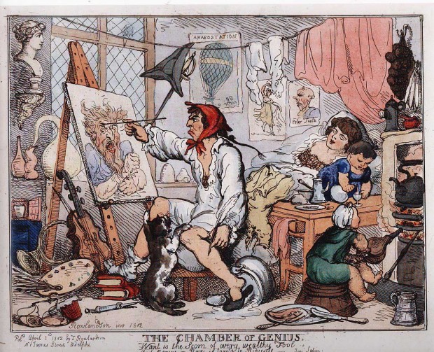
Thomas Rowlandson ‘The Chamber of Genius’
4.1 The networks of influence
So maybe we should consider the central spread of Radical Illustrators as contemporary version of Rowlandson’s work with a late 20th Century vision of different set of multiple, diverse things, film and books and bands, a network of the social plugging into the imaginations of illustrators.
4.2 Avant Garde plus pulp culture
As Rob Mason explains, “The middle spread of Radical Illustrators – Under The Influence – is the bit I like best as it shows, (a) our differences, and (b) a certain cultural curiosity – Fra Angelico and Alfred Jarry alongside Ian Curtis and David Cronenberg.” It’s a mix of the sacred and profane, the holy and the humorous, history and sci-fi, the slow institutionalized authority of Fine Art and the speed of pop culture, and in the music of Ian Curtis and film-making of David Cronenberg , illustration’s inventive social spaces where the avant-garde intersects with pulp fiction. These social spaces are also signaled by the stenciled lettering, the tool for spraypaint graffiti.
4.3 The geographies of scissors
Under The Influence is a fascinating spread not least because the aesthetics and technology of the Xerox machine and the scissors, was an industrial kind of image-making that became accessible in the mainstream as the industrial geographies and groupings of the old world were disappearing – the factories, communities, supply chains and tiers of skilled workers. As Marshall McLuhan remarked in 1977, “the Xerox makes everyone a publisher”, but it also made people image-cutters, image destroyers and image producers – bedroom industrialists.
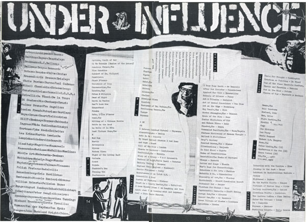
Radical Illustrators – Under The Influence
4.4 The multidimensional illustrator
The mix-tapes I made for friends in my bedroom in the 1980s weren’t just audio tools for the new devices of the Walkman and the Boom Box, the collaged covers I constructed from magazines were abstract ‘diagrams’ visualising a way into the music. Likewise the collaged lists of Radical Illustrators – Under The Influence is a diagram for users and readers wanting to think and make differently, ‘Radical Illustrators’ as an instigation for the individual illustrator not to see him or herself as simply one kind of image-maker, but as many and multiple – why do I have to be one kind of image-maker? As Molly Crabapple says in our feature on the changing formats of the political cartoon, “there’s no ‘the’ future of political imagery or of anything else. Multiplicity, that’s the future.”
5.1 The end of superpants
One of the ideas driving this issue of Varoom is that ‘politics’ and illustration has multiple, alternative lines of thinking, subject matters and ways of expression. Certainly in the world of design and illustration, politics is no longer simply played out as editorial cartoons of the printed newspaper, a media product fewer and fewer are buying. It’s remarkable how quickly the cartoon heroes of a generation, illustrators who subtly altered public perception (think of Steve Bell’s 1990s visualization of John Major with his underpants outside his trousers – an anti-Superman) are little known among a younger generation for whom newspapers are no longer an essential item of engagement with the world.
5.2 A history of silence
As much as some may despair at the lack of trust in institutional democratic politics, its practice, and its networks have been traditionally male, and anchored in a specific concept of the political – housed in institutions such as parliaments and newspapers. So if cartoonists on the Op-ed pages (Opposite the editorial page), commissioned traditionally by male editors bring a wit and creativity, it is around specific hierarchies of political content – it’s why politicians despite being lampooned often collect their caricatures. Institutional politics can be a clubbish world. And actually, as Liza Donnelly suggests, there is a simple brutal truth as to why women haven’t in the past created work for these pages, “historically, women have not been encouraged to share their opinions, so not unlike Op-ed pieces, women have not drawn political cartoons.”
Jen Sorensen
5.3 Long-form non-fiction
And just as there has been a hierarchical conception of politics, so the editorial design and layout of pages has framed the political cartoon in relation to text according to the medium of print, very different to the ways in which readers access information. “LOL The Changing Formats of Humour” explores how the political cartoon is also becoming animated and its content is becoming broader as webzines explore the possibilities of visual storytelling. Cartoonist Jen Sorensen, also editor of the ‘Graphic Culture’ section of media start-up Fusion, recently created a long-form comic about a friend who was raped in college that received a huge response. “Political cartoons tend to do well on digital platforms because they are so shareable. In the years ahead, I think you’ll see a greater variety of formats, especially more long-form nonfiction work and multi-panel comics. You can do cool things with animation too, although I don’t see that replacing static images.”
6.1 The sensible, rational, well-meaning theory of politics
So if classical political cartooning was representational, and even collectable for politicians, one of the key strategies of the Occupy movement was the refusal to makes specific demands, to represent itself in the conventional discourses of politics and media. No one can doubt the well-meaning of Owen Jones writing in The Guardian recently that, “if we lived in a rational, mature democracy that wasn’t dominated by shamelessly self-interested private interests running the ‘free media’, we would be able to debate these issues sensibly.” This idea of rational democracy has its equivalent in the famously ‘rational person’ of classical economics, who makes rational choices in the market place. We shouldn’t naturally assume that the ideal of politics and political engagement ought to be ‘rational’, ‘mature’ and ‘sensible’. The political chafing generated by Occupy was through their refusal to occupy the conventional discourses of politics – the refusal to represent their demands, to make them ‘sensible’, ‘rational’, ‘mature’. The strategy entailed a refusal of conventional political etiquette, a refusal to occupy the political discourse and terrain defined by others.
6.2 Don’t occupy the given space
The Occupied Times of London magazine, is one of the works featured in Dennis Elbers’ Graphic Design Breda Festival 2014. The cover we show personifies the high-rolling speculators of casino capitalism in the classic skeleton forms. The Resolute –Design Changes section of the festival breaks down the work of the designer and illustrator into the different effects and processes of their work – Revolt / Review / Refresh. It explores the use of images beyond simple representation, whether it’s the informational work of New York’s Center for Urban Pedagogy and Predatory Equity: The Survival Guide, Lucas Pope’s Papers, Please, a game where the player gets to play the role of an immigration officer, and Made In A Free World’s online Slavery Footprint, which enables the user to see how much underpaid labour is used in creating our much-loved consumer products. This direction of the commercial image-maker as more than a supplier of pictures, using their imagination to create scenarios and ‘products’ is both politically and socially interesting, and a professional and creative opportunity. The mobile gallery project, where political images were moved around town on specially constructed bike-frames, not only generated a response to the political images themselves but the bike itself generated a new space of the social, creating new ‘territories’ and new publics, new conversations, new kinds of sociality, creating a flexible, freewheeling public space. The lesson for image-makers thinking of political strategies? Don’t occupy the given space, move through it, use your creativity to invent new spaces of the social.
6.3 Inventing and antagonizing the social
What has always excited and agitated my heart and mind about illustration, whether it was as a child on my own reading the Beano or watching Loony Tunes, or connecting with my lone-parent Dad through sharing Asterix in The Irish Times, or later through sleeve art, and later still in Ren and Stimpy, Adrian Tomine and Chris Ware, was the way in which illustration invents and antagonises ideas of the ‘social’. It’s what makes Raymond Pettibon’s image-making so stirring, the intensity of the line, the use and abuse of the comic book vernacular, the provocation of its narrative iconography, all generating a deeply intense kind of reportage that emerges from a collision of the avant-garde, pulp culture and a refusal of journalistic convention. It’s a sensibility recognizable in Radical Illustrators. Unlike Hillary Clinton’s logo, which is unlikely to have too many fans in the world of Body Art, Pettibon’s logo for punk band Black Flag is apparently the most used tattoo symbol of all time.
Liza Donnelly
7.1 The space of the underdog
Sometimes the irritant of illustration generates unusual kinds of sociality, the Charlie Hebdo cartoons of Muhammad being a case in point. The response to the killings was a collection of very diverse attachments of the ‘social’ – from career politicians, to shocked citizens, to the tribute cartoons and posters, to the public squares thronging with placards. And the romance of the pen versus the sword, David and Goliath, the weak versus the strong – if there are only 7/8/9 basic stories in the world, one of them must surely be the ‘Underdog’.
7.2 Scribbles and the social
Alison Young, Professor at the School of Social and Political Sciences at the University of Melbourne carried out a study of the legal responses to graffiti and street art in Australia, and England and Wales (the Antisocial Behaviour Act 2003 includes sections on Graffiti). The law makes no distinctions between any types of ‘uncommissioned’ public image making. What Professor Young revealed in her paper, “Criminal images: The affective judgment of graffiti and street art”, was that despite increasingly punitive legislation, Judges and Magistrates respond with an intensity and emotion to the act and image of graffiti, that strangely leads them to transgress and exceed existing legal recommendations for sentencing. “Sentencing by these magistrates,” she writes, “is driven by disdain for the activity of graffiti (evidenced in calling it ‘scribble’), by incomprehension (‘I don’t understand the mentality’) and by a desire to effect social exclusion (when the magistrate locates himself within ‘the community’ along with ‘every law-abiding citizen’ and the writer of illicit images outside any community in a group of ‘people who are not getting the message’). Such an affective spasm results in a sense of entitlement to bypass restrictions on the imposition of custodial sentences.” The point is not whether Street Art and graffiti is aesthetically/creatively worthy, it’s that it’s a reminder of the odd power of illustration (‘scribble’) to irritate, redefine the ‘social’ and intersect with power in unexpected ways. How does illustration begin to compose new kinds of ‘social’, new kinds of politics, invent new connections with the world? Though illustrators (especially young illustrators) often seek the validation and art-world-legitimacy of the gallery show, illustrators have a singular advantage over fine artists – the illustrator’s canvas is everywhere. Like the Occupy George dollar bill, the everyday currency used by Ivan Cash and Andy Dao as a canvas – you might call it hacking, the Situationist philosophers of the 1960s would have called it détournement. They created five stamps visualizing some basic economic data, and people who couldn’t make the protests could download templates. The challenge for illustrators, like Ruben Pater’s drone survival guide echoing the Audubon classics, is to create the friction of the political through the unexpected.
Varoom 29 is available to purchase here as well as other past issues. You can also subscribe to make sure you never miss out on the latest Varoom.