Varoom concludes its interview feature on influential illustrators still producing important work. Published originally in Issue 11, we asked another three legendary illustrators how they maintain the creative fire, and which of their many works they consider important to them. We discuss which illustrators of a more recent generation they keep an eye on, and what they’ve been up to recently.
Continuation of a two-part article. Part one here.
Marshall Arisman
Interviewed by Steve Heller
The founder and chairperson of the MFA as Visual Essay at the School of Visual Arts, New York, Marshall Arisman is known for his images of the macabre. Born into a family of seers and clairvoyants, Arisman sees auras, which is perhaps why his paintings and drawings radiate with unearthly hues. He has taken on many political and social concerns in his work, but his most recent escapade is an illustrated novel, The Divine Elvis, about a spiritual monkey in search of redemption and a good meal.
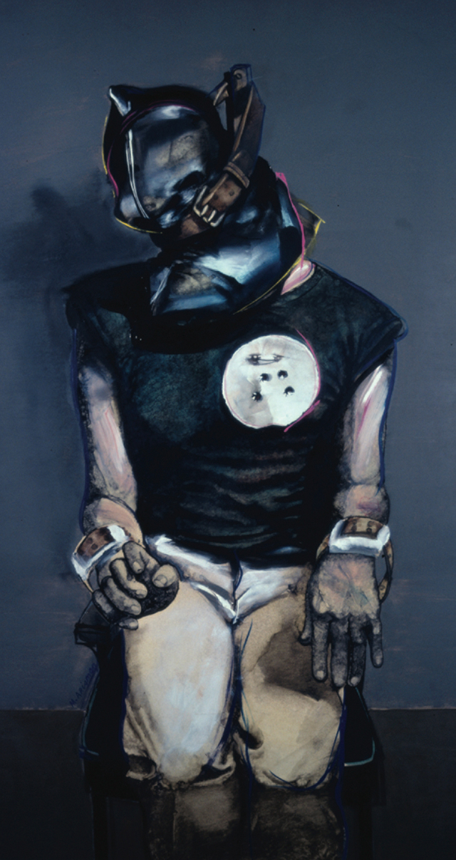
Hooded man in armchair, Marshall Arisman, Playboy magazine (1979)
The most significant early work in terms of your development as an artist
In 1979 Playboy magazine, who knows why, decided to replace the Playmate of the Month with my painting of Gary Gilmore’s execution. The Playmate, who knows who, would have to wait. Norman Mailer’s book The Executioner’s Song, was hot off the press and would be serialized in Playboy. The snag was that Mailer’s description of the execution had not yet arrived.
“We’ll have to wing it,” the Art Director said. “Firing squad eight feet away – jerking body in a chair – blood flying around the room – can’t you see it?”
“Run a colour photograph,” I said.
“They don’t exist for publication,” he said.
“How much blood do you see in your minds eye?” I said.
“About two pints,” he said.
Gary Gilmore was shot by a firing squad on January 17, 1977, at 8:07 AM. He didn’t jerk or bleed. His last words were in Latin: “There will always be a father,” he said.
As it turned out, the execution painting fell into Playboy’s Christmas issue. Hugh Hefner killed the idea. The Playmate ran as usual. My painting ran as a single page. After years of black and white graphic commentary for newspapers (The New York Times Op-Ed, The Nation, etc.) this was my first, full colour job for a national magazine. In spite of galleries telling me that illustration would ruin my fine arts career I continued doing it.
Recent work that demonstrates how your point of view has developed
Being an artist, not an archaeologist, I am interested in why cave drawings done 3500 years ago were drawn on top of each other. Today, when graffiti writers tag over someone else’s mural they can be killed for it. Tags, the calligraphic writings of one’s name, come under the unwritten rules of graffiti. The manifesto; you want to be known, but you don’t do it over other people’s work. In trying to decipher the numerous theories about why shamans drew on cave walls and why they drew over each other’s drawings I have come to an unscientific explanation.
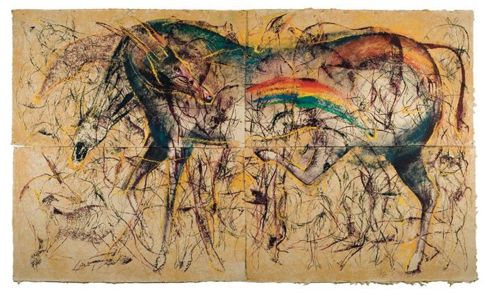
Ayahuasca Series, Marshall Arisman (2009)
The walls of the caves were curtains that separated the material world from the spiritual world. The shamans of the tribe, with the help of animal guides, traveled through the wall into the spirit realm. Upon returning the shamans illustrated their journey on the walls of the caves. The members of the tribe would enter the cave and place their hands over the paintings to absorb the energy of the trip. While their eyes were being told the story their bodies were experiencing the story itself. The more drawings done on top of each other, the more energy received.
It is only in looking backwards that I can arrange what appears to be a logical, step by step, progression from dark to light. I know that, in my case, it is misleading to perceive light and dark as opposing forces. Light and dark are two sides of the same coin, not separate activities. You do not evolve from dark into light; you encompass both in equal measure.
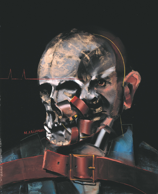
Rejected TIME cover, Marshall Arisman (1983)
The single piece that is the quintessence of your illustration
Horrific events captured in a photograph are not the same as when an artist paints them. This has something to do with how we perceive time. The photograph represents a split second. The painting takes longer to complete. We look at the photograph, not the photographer. We look at the painting and wonder why someone painted it.
In 1984 Time magazine commissioned me to paint a cover that would visualize the death penalty. My intent in the painting was to paint an image so horrific that it would evoke an audible scream on the newsstand.
I took the painting to the Time/Life Building. Carefully unwrapping it I showed it to the Art Director who carried it into the editor’s office. The editor emerged from his office carrying the painting.
“I’m sorry, we are not going to use it,” he said. “It’s too violent.”
The most “significant” contemporary illustrators
Sam Weber, Yuko Shimizu, Jonathan Twingley, Steven Tabbutt.
Continuing to blur the lines of illustration, fine art and storytelling, Marshall released the illustrated book “The Divine Elvis” in 2010. Earlier this year he was inducted into the Society of Illustrators Hall of Fame, as he continues to have involvement with the School of Visual Arts in New York. Marshall maintains a strong online presence, where you can keep up to date with his work through his regular short film posts.
R.O. Blechman
Interviewed by Steve Heller
This master of the squiggly nervous line burst upon the national scene with a talking stomach. It was a commercial for Alka Seltzer featuring the talkative organ. He is the author of many books, including the most recent Talking Lines: Fifty Years of Graphic Narratives. He is the founder of the Ink Tank and director of many animated films, including the feature length A Soldiers Tale. His line is still squiggly but always on the mark.
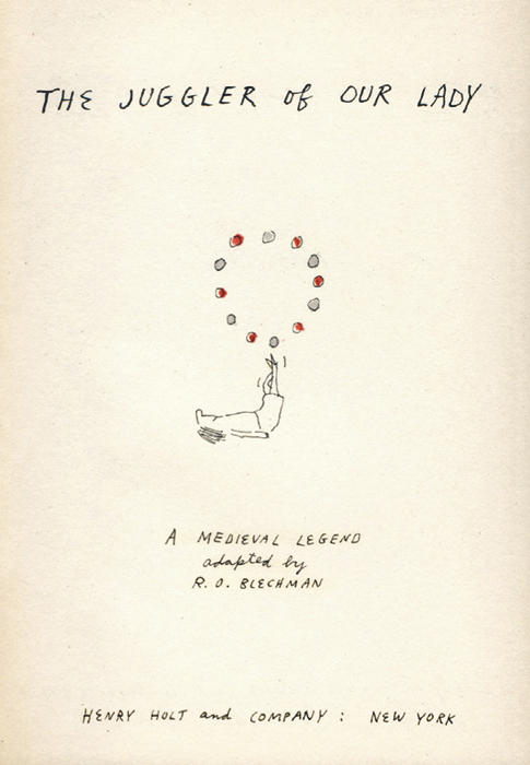
The Juggler of Our Lady, R.O. Blechman, Henry Holt & Company (1953)
The most significant early work in terms of your development as an artist
Let me preface this by saying that I am not a “natural” artist. By a “natural” artist I mean somebody who has an innate ability to draw; who has a skill in draughtsmanship that is almost inborn. I am a visual person I realize now (I didn’t know it when I was starting out), but I have to work very hard to realize my sense of how things should look. I have the vision, but to paraphrase an old saw, “my grasp does not (often) exceed my reach.”
I remember being with Milton Glaser at his studio sometime in the Seventies, and there was Milton chatting with me, taking a telephone call, listening to his radio—and here’s the kicker—drawing all the time (and what a drawing it was!). There’s a motto emblazoned at his studio entrance, “Art is Work.” But what may be work to him is hard labor to an illustrator like myself (and maybe that very inability to draw easily accounts for my signature shaky line, but that’s another story).
My breakthrough work (which is how I define “most significant”) was probably something I did when I was a 22 year old. It was a book I drew and wrote, “The Juggler of Our Lady,” basing it on an old French fable I had come across. As a work of art, forget it! The drawing, as drawing, was wretched. But as an ensemble—as writing and text—the book succeeded, and attracted a lot of critical praise. This encouraged me to continue doing picture stories, combining my talents as a writer and an illustrator—and did as much as anything to launch my career.
 Recent work that demonstrates how your point of view has developed
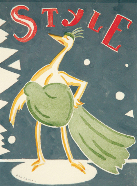
I’m sure all your contributors are scratching their heads over this question. There are so many illustrations one could choose. But rather arbitrarily, I’ll select this painting, which was never commissioned, but which I did for an exhibition of my work. I realize that it’s not typical of my work (mostly linear with spots of color), but occasionally I like to depart from my usual style.
I’m a strong believer in the need to make a statement. Here I join forces with one of my idols, Steinberg, who wrote that drawing is “a way of reasoning on paper.” My painting combined watercolor and gouache (although as I view it now, I wish my gouache was more flatly rendered, especially in the word “Style.” But no matter. It succeeds in other ways, and as Paul Valery said about poetry—but it could apply to art as well—“One never finishes a poem. One only abandons it.”).
One of the things I like about this piece is my use of abstract decorative motifs. If they don’t quite make sense, no matter. They look good, and that is justification enough. They also punch the idea of “style,” so they’re not entirely arbitrary.
The single piece that is the quintessence of your illustration
Here’s where I get to show another piece I was considering for the previous question. This was done as a submission for The New Yorker (but fat chance! I haven’t had anything accepted in years! But that, again, is another story).
The piece illustrates the memorial lights which for several years illuminated the site of the stricken World Trade Center. I’m in love with New York architecture, especially the older buildings, so I loved rendering them—and was delighted that I could do so employing an odd perspective. The trick was to make the structures recognizable, yet not betray my sketchy (nervous, squiggly, whatever) style, and I think I succeeded. By the way: Happy ending. The drawing was turned into a poster by New York’s Municipal Art Society.
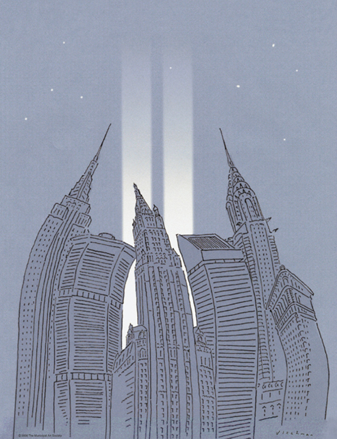
Memorial Lights, R.O. Blechman, The Municipal Art Society (2006)
The most “significant” contemporary illustrators
Every time I see something by Christoph Niemann…well, I’ll paraphrase Gore Vidal. “Every time a colleague succeeds, I die a little.” Well, Christoph’s work is to die for. It’s not only bright—he always captures the essence of what he portrays—but it has supreme gusto and flair. And he works with what appears to be the greatest of ease. He’s a brilliant draughtsman, and he’s brilliant employing any number of techniques and media.
He’s going to drive the rest of us out of business. But that’s good (I don’t mean going out of business, that’s not good. But I do mean that he pushes us—challenges us—to do better. And that’s not a bad thing).
More than half a century on from “The Juggler of Our Lady”, Blechman released “Amadeo & Maladeo” through Fantagraphics Books this year—his first graphic novel in 63 years. Whimsical, moving, and drawn with his signature style, it tells the story of two Mozart-esque brothers in 18th century Austria. A comprehensive collection of Blechman’s short stories—”Talking Lines” was published in 2009 by Drawn & Quarterly.
Judith Kerr
Interviewed by John O’Reilly
Judith Kerr and her family escaped Berlin to Switzerland the day before Hitler came to power in 1933, only 24 hours later the Nazis arrived at an empty home. Kerr has written and illustrated many classic children’s books including The Tiger Who Came To Tea, and the Mog series.
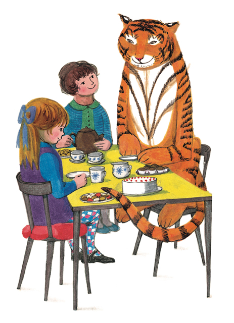
The Tiger Who Came to Tea, Judith Kerr, William Collins Sons (1968)
One Early work
With Tiger I used solid inks, layers on top of each other. I’d been doing quite a lot of painting in oils. This is the only book I have ever done where the story was more or less complete because I told it to my daughter, Tacy, when she was three and I couldn’t get round to doing a picture book until she was eight and the children were both at school. I learned a lot from Tom (Kerr’s husband Nigel Kneale, author of The Quatermass Experiment). It all came together, the children, the writing, the drawing. Wonderful. Even if I see a Tiger now I’m shattered by how good it is. We thought the Tiger would be quite hungry, it would eat a lot. We never thought of a Tiger as something ‘bitey’. Only as something ‘stripy’ and ‘orange’, the idea of it being dangerous never came into it at all. I think this picture is the essence of it.
Normally in a picture book I suppose more happens so you should have one picture of them sitting at the table, but in this case, another picture, and a third. Because that was what the story was like. I remember frantically trying to think of different ways of drawing two people and a Tiger sitting at a table, to vary it a bit. I couldn’t make it up without a small child. I knew it would work for Tacy, I told her various other stories but she didn’t want them. “Talk the Tiger!” she cried.
One lesson
The first Mog book was almost as bright as The Tiger, it’s fairly solid colour. I remember I talked a long, long, time ago with Helen Oxenbury and the same thing was happening in her work, it was getting paler. I wonder why that should be. It may be because I was using oils at the time. You don’t realise that at the time. That is the awful thing, they get paler and paler as you get older. I was very conscious of that in the show [exhibition of her work at Seven Stories Centre, Newcastle]. It gets paler but I suppose it gets more subtle, one hopes. Tiger was just pictures with type, you’re not conscious of the type. The first Mog I did the pictures and hoped I’d get the type in somewhere. Then as you get better at it, as one thinks, you design pictures with the type. It’s no longer like doing paintings, it’s illustration. The thing about writing and illustrating is you try never to write about anything you aim to draw. One thing that drives children mad, and me mad, is if they read, “Once there was a boy and he had blue trousers and a blue jacket,” and then there’s a picture of it. I try to say it with a picture, or put it into words, but never to duplicate it. And try to make it funny. It’s a terrible effort to try and find out something very boring you know already. That was very much in my mind and Mog was very different from the Tiger.
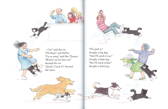
Mog and the V.E.T., Judith Kerr (2005)
An illustrator you admire
John Burningham.
Current work
My husband died about three years ago, and for about a year I didn’t do anything. Then I thought of doing a story, I was thinking I just what to do animals. It is very pretentious in relation to this, I thought of Chagall, I love Chagall, these wild things happening. All that’s left of him is a lot of wild animals, and a bit of blue, otherwise poor Chagall! I thought of doing something with rhymes which I had never done, and I thought of a few of these rhymes, and about what the animals could be doing, and I had a clear picture in my head of what it could look like. But I needed something to hang it on. Then Ian Craig, the editor to whom I dedicated it said, “Why don’t you make it a counting book?” That skeleton to hang it on solved everything. A crocodile and a kangaroo set off on a bicycle made for two. It’s something very different, I didn’t have to follow a plot. That was something very different. I’m now half way through another one. It’s rhymes, it’s surreal and about an old lady—you could say it’s got more emotional content.
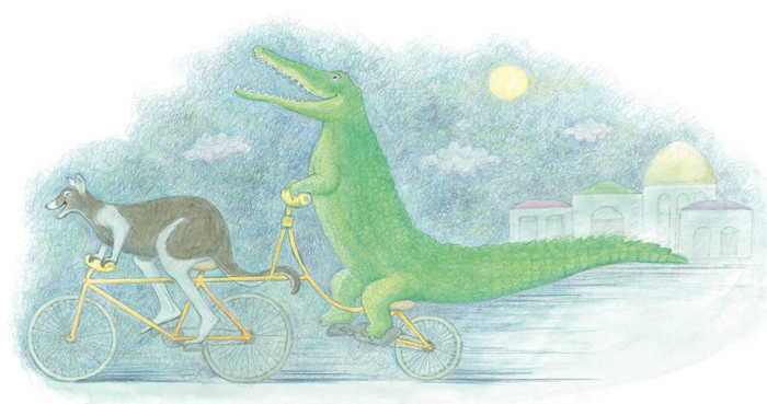
One Night In The Zoo, Judith Kerr, Harper Collins (2009)
Judith’s rhyming, surreal, emotional book was released in 2011 as “My Henry“. Now at 93, she writes and illustrates with the same continued dedication; last year saw Judith revive Mog for Sainsbury’s Christmas advert and subsequent release “Mog’s Christmas Calamity”— the first new Mog book in thirteen years. For services to children’s literature and Holocaust education, she was awarded an OBE in 2012.