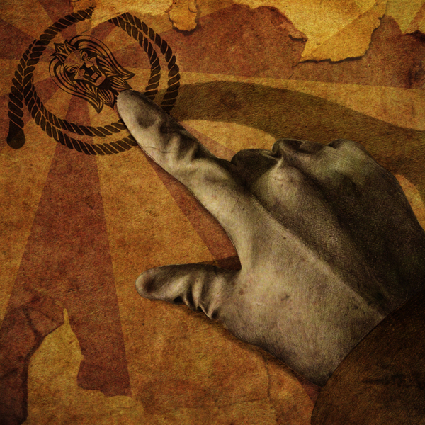
Image from a series of illustrations based on ‘The-All-Purpose Magical Tent’ by Lytton Smith. The poem is being adapted into ‘tweets’ for twitter, and the imagery will accompany them. Jamie Bradford
Punchy, heroic, cinematic, Jamie Bradford’s image-making combines ideas, narrative and playfulness with visual codes. Oh, and he’s one of the few graduate illustrators who is also a ‘Lord’
You could say that great ideas never go out of fashion. But then again you could equally say that great ideas are rarely in fashion – ‘good enough’ is cheaper, and doesn’t require much time or commitment from the image-maker, client or even the end-audience.
But then there’s Jamie Bradford’s work. Newly graduated from Plymouth University his imagery has the veneer of the classic, crafted, ‘traditional’. And that ladies and gentleman is part of Lord Bradford’s skill (see below). His work is about style, or rather styles, and ideas. And the challenge for young image-makers is not only the difficulty of creating idea-based work, but keeping your nerve under day-after-day, hour-after-hour, update-after-update of blog-generated inspiration. Bradford’s work can teach us a lesson or two about this.
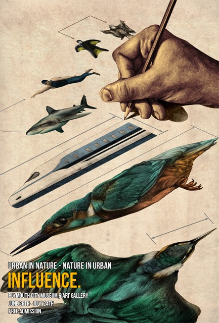
Influence, a poster for Plymouth City Museum & Art Gallery about the relationship of the urban and nature explores this very idea. A rich visual arpeggio pictures the movement of different species and machines along different scales. The birds, the sharks, the swimmer, the train, perfectly reproduced and framed by a line of scale/dimension – an example, Bradford tells us below, of the increasingly popular engineering and design idea of bio-mimicry.
The perspective and crop makes it dynamic, the draftsman’s hand makes it immediate – it’s about looking, thinking, weighing things up. Influence is about making connections between forms rather than styles. It’s about ‘being measured’ rather than ‘being inspired’.
Likewise, the Collaboration poster for the same project, conceives the eco-system as a collaborative network, mashing together technology and nature. The image of the landscape as the face of the elephant is a reminder it’s not about us – humans.

Jamie Bradford
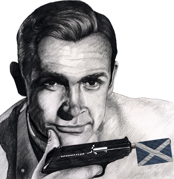
Bradford you feel could also be a cinematographer, he has an eye for the frame but most of all for an eye for the heroic, a seductive skill which will always catch the eye of the art buyer. That sense of the heroic is played out in the shadows, edges and crevices of Sean Connery, but also in the conceptual Rolling Stones piece marshaling a variety of symbols to capture the louche world of rock’n’roll in a single image that tells the story of the Stones. Bradford’s sense of scale and ‘crop’ is a useful skill to have when creating for a social medium like Twitter.

Jamie Bradford
Bradford pushes his ‘realism’ into the cinematic. The perspective, the crop, the close-up, presents a narrative mystery. He plays with a variety of different visual codes, counting Escher as an influence. And what’s more pleasurable than the artifice of the image?
Materials Format Name
Name: ‘Influence’, Format: Part of a series of posters under the theme ‘Urban in Nature – Nature in Urban’. Materials: Pencil, Photoshop.
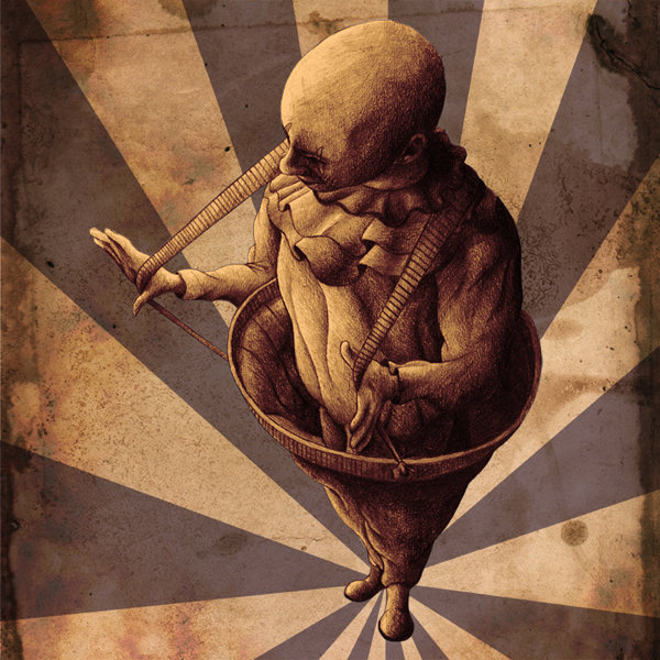
Name: ‘Twitter Narrative’ (individual names are ‘upon reflection’ for the head in hand illustration, and ‘Braces’ for the clown with braces illustration) format: illustrations accompanying tweets on twitter. Materials: Pencil, Photoshop.
Is it Jamie Bradford, or is it ‘Lord’ Bradford?
I came runner-up in a competition in which the brief was to illustrate your favourite Scotsman; the prize I received was one square foot of land in the Highlands of Scotland, which granted me the title of Lord. I don’t very often refer to myself as Lord Bradford, however it is an interesting conversational piece!

Jamie Bradford
Your Influence poster works on so many levels. Visually dynamic, conceptual, and the illustrator is placed at the centre of learning and research. How did you get to such a complete idea?
It’s all about biomimicry, which is basically the observation of nature or natural processes and applying this to human design. My initial ideas for the poster were based around trying to illustrate the ‘studying of nature’; I looked at a lot of nature exhibits in museums, particularly at those insect/butterfly pin boards they have. The poster is very influenced by old scientific illustrations that focused on the anatomy of animals, and technical blueprints that show dimensions, scale, etc. The kingfisher in particular demonstrates this, it shows the bird in profile and aerial views, and the arrows show the technical side coming in. The hand holding the pencil is showing the design process, displaying design by observation. I also kept it quite conceptual by giving it perspective and a sense of empty space around the illustrations.

Jamie Bradford
The wash of the paper and the shadowing round the hand also lend it a nostalgic feel.
This is something I incorporate quite a lot; I really enjoy using vintage colour schemes in my work as I feel it complements the traditional nature of my pencil drawing really well. Influence shows a more ‘traditional’ designer putting pencil to paper, so in some ways the colours pay homage to that.
Was there any particular challenge around delivering an image for Twitter?
The main challenge for me was the scale of the image, as it would only appear as a small icon on twitter until enlarged. I took quite a graphic approach to the imagery, trying to keep it quite simplistic and bold so it would be easily seen on a small scale.

Image from a series of illustrations based on ‘The-All-Purpose Magical Tent’ by Lytton Smith. The poem is being adapted into ‘tweets’ for twitter, and the imagery will accompany them. Jamie Bradford
Your handling of scale and ‘cropping’, in Influences/Twitter the close-up of your editorial illustration suggests you enjoy creating visual drama? It’s quite ‘heroic’ imagery.
I really enjoy creating imagery that has an immediate impact on the viewer. What makes the Twitter project work well in my opinion is that it is quite ‘punchy’ imagery. It has a clear, defined focal point at the centre of the image. I love surrounding my detailed illustrations with empty space or light texture so as to give them more attention and more impact.

Image from a series of illustrations based on ‘The-All-Purpose Magical Tent’ by Lytton Smith. The poem is being adapted into ‘tweets’ for twitter, and the imagery will accompany them. Jamie Bradford
Who/What are your pictorial influences?
There is a whole host of artists that have influenced my work, these include Arthur Rackham; his detailed illustration with washed out colour was very influential on my style. I feel the work of M.C. Escher also helped me develop a ‘graphic’ side to my work. I also cherish great portrait artists such as Chuck Close, as I have a love for realism in art. Some contemporary illustrators that inspire me include Eric Fan and Terry Fan as I feel we share a similar aesthetic.
One thing you took from college?
Don’t be afraid to experiment with new materials and media. I was very set in my ways when I started; it wasn’t until I experimented with a variety of different media and techniques that I found my strengths and formed a style.
What next for Jamie Bradford?
I have just signed for London-based Illustration agency Phosphor Art; it is really exciting to be part of an agency that already has a whole host of talented artists and illustrators. Alongside them I hope to make a name for myself as I attempt to tackle the illustration world.
See more of Jamie Bradford’s work here