Varoom 25 on the theme of empathy includes an extensive feature article by Adrian Holme on the extraordinary work of illustrator Phoebe Gloeckner for the Re/search edition of J.G. Ballard’s The Atrocity Exhibition.
In the interview below Gloeckner and Holme explore some key ideas around this version of Ballard’s book, and discuss Gloeckner’s background as a medical illustrator. Phoebe Gloeckner is currently Associate Professor at Stamps School of Art & Design at the University of Michigan.
Adrian Holme: What was your background before you came to illustrate the Re/Search (1990) edition of The Atrocity Exhibition by J.G. Ballard?
Phoebe Gloeckner: I took a pre-med course before studying illustration. I never wanted to be a doctor, but I wanted to know what was going on in the interior of a person, physically as well as psychologically. I then took a Masters in Biomedical Communication.
Phoebe Gloeckner
AH: And how was it that you came to be asked to illustrate The Atrocity Exhibition?
PG: I had been a punk rocker in San Francisco in the late 1970s and did illustrations for Search and Destroy, the forerunner of Re/Search, so they knew my work. For The Atrocity Exhibition they handed me the book and said ‘read it and do whatever you want.’ It was a dream job for me. I was only paid $1,000 with no residuals but I was free to do what I wanted.
AH: I have been thinking about the idea of ‘death of affect’ in Ballard, which also seems to come up in people like Warhol
PG: Unlike Warhol, Ballard is emotional. When you first read the book it’s frightening – it feels incredibly cold until you let it sink in, and then you feel the symphony of emotion that is in it. Ballard studied to be a doctor I believe. I think he referred in his writings to ‘sex and paranoia’ – the book is almost childish in a way. You can talk about it in terms of coldness, but instead it’s an awe… looking for an answer that he doesn’t seem to find.
The coldness he projects was appealing to a lot of people in those days. I felt it was sad, and emotional in its lack of emotion.
After publication I had a postcard from Ballard that said the illustrations ‘are perfect’ – I was very glad.
The Re/Search edition of The Atrocity Exhibition, Re/Search, illustration Phoebe Gloeckner
AH: How did you go about the illustration?
PG: When I read the book, there was a lot of violence and sex – and violence and sex was in my head at that time. I had seen post mortems and dissections at medical school – motorcycle deaths. I remember this beautiful young Mexican couple who had been drinking and driving who had their heads flattened in a traffic accident, and I felt shocked, and sorrow at the loss of this promise of life.
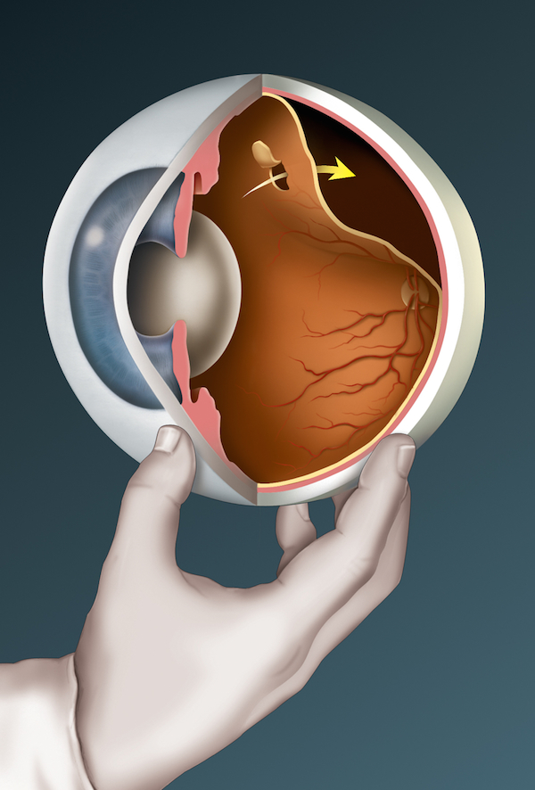
The first piece I worked on was the cross-section drawing of fellatio (see Varoom 25). I was thinking of the body as a tube within a tube. I also drew the dissected penis. I wanted to show the geography of the body. If I look back now it’s not perfect.
The Re/Search edition of The Atrocity Exhibition, Re/Search, illustration Phoebe Gloeckner
After The Atrocity Exhibition, in the days before Viagra, I had a lot of work for a medical company illustrating treatments of erectile dysfunction. I also illustrated sex manuals and an encylopaedia of sexual practices – I got pegged as an illustrator who could do that.
I thought of Ballard as depressed and angry – a childish anger – he objectified things.
It was my first job as a medical illustrator. When I left college I had this fantasy of seeing classified ads looking for medical illustrators. I have never since been given as much freedom on the job – in this case I was not a hired hand because I was not being paid enough.
For the illustration of Chapter 2 – the women inserting a diaphragm – I was consxcerned with the violence of things we do to our body – it seemed to harmonize with things I was feeling about what Ballard was saying.
AH: Can you tell me about your process for making the illustrations?
PG: It would have been possible to pick a sentence here or there, but that didn’t seem to work. I felt it was better not to take it literally – better to make illustrations that had the same feeling. (There were also photos in the book by Ana Barrado – we didn’t see each other’s work).
I used elements to make the images – rather than being redundant after the writing – I wanted to do stuff that continues that montage / fragmentary writing approach.
I also decided not to choose any celebrities [featured in the book], which another illustrator might have chosen. When I look back at that time there was a lot of taking faces as symbols – personally I was tired of that. That part of the book attracted me the least. If I had drawn those people it would have frozen the book in time.
I guess it’s about love and violence, birth and death, danger and potential accident.
AH: What was the response from Re/Search?
PG: When I delivered them they loved them – I just had to make the borders more clearly defined – they asked me for a few more, the end papers.
AH: What was the response generally?
PG: People assumed they were made by a man. A guy from a print studio in Mexico City contacted me. He said “I knew someone with that name who had done The Atrocity Exhibition” – and I said “I did them!” He had assumed it was a man that had done them.
AH: Tell me about the cover?
PG: The background, the industrial landscape is based on Oakland where I lived. It is a pretty straight forward colour in the cover – I think they wanted a full cover colour because it was a naked woman.
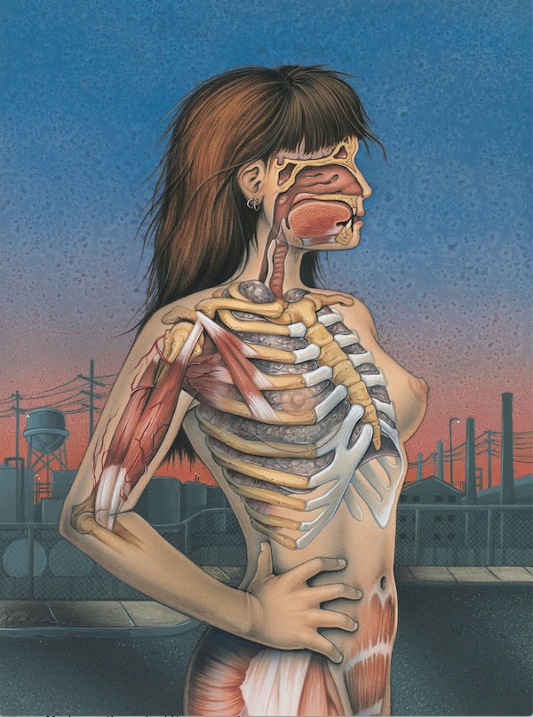
Phoebe Gloeckner cover for Re/Search edition of J.G. Ballard’s The Atrocity Exhibition
The illustrations inside are cold but soft. I wanted them to be harmless and approachable, like doing a fuzzy animal, so they have some humanity. It isn’t because of what they are but because of that softness, not rejecting of humanity. I tried to make them beautiful. I didn’t want it to be horror. It has impermanence but this is beauty as we live it.
AH: On a technical level, how did you make them.
PG: They are on Bristol Board – I used a variety of materials, pencil, ink washes, no particular technique.
Read Adrian Holme’s feature on Phoebe Gloeckner’s imagery for The Atrocity Exhibition in Varoom 25. Buy here