With the Museum of London celebrating the 90th anniversary of Radio Times in their exhibition, Cover Story: Radio Times at 90, Varoom’s Cartoon Editor Martin Colyer, gives his views on covers from the 1970s and 80s. Article from issue 17.
Modern Magazines Are Rubbish?
By Martin Colyer
Late 2011 saw a firestorm of debate on the merits of the Radio Times of today vs the Radio Times of the Golden Age of British Magazine Design (ironic italics mine). Mike Dempsey, graphic design grandee, had posted a critique of the current RT on his always thought-provoking blog Graphic Journey, and the magazine community fervently responded.
Mike Dempsey’s point could be summed up as “Modern Magazines are rubbish – where are David Driver and Michael Rand when you need them?” The response from those still at the coalface seemed to be: “Try doing a great magazine cover now with a bunch of marketing men breathing down your neck, a load of Celeb PRs playing up and a design team of one Mac and a dog.”
As someone who straddles both periods I always have a problem with the “It was great back then” approach. It often cherry picks to deliver its argument there was some fantastically bad magazine design in the 1960s and 1970s. It usually doesn’t take into account the massive changes in the industry. Way more pages now, allied to far less staff, and with a newsstand that no-one in the 60s could have imagined. And finally it always seems to subtly belittle the great work being done now.
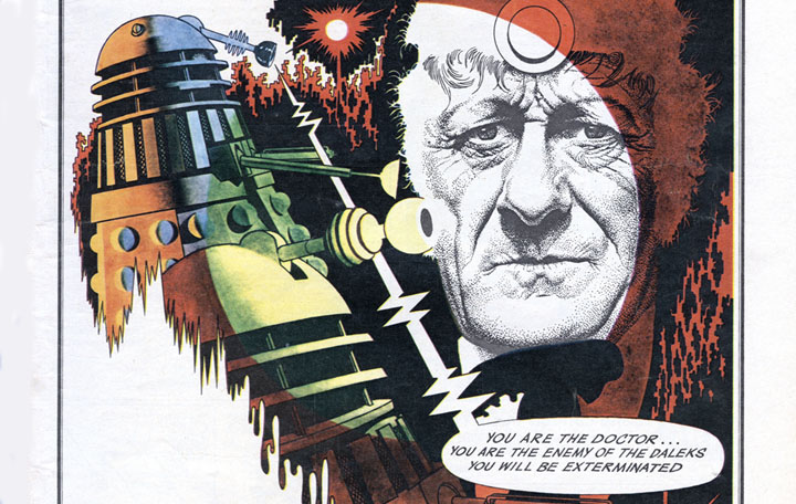
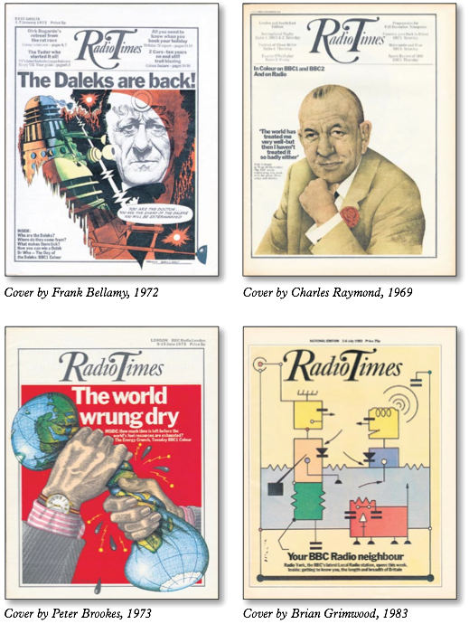
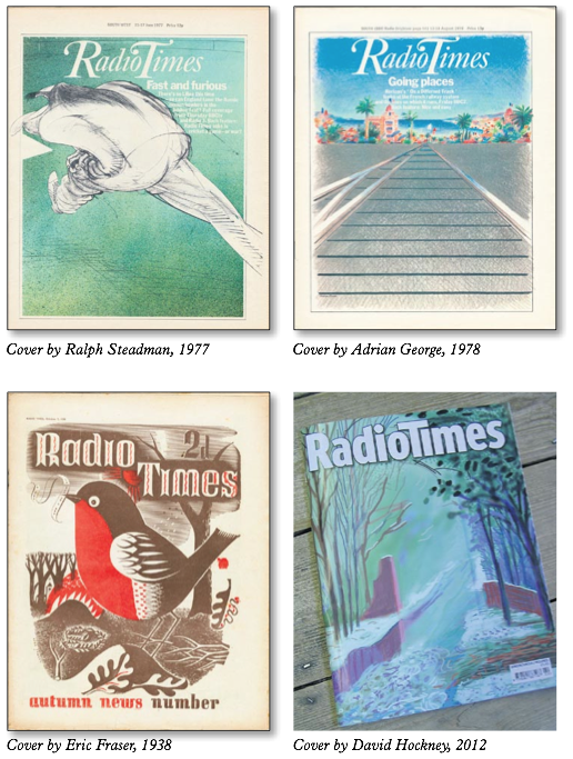
I bow to no-one in my admiration for both David Driver and Michael Rand (especially as they taught me most of what I know). They presided over a period of fantastic illustration, beautifully rich and inventive photography and smart graphic concepts. The clever updating of illustrative styles from Eric Ravilious to Paul Slater and Ralph Steadman found a way to take a readership used to illustration to new places. But the world was a different place. It was a world with four TV channels. There was no such thing as rolling news.
Look at rock music, for example, and tell me it’s as easy to be inventive now as it was in 1966. There’s always a ‘perfect storm’ time when the talent meets the market and the market says: Yes! Give me more. Give me more of that different, difficult and interesting stuff! It’s a heady time when mass taste coincides with aesthetic intent. That doesn’t mean that everything that follows is always inferior, but the shock of the new is always a powerful thing. Photojournalism looked powerful and moving on a magazine front cover in 1968, when TV news was more circumspect (although my guess is that the designers of Life and Picture Post probably thought they’d been there and done that!). So it looks from here like bravery. But you can’t keep doing that forever. And you look to different places for that level of inventiveness. Which is currently to be found at the fringes of this fractured industry, and mostly not in the mass market.
Also, the award-winning spreads and covers are never the whole story. Even the great magazines had mundane features behind the cracking Peter Brookes or Don McCullin cover. The sixties magazines technically weren’t a patch on, say, the Fortune magazine of the forties or fifties. Hot metal was dying, the craft was being lost, and no- one was sure what was coming (what came was the much unloved phototypesetting). So there were no computers, and all your precious typography was in the hands of a man in the bowels of Fleet Street or on an industrial estate at Park Royal who really didn’t care about your lovely attempts at better line breaks and interesting drop caps. In the days of hot metal, I once asked for a cut-out of a man smoking a pipe and when I dared to venture a suggestion that the blockmaker’s attempt fell a little short, and that it would be good if the pipe was attached to the man’s mouth rather than floating in thin air, being curtly asked “Who d’you think I am? Fucking Rembrandt?”
It is true that the large mainstream magazines of today are commercially tuned and focus group driven, but if you look around even a mid-sized branch of WH Smith’s you’ll come across the inheritors of what is possible in magazine design. It’s an understandable impulse to make the comparison of a single title then and now, but I’m not sure that it’s the right prism to view this subject through. Let’s just celebrate that great past, be glad that those people got to do that work. But accept that the challenges and the context are different today and celebrate what’s great now… Tell me that Andrew Diprose at Wired or Finnie Finn at I:Global Intelligence or Marissa Bourke at Elle aren’t doing great work, too.
www.mikedempsey.typepad.com/graphic_journey_blog
Images courtesy of Paul Smith, Radio Times