Varoom presents a selection from the many Awards winners from across the globe featured in issue 23 (available here) This extract reveals the thoughts behind the AOI Illustration Awards winning works by Merav Salomon (Books) and Jonathan Burton (Design).
Merav Salomon
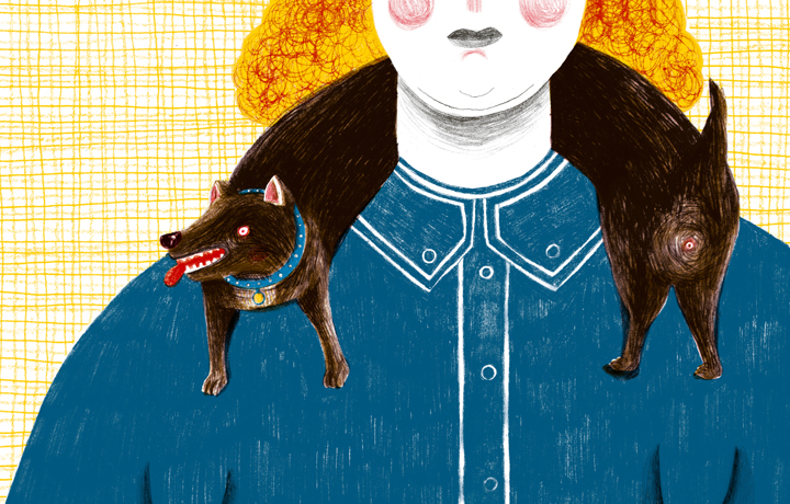
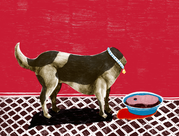
Frostbites
Winner: Books
Brief: I was very lucky to be invited to publish my book Frostbites (Frostbeulen) with the Tollen Hefte Illustrated books series. I was given complete creative freedom to construct my visual and poetic vision. I wanted to create a brutal and grotesque atmosphere as a visual echo of my memories of my late grandmother’s persona. I also wanted to untie the direct classic affinity between text and image, in order to allow an associative reading and viewing experience. I worked closely with Armin Abmeier and Sussane Berner, the Editors of the series, on adjusting the book to the Tollen Hefte strict format. All of the Tollen Hefte books are 215x130mm in size, have 32 pages and use 4 special hand separated colours. The books are printed on an Offset printer, and manually bind. Each book also comes with a poster folded inside.
Materials: Most of the illustrations started as acrylic images, which were then transformed into a pencil image on draft paper, scanned, and then coloured in Photoshop. It was a translation mission, and it was a great fun. It gave me a fresh point of view on my work. A little bit like when you look at your illustration in a mirror. I also made different patches of backgrounds in pencil, which I used later on when I constructed the separated layers together.
Research: The visual world in the book is based on old photos of my late Grandmother from her photo albums. Some images came from the collective visual memory from where I come from. In addition to those references, there is quite a lot of influence from Heinrich Hoffman’s notorious children’s book classic Straw Headed Peter (Der strawellpeter), which I grew up on. In the design stage of the book, we used the futura typeface as a tribute to the German Bauhaus school.
Process: The text came later. First came the images. Clear and surreal. Wacky and cruel, colourful and distressing. The complete series of illustrations, dealing with the barren effort of stitching the fragments of my Grandmother’s life story, was created in a series of “seizure” like work attacks resulting in about 18 acrylic on paper images. At that stage the project progressed from a “personal project” into a solo art gallery show at the Erlich Gallery in Tel Aviv. By then it was already named Frostbites. But I wasn’t satisfied. From the beginning I had a very clear vision that it should be an Illustrated book. Illustrated books are the form of expression I mostly work in. I see it as an exciting form of Art that allows me to synergize content, images and format. In order to fulfill my vision I made a sample of the book I had envisioned, using the illustrations from the exhibition, and sent it to a few friends. After a few months I got an email from Armin Abmeier, the founder and Editor of the Tollen Hefte Series, asking me whether I would agree to re-illustrate the whole book, to fit into the series format (I did not know him then, though I have admired the Tollen Hefte series for many years). I said – YES! – and started the process of translating the book from one visual language to another. I also had to adjust the image composition because the layout proportions had changed.
Resistances: The hardest part, to be honest, was to find the right partners to publish the book, a partner that shared my vision for visual poetics and illustrated books. During the early stages of the process, I found the hand separation quite challenging. I had to re-vision the paint and brush illustrations in 4 colours only. It took me 2-3 illustrations to get the hang of it, and from there on I only saw the world in 4 special colours. On the other hand I found it wonderfully liberating to do the separations manually. It gave the whole process a new mysterious suspense to how things would eventually look.
Insight: “Stick to your dreams…”, “Believe in yourself…”, “You are not alone…” All those corny cliches are true! I was very fortunate to find the right partners in the form of Armin and Sussane, and the Tollen Hefte series in Buchergilde Gutenberg in Germany, that shared my vision and my ideas on Visual Poetics and hence enabled me to materialise my dream and publish my book. It is a very interesting era to be an illustrator. When I stepped out of college with my fresh portfolios, most of the work for young illustrators was in editorials and children’s books. If you wanted to work somewhere you had to go there and live there. Now all the distances have shrunk, the web and internet make almost anything within reach.
Distractions: I don’t know if this is the place to mention it, but last July Armin Abmeier, the Editor and founder of the Tollen Hefte series, passed away. It is a terrible loss to the many many people and artists and publishers and editors who knew him and appreciated him, and to the Illustrated Books community. His legacy still lives and will continue to live through the art and books of many talented friends. Frostbites was the last book he edited.
Numbers: Frostbites is the 37th book in the Tollen Hefte series. It includes 32 pages, 10 short pieces of text and 13 images. When closed its measurements are 130 mm wide on 215 mm tall. All the images were hand coloured and hand separated in 4 special colours (Pantone colours 307, 7406, 186 and Black). In the book’s illustrations there are 10 different references to animals, 6 cut heads, 10 hairdos, 10 trees, 5 references to water, and 3 to fire.
Afterwords: The printed book is not dead. Books are great! Illustration is a wonderful art. Illustration is a wonderful way of life! I’m sorry I did not ask my Grandmother to tell me her life story before she died. A huge thanks to all the people that took part in making Frostbites become a book.
Tel aviv, Israel
meravsalomon.com
Jonathan Burton
Odd Bods
Winner: Design
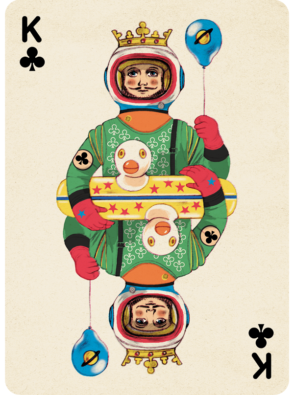
Brief: Design a deck of playing cards to be used as a promotional gift from the Folio Society. I was given complete freedom to suggest any ideas I thought were fun. My first sketches on the theme of ‘eccentric characters’ were given a big thumbs up so I was very happy.
Materials: Pencil on Bristol Paper and Photoshop.
Research: Looking into the history of playing cards I discovered ‘O. Gilbert, a mid-19th Century card maker who produced hand coloured etched playing cards. They beautifully depicted contemporary costumes or those of bygone eras and which led me to think of ‘silly’ costumes that would give that traditional look a bizarre twist. I later found it fun to throw in some modern references like a sock monkey, a telephone, an inflatable rubber duck ring. I was thinking of the ‘absurd’ so re-read Spike Milligan poems to get me in the mood.
Process: Pencil drawn characters coloured and ‘aged’ in Photoshop. I worked hard to give them the look of Victorian lithographs with limited colour and slight printing errors.
Resistances: The biggest challenge was making the opposite flipped drawings fit together in the centre and thinking of ways to facilitate it. Diagonal designs in the clothes worked well as did holding a joint object. I really tried to have one holding a Rubiks cube but couldn’t get it to work flipped over! I was given the wrong card size at the beginning so I had to go back and resize ALL the cards and retouch the layers to the new format.
Insight: There was a tight deadline so I had to trust my first instincts as to which ideas would work best. I tend to over-think things but this intensive period was actually quite freeing. For colouring I made the process simple by treating it as a production line working on the 16 picture card files all together on the screen. It speeded things up and made sure they worked as a set. I learned not to be too precious.
Distractions: I work at home so my two kids always distract me though with a project like this I welcomed their reactions to the characters. If they were interested in or laughed at the characters it spurred me on. Then I had to shoo them out of the studio so I could work.
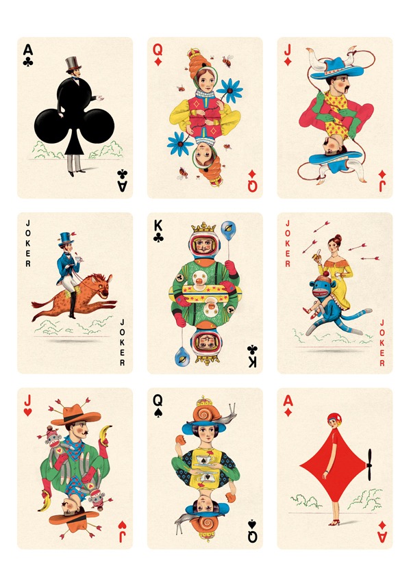
Numbers: 16 picture cards, 36 number cards, 2 Jokers, 1 box design, 2 weeks.
AfterWords: The absurd drawn well is fun and silliness is preferable to comical.
Bordeaux, France
jonathanburton.net